Context of the company:
Infintra360 is an entrepreneur ship which helps directs students in high eduction to expand their idea. This idea specialised in Climate change.
About Eit- the company with holds these sub- companies - such as Infintra360
It is a European Institute of innovation. Technology is an independent body of the European Union set up in 2008 to spur innovation and entrepreneurship across Europe. Bring together higher education institutions, research labs, and companies to form a dynamic cross border partnership.
Context:
Eit: "Our vision is to become the leading European initiative that empowers innovators and entrepreneurs to develop world-class solutions to create growth and jobs"
*Knowledge and innovation communities that develop innovative products and services, start new companies, and train a new generation of entrepreneurs.
* The innovation communities are also tasked with overcoming some of the greatest challenges society faces, including climate change, the use of raw materials, energy, and active ageing.
Infinity Symbol
The infinity symbol (sometimes called Lemniscate) is a mathematical symbol representing the concept of infinity.
Definition of infinity: endlessness, boundlessness, limitlessness
Mathematical Definition: A number greater than any assignable quantity/ countable number.
History
* The infinity logo sideways figure 8
*It appears in the Cross of Saint Boniface, wrapped around the bars of a Latin cross.
*John Wallis credited for the design of the mathematical symbol.
*The symbol was influenced by the variant form of a Roman numeral for 1000 which used to mean many or the last letter in the greek alphabet.
Contextual Research
Exploring competitors, and inspiration, what the client requires.
Apple
Even though the context does not relate to education, the client required a design like Apple, in the sense of clear, minimal graphic design. The use of innovation and unique shape to create recognition. The San serif typeface creates a freshness and a contemporary feel. The use of a centred position with the use of space creates an easy communication. The grey tones and black works well in creating something more formative and professional. The use of colour creates a sense of innovation, feeling, and thrill which the client requires within the designs.
Stanford d.school
Stanford d. school build on methods from across the field of design to create learning experience that helps people develop their creative potential. The company helps individuals tackle problems.
The website includes a simple unique colour scheme, which a clear grid layout. The website includes an animation which conveys innovation and creativity. The use of the circles creates a sense of harmonious feel as well as a sense of a community. The logo uses shapes and symbols to convey this idea of education. The san serif typeface works well with the overall concept of targeting a young student audience.
Ideou
Ideou is winning global design company which takes a human centred, design-based approach to help organisations grow and innovation. The aim is to create confidence and tackle complex challenges. The use of the lines connecting with string creates the illusion of complex ideas, the process of ideas expanding. It creates an innovative approach to identify the creative base. The clear type creates a more business like nature. The use of scale and size identifies the success of individuals and what the company aims to do.
Fraunhofer- Gesellschaft
Compared to the other examples, the design layout is less innovative and more informative. The design gives out a generic business design. The colours green and blue create the association to do with climate change which relates to context of Infintra360. However The tones in the colours are darker which are perceived as generic.
The design on this relates to what the client requires through innovation, unique shapes, a technical feel towards the company. It also plays with shapes with opacity to show the idea of generating ideas. Compared to Fraunhofer the design is more complex and creative, the colours are unique and stand out compared to the other examples.
Idea Process
Thumbnail sketches
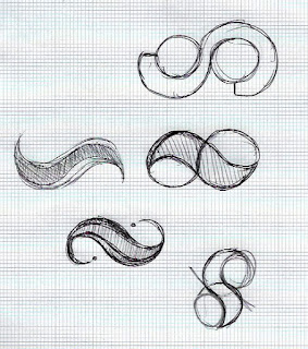
Exploring shapes created through circles and the concept of infinity logo. In the designs I have taken out certain shapes and sections. The ideas include a curve element to rectify this idea of a circle and unity.
Repeating elements to create unique shape. The issue with this, the designs were too complex for a logo design. This perhaps may be difficult to print on tops and crate identification for the company.
Incorporating type within the logo, however this perhaps is to generic and doesn't fit the brief of innovation.
Zooming in on thumbnail sketches to create compositions. Perhaps the complex shapes could simplified through zooming into certain sections.
These designs show the idea of links and focusing on scale and size. However the feedback on this design it relates to the similarity of the Nike logo which may confuse the design.
Focusing on the letterforms of the 'F' as the client wanted this letter to stay out from the crowd. The design are strong, and strengthened which perhaps creates a more intimidating feel. The use of the curve works better as it creates a more approachable characteristic.
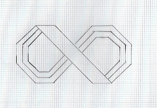
Using more complex shapes which may not be used for the infinity symbol. The use of using geometric polygons creates the illusion of complexity but also innovation. These designs were more appropriate for the context.
Using Illustrator
To create these thumbnail designs, the programme appropriate is Illustrator. As I am still learning new skills, the question was how to tackle these designs using Illustrator?
The first approach was watching youtube channels of tutorials, However some of the sketches were to unique and complex. The tool used was the shape builder tool, where I took out sections to create these shapes. However doing this, the designs looked uneven, not professionally presented.
Experimentations on Illustrator
Illustrator thumbnails
These thumbnails are using geometric shapes and the paint brush tool. Using the paint brush tool for this brief left the designs unsophisticated. The designs were not innovative enough for the set client. The designs looks generic, too simplified.
Exploring Ideas through colour
Doing this, the ideas were unsuccessful as the prototypes needed refining before applying colour. The colours chosen create a more generic feel towards the brand which did not fit to what the client required.
Initial Ideas
Initial Ideas for typeface.
Exploring a univers typeface. Positive feedback came from using a san serif typeface.
Exploring combining unique type to create a logo feel. However the client did not like the use of a structured layout of the 'f'. the client wanted something more curved to create an approachable feel.
Feedback from the client
The client chose:
However the feedback given: The first design could be developed further through lines and shapes, the use of the design shows a continuous feel through a geometric nature, however the design could perhaps include dots to create to this element of 360 degrees.
The dots on the second second needs to be structured more, perhaps developed in a grid system. The use of the middle band needs to be developed as it look like the Nike logo. This could be through perhaps applying more edges at the end. The use of dots could be adapted by applying different compositions layouts within the designs.
Another idea was implicating wheels, to create the idea of thinking and idea generation. However this concept perhaps would over complicate the design.
The colours chosen were required by the client. The client wanted something cool to relate to climate change however with added colours of red to create a spice feel.
Responding to feedback
Quick thumbnail sketches, to explore innovation, quick design activity.
Development
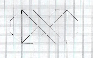
Responding to feedback, ensuring that thumbnails are more precise. Using grids and layouts to ensure symmetry as well equality around the design.
These thumbnails were then scanned and applied on Illustrator
Further feedback
When using Illustrator, perhaps use the pen and curved tool to create unique shapes. Scan the drawings through and draw overtop in Illustrator. The use of the pend tool, works with Anchors.
Therefore, I watched a few tutorials about the pen tool. The use of using is, is to create a shape and to make sure you deselect the item, layers work effectively swell on illustrator for combining shapes together. I found this process a lot more successful as this left the shapes look better presented.
Prototypes
designs using colour
Editing
The client gave me the colour scheme of what colours they required. The client wanted something with a gradient effect.
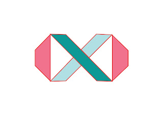
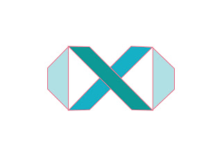
These designs are successful however the colour pink creates a more delicate approach which perhaps doesn't fit the client and their firm's purpose. The use of outline works effectively more than the fill as it creates a minimalistic, professional quality.
The fill doesn't work as effetely compared to the previous designs. To develop this further perhaps add another colour to make the shape stand out.
Exploring designs with outlines. The outline strengthens the designs and creates the logo to look firm and strong. A company which you can trust. The use of grey creates a darker contrast. This contrast works effetely as this colour scheme is diverse.
The orange and teal works together effectively. However a gradient fill will make the designs more intriguing.
Adding another colour perhaps complicates the logo design. To develop the designs further perhaps fill in the space of the triangles to create a more structured shape.
Exploring colour palette which works effectively. The use of the orange makes the logo stand out. To develop this design further perhaps create the main band as orange and the rest a set teal.
The direction of the gradient fill does not work effectively here. The design looks old fashioned and not contemporary.
This gradient fill works effectively by creating the designs to be more contemporary. However this design by the 3 bands in the centre makes the designs more complex and and not minimalistic.
Exploring scale and size within the logo design
This colour scheme works well however a thinker outline may create the logo to stand out more, as from a distance the diagonal line will look like the logo and may be misinterpreted.
By applying a colour flow towards the lines does not work that effectively. It creates the logo to look like it is for a younger target market.
Experimenting a combination of colour swatches
The element of red creates a sense of richness and sophistication. However, the feedback given was these designs were to formal which perhaps would be interpreted as a bank instead of a creative firm. The idea of innovation is lost.
Taking the feedback on board, the designs examples above show a minimalistic approach in using just an outline with a gradient fill. However this design communicated a letter 'x' where the logo design was lost. Therefore these were not as successful.
Exploring a larger scale with outline
These designs are more successful as the wider outline show the structure of logo better. The colours used work effectively. The diversity in size and shape creates the concept of innovation and relates to the idea of new ideas connecting and expanding, a continuous approach.
Combining circles with the design to convey the 360 degree element.
From the crib, these designs were more successful as they conveyed movement as well as addressing the idea of a community through the circles. The direction of the gradient fill works effetely as it creates the illusion of the logo being made out of metal, a shiny service. From the feedback the combination of blue tones works effectively in relating to context of climate change.
Exploring 360 degree in the band as the main focus
To develop the designs further perhaps use a background behind the circles to create more a structure. The bottom line of the circles being cut of perhaps looks unprofessional. This could be developed further by moving the circles further up and applying a structure around the texture. The combination of circles and lines creates the idea of diversity as well as something unique.
These designs are successful through colour, ensuring the structure is accurate. However the feedback given was it is to similar to the infinity symbol, and perhaps this is to generic and obvious.
The use of red looks out of place, to develop this further perhaps Create all the circles red, as the red does not fit with the sequins of blues.
The band over the top of the circles works effectively as it a lot heavier. The colours do not compliment each other. Perhaps the circles could continue the gradient flow which will communicate a continuous feel.
Designs developed further through colours which have work well.
Creating 3 final prototypes.
The feedback given was the second design was most successful. The design is unique by using a hexagon shape. To develop the design further perhaps create the lines to be slightly thicker.
Contextual Research
The design colour was influenced through the Business Forum Sofia 2018. The company have used orange and teal which has been explored in previous prototypes. The design includes a minimalistic approach by using outline. The final design uses the same dynamic.
Final Design
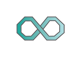
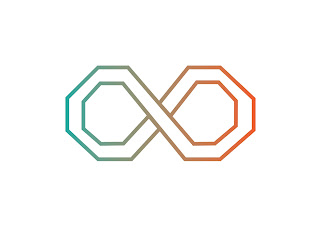
The final design conveys a continuous approach through linking the shapes together. This characteristic f linking is taken from the infinity logo. The colour format shows two colours, however with a gradient fill. This idea of gradient as well as chosen colours creates a contemporary, creative design which also communicates in a formal manner.















No comments:
Post a Comment