Sexualism in the Middle East
Sexualism
Middle Eastern men had so many
wives that the women are more malleable and easily controlled. Even with the
stereotype of Middle Eastern women of being belly dancers came about in the
nineteenth century from a performer called “Little Egypt”. “Little Egypt”, had
performed a provocative dance that branded the women of the Middle East women
as sensual and also being mocked by the performance, “the repeated
representation … Middle East belly dancers and harem girls.”
Incorporating Concept
Contextual research from Azeema Magazine
The concept of this of documentation of old photographs, as well as a Fragile label to address the vulnerability women face through sexualism.
To develop my practise, I incorporated fragile tape in influence of the Azeema magazine and created a background to highlight vulnerability.
This idea could be developed further through primary photography, then incorporating fragile tape to create a composition. To develop the designs further, feedback was given, highlighting to incorporate graffiti to address vandalism to suggest how woman are perceived through sexualism.
During the critique, the final composition was seen as to complex, perhaps include less pictures. The type of sensual could be created in a calligraphic style to highlight the idea of history. Perhaps research into type during the ancient Middle-East. The use of Arabic could be interesting by applying that over the photographs.
Research into Binding
To develop my practise further, I wanted to try a different technique of binding which allowed the spine to be more flexible so the double pages were visible. Kettle stitch- open spine fitted that criteria. Previously creating glue perfect bind, this was more challenging, as a designer, I am finding ways to resolve the issues that occurred. One of the main issues was the front cover was not bonded accurately and securely. Another issue was some of the pages became loose, therefore less glue should have been applied to create an even layer. The open spine creates a front cover which does not need a spine measurement. As I was working in a strict time base of 2 weeks, the bind had to be quick and create a sophisticated finish.
Production- Binding
Format- the pages were printed on a matt paper in a 200gsm. Some pages came out dark which was unsuccessful, therefore in the future I will ensure all photos are lightened accurately before on Photoshop.
Creating pages into sections, pages of eight. This included folding 2 pages together in the right order from how it printed.
Folding every page to ensure the order is right and to show how the publication will be played out.
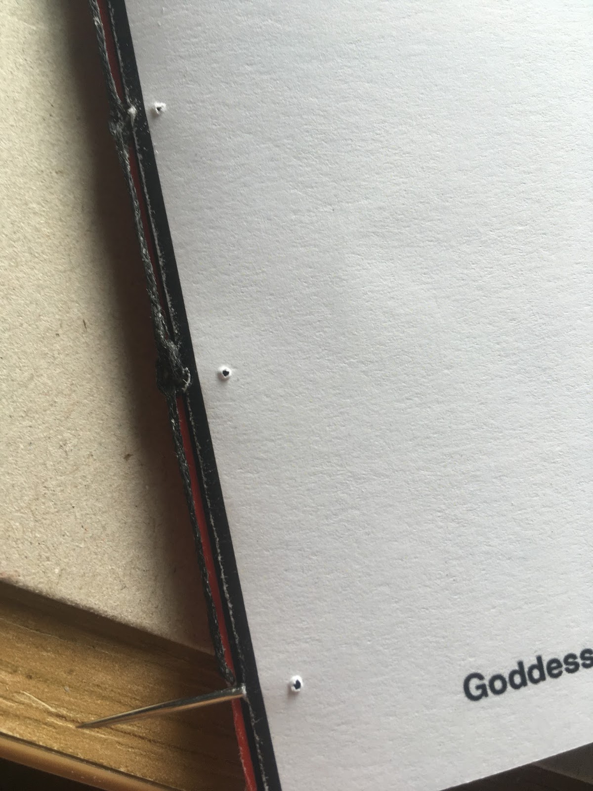
Creating Prototype for accurate measurements for the holes. This will ensure each sheet has the hole in the same place. It will ensure the original copy won't get damaged through marks and uneven holes through pressure.
Shows the markings of the holes. The holes have come out successful in ensuring they are situated on the spine and on the same position on each page.
Mistakes, during creating the holes, the prototype was misplaced and caused the holes to occur of the spine. To reduce this issue ensure the prototype is in line with the spine.
Due to short time base, I was unable to re-print this page again, however when binding this mistake was hidden and is not that visible. For development or future reference, I will ensure more time so I am able to create a best quality finish.
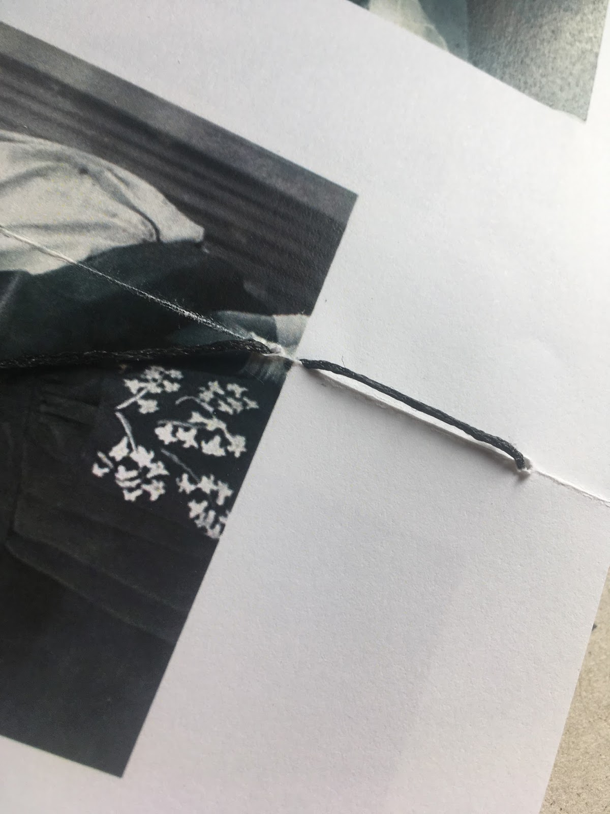
The wax thread caused marks. To reduce this Wie of straight away. Or perhaps try with unwaxed thread. This will create a better quality finish.
Ensuring the pressure is accurate. As it was my first time, the hole ripped due to a stronger force. To reduce this, as a designer I should have created prototypes on this bind.
The prototype had missed the spine by a few millimetres. To reduce this issue make sure the prototype is applied accurate from top to bottom and is parallel.
Whiles binding, some of the threads appeared loose. To reduce this ensure each loop is pulled accurately, smoothly, and evenly.
Another mistake that occurred was making sure the next section was looped around the previous stitch and not from the first stitch. This will create a bigger knot which will appear untidy.
Loose thread which appears untidy.
During this section, the thread was pulled forcefully, which made the hole to rip. This looks unprofessional. To ensure this does not happen again, I will create prototypes to practise the amount of pressure which is needed for this binding technique of Kettle/coptic Stitch.
Overall, this stitch was more successful compared to perfect bind as each page is secured safely. The use of the open/ flexible spine allows the double pages toped up fully which the double page spreads will not need an extra creep of 3mm when preparing for print.
Final Outcome
During the critique, the feedback given was to create a hard back cover, as the front cover is too thin for the publication. This would allow a neater, appealing spine aesthetic. Also during the critique, the use of just having the title "Rawiya" and the meaning "She who tells a story" being placed on the front cover rather than focusing on one role model. As the publication focuses on a number of issues, which the audience may miscommunicate through the front cover. The use of Universe typeface doesn't fit well with the Bodoni as there are too many styles within the design concept. Perhaps sticking to one typeface will create a more professional, sophisticated approach. The binding could be applied better as some knots appear bigger than others, to improve this create prototypes before the publication is made. The topics are different and diverse, perhaps include a content page and numbers to identify each section.


The feedback given was to break down this sentence to create more of a centred layout.
Column grids are explored, using space to create the type to be more readable and appealing. The photos are developed further through Photoshop by creating a continuous theme of the red tone. This works effectively by relating to the emotion and sensitivity of the issue. To develop this further this effect could be implicated on all the pictures for the Princess of the Middle-East series. This would create a continuous theme and create more of a section for this topic, as this topic is more serious compared to the issues explored.
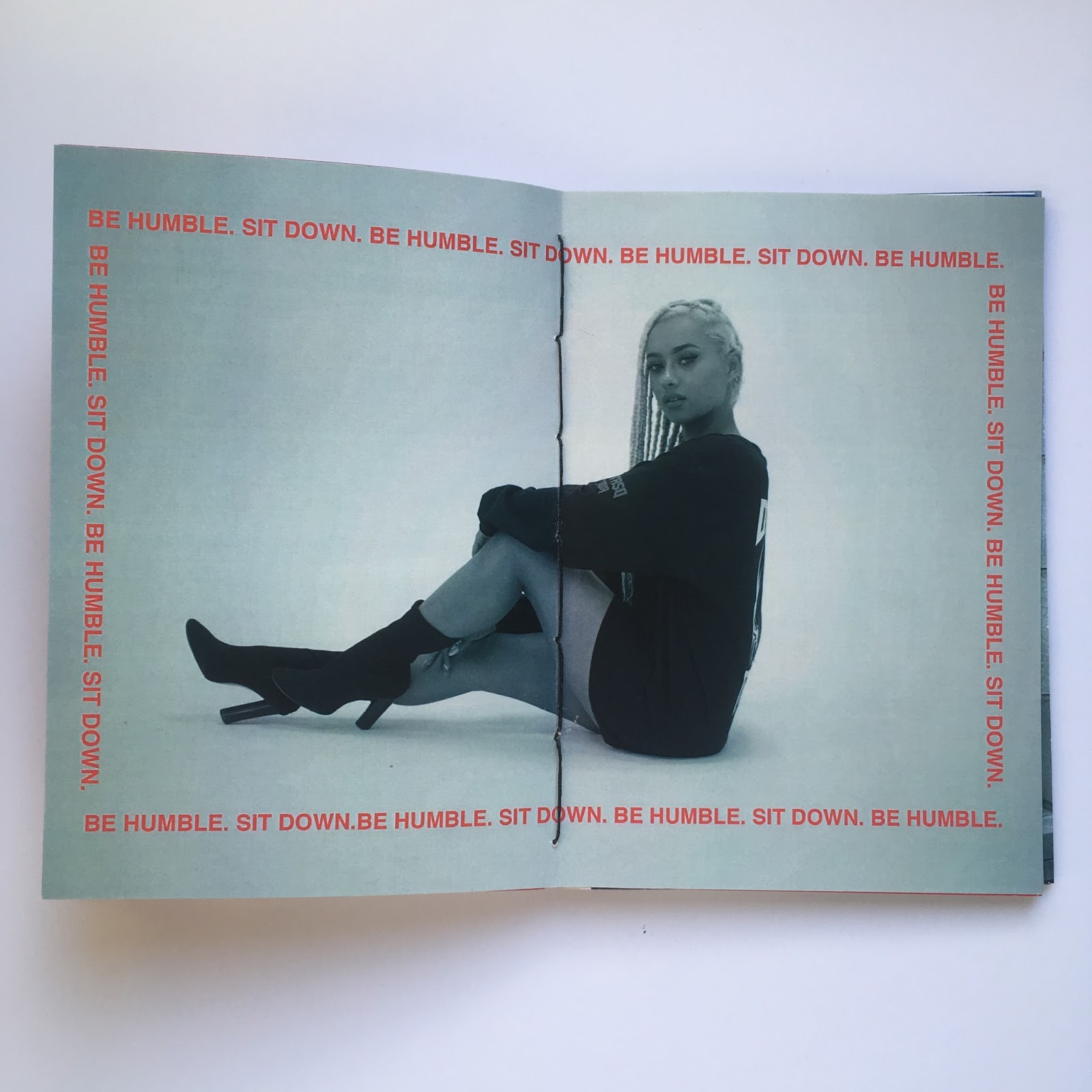
Exploring layouts with type and image. This creates the type to look broken up and more appealing as the audience will have a contextual understanding of the type. This layout was seen as successful and works with the bind as the pictures a fully visible and not cropped off. If a perfect bind was used an added creep would be considered, however the pictures may not be visible.
This composition could be developed further by ensuring the photos is spread over a page accurately. This mistake can be altered before print on indesign to ensure the image covers the whole page.
For the context of the story this theme relates to the concept of the unknown. however compared to the other compositions this page does not look as visually exciting. The use of the black background helps break up the publication, however staying within the theme of red type and a white background would create more of a category for the publication. During the critique, to develop this further, the colour theme of black, red and white could be varied through out by alternating which colour is the background. The theme could relate to the front cover, by creating more of a creative approach of a red and black block background, Influenced by Jade Laurence Graphics. This will create a new, unique approach and make the type more visually exciting.
Azeema Section
The layout of this section was influenced through the Vogue layout and Missguided layout from the International Woman's day. The designs are more creative and play with grid systems and scale and size layouts.
For the Azeema section, the typeface is Helvetica outline to create a more contemporary modern approach. This work celebrates the aspect of rebellion as well as celebrating woman of colour. The layouts are diverse and innovative to relate to the idea of identity and individuality.
Introduced a soft pink background to highlight youth as well as harmony and freedom. This section also includes the aspect of something exotic and cultural to celebrate cultural heritage.
Exploring Space to break up the layout. During the critique this layout was seen as unsuccessful compared to the others. The use of adding colour and backgrounds relates to the idea of culture and identity which works successfully.
For this section, I wanted to break up the publication by creating something more spacious to emphasise this barrier and bridge of the two cultures of the East meets West. As the photographs are sensitive, and landscape focused, I wanted to show the diversity in landscape and appreciate the cultural environment which surrounds us and creates cultured identity influenced through our cultural surroundings. It also explores the idea of economy, of places being more deprived than others, it shows the hidden message of there perhaps being ore opportunities available in the West.
This layout is successful as it breaks up the centred layout and creates the publication to continue being exciting rather than repetitive. It also plays with scale and size by the images appearing larger so the uneven layout works effectively with space.
Exploring a role model
Focusing on Fashion
The Jade Laurice section was influenced through the Odeur work, by creating work which appears as a fashion look book. The address red background relates to the overall message of power and strength which is the overall message of the publication.
During the critique this section was seen as the most successful through layout. The composition above shows the image being expanded over a double page spread, as well as incorporating type influenced through fragile tape. The black bind works effectively with the type with focusing on the theme of colour (black, red, and white).
The use of the red background helps break up the publication. This idea was influenced through the Missguided Graphic design example.
These examples were seen as most successful, as the concept creates the idea of a scroll, which relates to the idea of fashion apps, in the contemporary world.
The use of Jace Laurice's work being displayed as a background could be developed further. This concept could be adapted by perhaps myself developing illustrate background to create more of an innovative concept towards the publication. It also relates to the concept of individuality, freedom, and identity.
Harem Girls
This section explores the serious topic of sexualism. The title Harem Girls comes from the meaning of something bad in the Islamic faith. This relates to context.
During the critique these examples were seen as successful but could be developed further perhaps through primary research of portrait photography. The use of fragile tape could be adapted into a layout of a border. This could be a concept within itself. The theme of black red and white could be adapted buy applying a black background underneath the the fragile tape. This could be done through Photoshop.
Printing Format
The printing format for this section was not successful as the images appeared dark. The images itself were strong however the format made the images appear blurry and dark. If I had more time I would reprint these images perhaps on a lighter background to make sure the images stood out better.
The use of Arabic illustration could be created on a larger scale through a fill and expanded on a white background. This could be an interesting approach and would relate to the idea of innovation and identity. The use of Arabic works well at
Credit Page
For the credit page, the designs could be refined further incorporating bold type to vary to typeface. It will also create the type to appear more readable.
The back cover incorporates the same design as the front cover. This insures a continuous design flow. This layout is successful as the font is readable of a san serif with a wide line gap to ensure the type is easily read.
Overall the publication was successful, to develop the publication further, incorporate more primary images of portraits and more experiences as this will ensure the publication to stand out. Include a continuous theme of red, black and white as this could be interesting to play with. Develop a hard back cover so the publication sits better and will appear more professional. Perhaps the front cover could be made out traditional Eastern fabric. This relates to the Arabic name of the publication as well as relating to the decorative typeface of Bodoni. It will communicate the focus on the Middle- East culture.