As apart of the research, I have read the book to understand the underline message, the moral.
Genre: Romance, adventure
Explores a political division.
Noughts and Crosses is a series by English author Malonie Blackman of young adult novels. The series describes an alternative history in which humans evolved in which African people had gained technological and organisational advantage over the European, rather than the other way round, with African's having made Europeans their slaves.
At the time of the series, slavery had been abolished for some time, but segregation, continues to operate to keep crosses (blacks) in control of the noughts (whites).
Inspiration for Noughts and Crosses
lifetime experiences, some was racism, real life events. History is down to luck, the book elaborates this concept.
Racism- Theme
Racism is developed through ignorance and fear. Explored through different cultures, races, religions. tories promote empathy, a sense of being able to see through the eyes of others and being able to walk in another person's shoes. The book is a story of reflection, a metaphor of a mirror, the reader relating to the issues explored.
The Civil Right Movement, is a term that is a social- movement which accomplished its goal of ending legalised racial segregation and discrimination laws in the United States.
Summary
Persephone (Sephy) Hadley is a cross, with dark skin, who is the daughter of Kamal, a wealthy senior politicians. Callum McGregor is a nought, with light skin. They use to play together when Jasmine, Sephy's mother, employed Meggie, Callum's mother, as a nanny. Jasmine fires Maggie for not being an Alibi for Kamal.
Sephy and Callum's relationship is frowned upon by society, like interracial friendships in the Southern United States before the Civil Rights movement.
Callum is one of the first few noughts to star at Heathcroft, a high school for crosses that now accepts the best performing noughts. Sephy's classmates do not accept her association with a nought. The two developed an intimate relationship, they both do not care what others think.
Meanwhile, Callum's elder brother, Jude, and his father, Ryan, join the Liberation Militia (LM), a violent terroist organisation against cross supremacy. Jasmine becomes an alcoholic.
Callum's troubled elder sister, Lynette, commits suicide by throwing herself infront of a bus. Only Callum is aware it is suicide, as Lynette left him a secret note that describes her depression after an attack from her and her ex boyfriend.
Jude and Ryan are accused of bombing in Dundale shopping centre, which was committed by LM. Callum is also accused as he tells Sephy to get out of the shopping centre, but there is a lack of evidence. Ryan escaping hanging, Ryan gets a life sentence but is killed by an electric fence, supposedly in an escape attempt.
Callum decides to join the LM, Sephy has not heard from Callum in a while, she suggests to run away together. Sephy left a note for Callum, by the time she read it he was gone.
Years later, Sephy returns home from boarding school, she discovers a letter from Callum to meet. Sephy decides to meet and Callum is there with others from the LM to kidnap her and hold her hostage. The members from the LM deliver a message to Sephy's father, Kamal, to release at least five Lm from prison and pay money if he wants to see Sephy alive.
During the time alone, Callum visits a hurt Sephy in the room where she is being held. Callum reveals he ran after her before she left for boarding school. They rekindle there relationship. Sephy escapes into the woods and Callum helps her.
Later on it is discovered that Sephy is pregnant with Callum's baby. There is speculation about pregnant rumours, however Kamal denies this. He later on pressures Sephy to get an abortion, Sephy repeatedly refuses.
Sephy confirms rumours, hours later Callum is arrested and accused for rape. Kamal tells Sephy that if she keeps her child, Callum will be hanged, but if she has the abortion, he will serve years in prison instead. Kamal makes a similar offer to Callum but also wants Callum to say publicity that he raped her. Both decide to keep the baby. Callum is executed. The story ends with a newspaper cutting announcing the birth of their child, Callie Rose.
Contextual Research
The story line is a reminiscent of Shakespear, Romeo and Juliet.


Romeo and Juliet cover, designed by Manuja Waldia
The meaning
The twin coffins symbolise the tragic act of double suicide by the lovers in the plot. The coffins have a poison icon and a dagger icon on them which stand Romeo and Juliet respectively, as those items were the instruments of their death. Arrows pierce the coffins to show how young love was met with violent resistance from their feuding families. Additionally, the flower icon on Juliet's coffin references, 'A Rose is a rose is a rose' and the heart icon stands for Romeo. Hot pink is used to represent romance.
Existing book cover designs for Noughts and Crosses

In the examples, all designs have used a black and white, monochrome effect in a divided composition. This relates to context of racism. The first design shows a hierarchy of the black section being placed above. The type is a san serif which relates to the serious context of the book. The use of the orange shows the message of being left out, out of place, as the noughts are seen as a lowerarchy. The type of the author is a larger font compared to the title, this perhaps indicates the message of breaking the rules, breaking expectations.
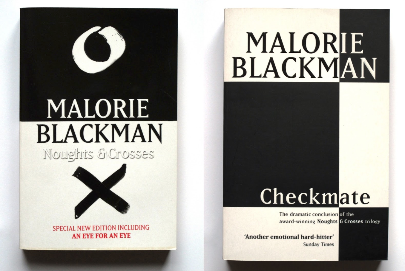
In the noughts and crosses design, the composition is influenced through the division symbol. This relates to the concept of school but also works as a metaphor of societies diffusion through race. The design includes a contrast to emphasis the concept of difference and race. These designs are very similar, which perhaps may come cliche. In the design process, perhaps incorporate colour as this make the design stand out. The type has included a red font, this conveys the passion and love aspect as well as danger. The problem with these designs perhaps don't fit the target market of teenagers. The book design looks to mature and serious. When designing, perhaps the concept of love will make the book stand out as this aspect is not addressed.

In this design, they have played with the idea of games as noughts and crosses is known as a game. The concept is taken as darts, and the crosses winning over the noughts. They have also played with shapes as noughts is a circle shape which relates to the dart board layout. The use of division is created through the cross shape. This design is conceptually successful compared to the previous designs, as it is different and breaks the boundaries compared to the cliche designs.
Previous Penguin book design winner

This book cover design is most innovative. The designer has used a strong colourful texture to convey the aspect of adrenaline and feeling. The designer has used the colour of pink and blue to establish a stereotypical perception of gender. For instance the cross is pink to establish the character Sephy, as well as the nought being a blue shade to convey the character Callum. The layout is similar to the division concept, however the design is developed further through colour and type. The typeface is appropriate for the target market of teenagers. As well as a good contrast between the black and red. This suggests the tragedy towards the book ad what will happen towards the main characters. Therefore, this design is more successful compared to the examples above.
Contextual Research of books for the target market of teenagers


This book design explores the theme of justice, and fighting for rights. This is similar to the theme in Noughts and crosses. The black background explores the darkness of the issue, however the colourful type fits for the target market of creating the book to be approachable and suitable for a younger audience. The illustrations create more of a friendly aesthetic which works effectively. The grid system is a centred composition to highlight the drama, the design is not to busy however the illustrations are repeated in a simplified approach.


The fault in our stars, is a known book and a bestseller. Due to this the design is fluent in a sense of a brand which relates to the concept in the movie. The colour is a metallic blue to relate to the sensitivity of the book. The metallic. approach creates a colourful vibrant aesthetic which makes it visually appealing. The typeface is illustrated to create an informal approach which relates to the context of fiction. The design is minimalistic, which perhaps ensures the book to stand out compared to other designs. The design is simple yet effective. The design includes a metaphorical meaning which relates to the book, as this concept is explored. The use of the shape of a cloud relates to the context of the title, to highlight the negativity, sadness of the book. The colour and type explores the characters relationship, and how the audience feels about the character, the idea of the audience creating a unique bond with the story.


With This composition, the designer has used the structure to position the drama. The use of the birds head being at the front and the tail of the bird being placed at the back. This composition is unique and different, and is beyond the audiences expectations. The use of the title being incorporated with the illustration creates an innovation towards the book. The context of the book is a different genre and perhaps fits to a more masculine audience. The use of the royal red creates a medieval approach which reveals it's context. The design for Noughts and Crosses may not be practical as the book genre is more romance and tragedy.


With this book cover design, it is a lot more busy and complex. The design includes decorative elements which indicates the idea of a celebration. It conveys the idea of feeling and emotions. Even though the idea is busy and complex, for the target market of teenagers, the book conveys a more appealing aspect which may draw the reader. Compared to the other designs, this perhaps is least successful for the client of Penguin books. As the client prefers a more clean idea. This book is not as successful due to there being to many ideas explored.


This example is a book from Penguins book designs, and from the same author as Noughts and Crosses. The design idea is simple and focused on one idea, however applied in a pattern decorative format using multiple media. The aesthetic is colourful and has focused on textured background. Perhaps this could be an idea of exploring colourful backgrounds which relates to the context of the book. This will make the book stand out compared to other designs.

The designing has played with the concept of line. Relating to context of striped Pyjamas. The element of a fence being applied over the top address the meaning of the story as the main character would go and talk to a boy on the other side of an electrical fence. The pastel colours creates more of a sensitive approach. The composition creates the idea of someone being trapped. The use of the electrical fence describes the element of horror to convey a tragedy. This book is successful as it creates a sense of sensitivity as well as addressing more of a simple but clever idea which is successful compared to the other examples. This could help within the design process to create something more sensitive to relate to the tragedy in Noughts and Crosses.


The yellow background creates the book to stand out. The use of media of brushstroke ink creates a softness and harmonious approach which relates to the characteristics of the sun. The typeface is elegant and calligraphic to create a decorative, appealing approach. The design has incorporated the type within the composition. This idea could be adapted when designing of considering how the type could fit into the visual aspects.
Summerise
The designs which are successful tend to have a colour which stands out as well as an illustrative approach to create the book to be friendly and appealing to a younger audience. The concepts are conveyed in an informal fashion. For designing, consider exploring calligraphic type, and illustrative concepts, as well as exploring backgrounds and textures which relate to the book.
Thumbnail Sketches

These thumbnail examples shows 4 ideas explored. The first idea will visualise as a portrait of a character: Sephy or Callum. The second example explores a scene of a shed in the forest, this is a place where they capture Sephy. The third example shows the scenery of a beach and two figures sitting there; the figures are Sephy and Callum. The fourth thumbnail shows a figure running through the woods. This shows the scene where Sephy escapes when she is kidnapped.
The portrait idea expanded further. This idea explores cultural identity. The idea explores reversing societies perception of race and identity. The feedback given was the idea is too controversial, and may not appeal to a younger target market.

Taking the feedback on board, to develop the idea of portrait illustration, the idea shows a symbol tattooed on the character's face. This shows a permanent perception of someone being labelled and categorised. The feedback given was the design is more appropriate for the target market.

The first thumbnail explores a the beach idea experimented on Illustrator. The composition shows a gradient background influenced through the sun setting. The symbols of noughts and crosses will be placed as a pattern in the visuals of stars to reflect Sephy and Callum's love story. The palm trees will be drawn using a drawing pad. This technique has not been explored, so I researched into tutorials based on drawings pads on Illustrator.
The second idea shows the idea using a gradient fill, however the character being drawn over the top. For the back the design continues by bringing more elements such as palm trees. The barcode is included in the design by incorporating the composition of the Noughts and Crosses game. The feedback given was these ideas were more successful, however the second one may be to complex as there is too many elements involved.

In the first thumbnail shows Sephy and Callum looking at each other, this will be through a side perspective. This will also address the theme of the division. The second thumbnail explores the idea of letter writing, this will show the letters they have sent to each other. It will be explored through the theme of documentation. The third thumbnail is simply typographic, type will be explored perhaps in a calligraphic way. The final thumbnails are to generic and not as successful compared to the other thumbnails. The feedback given was the designs were to obvious and already interpreted in existing designs.
Quick thumbnail to show how the calligraphic style may be explored

The feedback given from this thumbnail was perhaps develop the type on Illustrator to create a more precise outcome. This style could be explored through experimentations of different brushes. The design could also be explored through a textured background. This might create the composition to be more visually exciting.
Initial Ideas

The first initial design used acrylic black paint to create a new different effect. The idea is in a monochrome layout. To develop this design further perhaps incorporate different colours to stand out from the previous book cover designs. The game shows the crosses winner as they are seen higher than the noughts. The outline typeface was influenced through 80s type as the context of the book was set in the 1980s. During the critique, the Illustrations at the back were seen as just placed. Perhaps the concept from the front cover could be adapted into a grid system to reflect this. The type for the quotes perhaps could be larger and more visible. This design is not as successful compared to the other designs, just because this concept has already been addressed visually.

This design is responding to the thumbnail feedback. The illustration was drawn on a drawing pad on illustrator. This illustration is my interpretation of how Sephy would appear. The colour magenta is explored to show the example of stereotypical gender of a woman. This relates to meaning of division and people perceiving and expecting diffusion in society. The use of tone highlights the importance within text. The text 'Not suitable for younger audience' is in a darker tone to suggest the importance of the sentence. The layout is taken from the penguin books, with a minimal title size. The purpose of this is to connect to a mature teenage audience. The feedback given is to perhaps include a background as the book cover looks to minimalistic. Another idea was to include an interpretation of Callum however in a Cyan shade, to address this idea of division. This will also relate to a larger target market one for girls and another for boys. It will also create a sense of joy of the audience picking which. book cover they want.
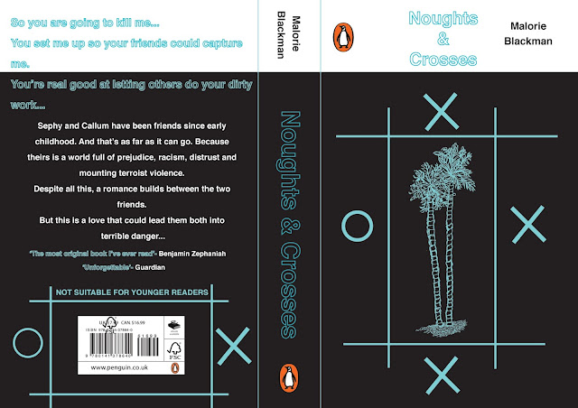
This design uses a black background influenced by the contextual research. The idea stems from the grid system of the noughts and crosses game but exploring scale and size. The use of the two palm trees act as a symbol conveying the two characters Sephy and Callum, as well as them visiting the beach to escape and express their love. The palm trees were illustrated using a drawing pad on Illustrator. The grid system and the noughts and crosses were explored using the shape tool, this creates a more contemporary approach towards the design. The use of the palm trees fits in with the 80s theme. The use of the barcode being developed further through the design fits in with the design concept. However during the critical, ensure all shapes are the same size as some are uneven. The type is centred in relation to the grid. However this perhaps is to generic, and could be developed further to convey the concept of breaking the rules.

With this design was exploring using the drawing pad of an Illustration of a scenery of a beach which uses the whole books composition. During the critique this design was the least successful. The use of the white outline made it hard to interpret. The design lacked concept and meaning, perhaps exploring constraints of the beach scenery would create something more meaningful. The design at the back was hard to interpret as the text was played over the top, perhaps the type could be adapted though the composition lay out. The type on the spine is too low, make sure this is even.
Taking the critique on board, I developed the design by using the constraints of palm trees. It also acts as a symbol of the couple Callum and Sephy. The palm trees are laid out in a grid system influenced through the grid system in the Noughts and Crosses game. The background has included small Noughts and Crosses to reflect the idea of stars, as well as the background being a gradient fill in response to the sun setting. Feedback was given, the response was the pattern overcomplicated the design and the design of the palm trees was stronger, aim this to be the focus. Perhaps include the idea of division through colour. The type on the spine needs to be central. The title could use a smaller gap between the '&' symbol and the 'Crosses'.

Responding to the critique, the design was developed by incorporating monochrome approach of white and black, this reflects the concept of racism. This idea highlights the White colour race being isolated, the roles being in reverse.

The portrait design was developed further by applying a gradient background of the sunset and the portrait being applied over the top. However this perhaps did not communicate as effectively, as it was hard to interpret why this gradient fill was used. The design of the portrait was to low down and allowed a lot of space. The illustrations of Callum will be developed further and need refinement. The lay out of type works effectively however the added illustration is to big and perhaps could be smaller to allow more space for the back cover. This design was unsuccessful compared to the palm tree idea, as that idea was seen more unique and different.

Taking the feedback on board, I have adapted the concept of palm trees so there is relation towards the background. The added pattern fills the space which works more effectively. The type on the black is easy to read. The back cover has worked more successfully. The design is complicated however all the elements fit together, and compliment each other successfully. During the final critique the type for the quotes were seen as unreadable, however in my opinion, for the print format the type will print effectively, therefore the type works effectively.
Final Outcome

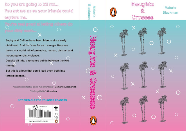
For the final design, taking the criticism on board, I decided to create something minimalistic but focusing on one main concept of the constraints of palm trees. The idea shows two palm trees reflecting as a symbol of the two characters Sephy and Callum. The layout is a simple grid system which is taken from the Noughts and Crosses game layout. The use of monochrome of white and black is applied to show the idea of racism, and isolation. During the critique, perhaps incorporate the illustration of the palm tree on the back cover to create a connection as this concept worked effectively in the previous designs. Perhaps the blurb could be a centred composition to relate to the centred composition of the white palm tree on the front cover.
Taken this feedback on board, as a designer I wanted to create something simple and effective. Therefore I decided not to edit it further as the design already communicated isolation, division, racism, and symbolism of love. The final design is colourful which aims at a teenage audience. The use of 80s type creates a joyful, retro aesthetic which perhaps will aim at a more older teenage audience.


No comments:
Post a Comment