For Brief
one, the requirements was to produce a piece of wayfinding which is clear, functional, and
useful. When producing the wayfinding, I will have to consider scale and where
it will be placed. The brief includes a cultural reference; referring to Leeds.
To start
this project, I began researching different events and places within Leeds. I began
researching into the Leeds Night Light event, as I found this most interesting.
Leeds Night Light is an event which takes place in Leeds City centre. The
artist which have worked with this event used inspiration from the earth, air,
fire and water which included light projection.
In the
previous tasks, we explored a subjective quality through abstract. The art work
from Leeds Night Light reminds me of conceptual art which we previously
studied. The abstract approach explored shape meanings and adapting this to a
subjective nature, I could adapt this to this project. I then came up with the
idea of exploring natural environments around Leeds juxtaposing natural with
the unnatural. This relates to the idea of contrast between objective and
subjective. The concept of projection light and animation establishes movement
and direction which relates to the concept of way finding.
At this point in the project, I wanted to research into natural landscapes and create a way finding system influenced by the Leeds Night Light event.
During the critique, the feedback was to research things to set the scene in the daytime. This then led me to researching into Canals. The association with canals leading to one place to another.
I will research into Canals and which places surround the Canal.
Canals around Leeds: Leeds and Liverpool Canal, Meanwood Beck flows through River Aire, Cock Beck, Wyke Beck, Bagley Beck, Wortley Becks.


Contextual Research:
Leeds Night Light event, researching into artists work.
Antonin Fourneau
created waterlight graffiti which is an installation; a wall of LED lights that light up when wet. I wanted to include this technique showing light been used with the element of water.
The Phoenix in the Stone


I have included this into the research to show the projection onto a Natural element in everyday life. This is relevant as it creates something visual and innovative. I also noticed the shapes created of triangles and how people were reacting with this with something peaceful and relaxing. The use of the shapes being positioned in an eye view perspective indicated a relaxing thing. The use of green indicates something natural and pure which perhaps leads into a relaxing purpose.

Projection across iconic buildings in Leeds. Projection symbolises different parts of Yorkshire coming together.
Leeds Night is one of the cities most popular and exciting cultural events. Light Night makes art and culture engaging. Light was used to address art, innovation, creativity through it being shined so brightly.
I then researched into Artists exploring Natural Environments and incorporating light.
Photographer Phill Davison explored tunnels underneath Leeds through Roundhay Park.


The concept of shapes of circles relates to circle theory of people associating the shape with sensitivity and emotion. The idea of tunnels being very trapped and secluded. The photography has adapted Light in an abstract way by creating shapes from natural elements. Through out my research process I could adapt this idea by finding shapes and elements within environment. The use of blue addresses isolation and loneliness. This connects to the idea of water and the Canal being singular. What if I were to adapt shapes and colour through projections on the canals, would this change the dynamic of the canal itself?
I then researched into Conceptual Artists.
Yayoi Kusama Mirror
In the room, the walls and ceiling are mirrored, in addition to the floor
featuring a shallow pool. This perhaps relates to idea of reflection
of the water holding the same quality as a mirror does. I could adapt this
concept by projecting onto water and what outcome would be produced.

From the ceiling hang small LED lights that flash in different colours.
The idea of the reflection creates an endless quality. The idea of the light
being appeared in an endless place; this idea is only broken up through
darkness. I could use this quality of contrast through black and white when
creating my projection.
I also noticed the quality and use of reflection. How reflection has created an endless pattern.


I then collected Photography of Lighting around Leeds for inspiration for my Way finding System


I could create this into a grid system when designing.
Dan Flavin
Dan Flavin uses the medium of fluorescent light
tubes to explore possibilities within environment space. Flavin began introducing
electric lights into his work in early 1960s with the Icons series. Flavin
focuses on light works producing installations and sculptural pieces made with
fluorescent light fixtures and tubes that came in colour and size variations.
The purpose of light was the transformation created within space. The idea of a
progression in scale within architectural environments.
The ideas behind Flavins light work is the response
created to specific architectural setting. The outcome created by
two-dimensional illusions created in their environment.
Dan Flavins explains how aspects that appear but we
only partially conscious of them. This is established as the freedom of art,
open to interpretation. Flavins then explains that light is fact; it is plain
and direct. Art is thought: space in a room can be broken up and played with
applying illusions of real light. Creating a new room composition. Shapes
created through one element of a diagonal line placed on a wall suggests the
shape of a triangle.


Anthony McCall
Line Describing a Cone
is created by a beam of light emitted from a projector placed in a dark
room. Passing through the projector is an animated film of think arcing line
which gradually joins to form a circle. Mist from smoke machines gives the
light a greater density to appear my realistic.
McCall encourages interactions with the audience by moving
around and in front of the projection, which results to the line being sliced
up. The purpose of this is to challenge the motionless viewing experience of a
conventional cinema. It also introduces the idea of space and how much time is
spent during this interaction.
In 1971 McCall was living in London and began producing
experimental films. Line Describing the Cone was produced in August 1973, after
moving to New York. The work was exhibited widely in New York in venues such as
Artist Space and Millennium Film Workshop. McCall work was classed as
minimalism and impacted contemporary New York artists.
This will help me develop my practise by gaining information
on how to develop film projections. I could perhaps incorporate individual’s
movement by the wayfinding image changing to form another image. The idea of
there being more possibilities rather than just one for example from A to B.

https://www.youtube.com/watch?v=qsGWjpfxa8c
(A Youtube Video I found of how the interaction technique works)

You and I by Anthony McCall
Finnboji Petursson
Second/second is Petursson’s first solo US exhibition,
which features installations including sound, light and water.
Infra-Supra (2014) includes a shallow pool of water
on the ground with three small speakers placed above the water surface. The
speaker deliver the equivalent of 3 hertz of sound onto the water. This recurring
sounds creates concentrates circles within the water. Lighting is placed
underneath to project the pattern on the water which is then reflected again in
the water.
This will help me develop my practise, through the
form of reflection to form an abstract approach. My animation could be produced
by repeating certain shapes through this reflection process. I could also incorporate
water by adapting the concept of ripples and circles. This then relates to the
circle theory of producing something secluded, motion, secure.


Adidas Sign System
The designers incorporated the context of the brand when creating the Way finding system. The building itself forms a loop; the way finding system structures together like the laces on sport shoes. The designers created the way finding system to determine space within the building; the walk ways connect individual departments. The problem with the environment was the disruptive effect of people walking through offices. The signage system supports this concept providing direction. The way finding system functions with a rhythmic and dynamic, sporty effect. The design varies pattern within the 'lace' theme. To identify destinations an alphabetic code is applied. The letters create an interesting, intricate, way finding aid. The way finding system is abstract at first glance (perhaps subjective) but clearly identify different spaces. The media used is glass to signify clarity. The theme of line is introduced through the theme of lace.

These design sheets show something clear and accessible. It shows a rhythmic flow establishing A to B. Way finding design with the purpose of reducing interruption and to create a better work environment. Relates to context of Sport shown through the element of speed. The arrows to signify direction movement, a simplified and modified arrow shape.

Capitals to suggest the strength through the context of sport.

Using Glass to reveal clarity but to also adapt an abstract approach.
London College of Communication Way finding system.
Domenic Lippa have developed London College of
Communication wayfinding system. The previous wayfinding system was photocopies
of A4 paper hung above doors.

The challenge was to establish the solution of a
wayfinding system that would work in all buildings. Unlike other wayfinding
systems where they have taken inspiration from the buildings, the architecture
of LCC was lacking. In the end the wayfinding system was created out
powder-coated aluminium, which was easily accessible through a detail fixing.
Colour coding was introduced to signify the system,
where the designer also used a Helvetica typeface to create a modern approach.
The consistent typeface shows clarity as well as a pattern within the LCC
building.


I then visited the River Aire in Leeds and explored places around the River. When recording information about the River, the river was not what I expected it to be. It felt like an unnatural environment through litter being placed around the River.

The useful information in this image is the reflection and the use of water movement. It relates to way finding as it has a sense of direction.
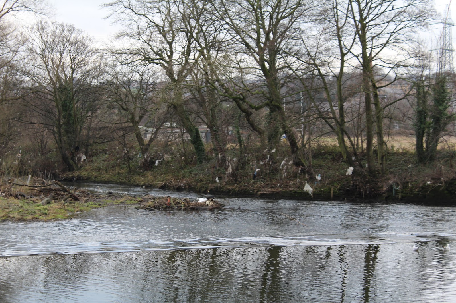
The problems with this environment space is the amount of litter being placed. I could adapt the idea of pollution and creating pictograms to stop litter being placed.
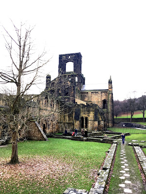
However at this point, I felt I needed to look around the River at near by places. I came across the Kirkstall park and Kirkstall Abbey.
Photographs I took of Kirkstall Abbey


The concept of the footpath addresses the way finding purpose. I could adapt this concept by creating an animation leading to the entrance in a style of a footpath.


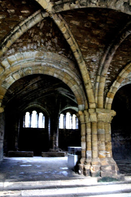
This image reminded me of the research of hidden tunnels. I could incorporate lighting within this section.

The animated footpath could indicate where to walk, as the chapel room was very enclosed and daunting due to the room being dark.


Rational:
The main problem with Kirkstall Abbey, which I identified
was: the main entrance wasn’t clear, the hazard precautions was told verbally
and written on a wipe board, the identification of each section will be
addressed easier for the audience as this was displayed on a map.
Design a wayfinding system for Kirkstall abbey for each section identification. Within, Kirkstall Abbey I will create a way finding system to identify each section.
Subsequently, I will research into wayfinding system in historical buildings,
perhaps wayfinding system in a museum, as a museum are more developed. I will have to consider the restrictions and how what materials I will use to make the way finding system.
The subjective quality in Graphic design was through the idea of an animation appearing abstract, however I have decided to change my idea to something more objective. The objective is the interpretation which will be a factual interpretation;
the signage will have to be clear and easily identified. I will also research into opinions about subjective and objective in Graphic design and how this relates to my way finding system.
Cultural reference will be researching into the history of Kirkstall abbey and applying that into signage of what use to exist, as
when visiting this was unclear. Kirkstall abbey provided a map, however people
may not be able to interoperate maps. I will create pictograms identifying each
place communicate in clear manner.
The usage is to reduce health and safety measures and create
more awareness of the history of Kirkstall abbey in a visual way. The
images will have to be clear perhaps in a minimalistic approach. I could
research artist which have used a less complicated approach towards projection.
I will produce pictograms however some could incorporate type. The type will
have to address the historical contextual meaning as well as including clarity. The type will relate to the
personality of the building. I will consider colour by creating a palette through PMS. I will consider CMYK for the printed
outcomes and contrast this to RGB.
One of the main target audience are families. The wayfinding
system will interactive towards kids creating more interest and allowing them
to expand their educational purpose. It will have the intention of creating
the information to be more understanding. Also students and young adults which are interested in the subject History and exploring new places would be able to interact with the way finding system. Therefore, the
target audience includes a wide range of age groups, so the wayfinding system will
have to be adaptable and versatile to fit this diversity.
To summarise the design proposal is to create a wayfinding
for Kirkstall abbey which will include the qualities of informing the audience
of the identification which is used to educate. I will also include health and safety
measures of hazards which will be produced to be more visually exciting.
In Eye magazine, the article 'A Dutch battle which still rattles' discusses the subjective and objective nature of Graphic design work. Rick Poynor notes about famous clashes between Graphic designers between Wim Crowel and Jan van Toorn. Crouwel and Toorn debate between subjective and objective nature. In 1940 the debate between Max Bill and Jan Tschichold about New Typography and traditional Typography. Perhaps traditional type included a more subjective nature contrasted to the modern day of new type appearing more clear and objective.
Design in modern day is usually refined and restricted to appear as better and good Graphic design. This is shown through project such as the London 2012 Olympic Games logo and branding.
This debate and contrast between objectivity and subjectivity allows criticism; it has open the barrier for criticism in Graphic design.
Crouwell discusses objectivity through the designer purpose of never standing between the message and its recipient. However Toorn argues this by discussing how the designer should not act as a neutral link. Toorn then leads this by describing how designers are the subjective link which designers deny this quality and view their own work as neutral.
To summarise, Rick Poyner discusses pluralism: a willingness to accept that their are plenty of ways to design in the industry. This explains why there is conflict within Graphic Design and this barrier between the two of subjectivity and Objectivity.
Researching into Designers which have discussed Objectivity and Subjectivity
In Eye magazine, the article 'A Dutch battle which still rattles' discusses the subjective and objective nature of Graphic design work. Rick Poynor notes about famous clashes between Graphic designers between Wim Crowel and Jan van Toorn. Crouwel and Toorn debate between subjective and objective nature. In 1940 the debate between Max Bill and Jan Tschichold about New Typography and traditional Typography. Perhaps traditional type included a more subjective nature contrasted to the modern day of new type appearing more clear and objective.
Design in modern day is usually refined and restricted to appear as better and good Graphic design. This is shown through project such as the London 2012 Olympic Games logo and branding.
This debate and contrast between objectivity and subjectivity allows criticism; it has open the barrier for criticism in Graphic design.
Crouwell discusses objectivity through the designer purpose of never standing between the message and its recipient. However Toorn argues this by discussing how the designer should not act as a neutral link. Toorn then leads this by describing how designers are the subjective link which designers deny this quality and view their own work as neutral.
To summarise, Rick Poyner discusses pluralism: a willingness to accept that their are plenty of ways to design in the industry. This explains why there is conflict within Graphic Design and this barrier between the two of subjectivity and Objectivity.
History of Kirkstall Abbey
Kirkstall Abbey is a ruined
Cistercian Monastery in Kirkstall allocated in North-West of Leeds City centre
in West Yorkshire. It is placed in a public park on the north bank of the River
Aire, Kirkstall Abbey was founded in c1152. Kirkstall Abbey was disestablished
during the Dissolution of the Monasteries under Henry VIII. The Dissolution of
the Monasteries was a legal process between 1536 and 154, where Henry VIII parted
Catholic Monasteries in the United Kingdom.

A painting by Johann Baptiste Bouttrats. This painting reflects the lifestyle and culture within the opening of Kirkstall Abbey

Creative a subjective nature through shapes influenced by the buildings of Kirkstall Abbey.

I sketch the shape then developed it further on Illustrato,r where I thickened the lines ad repeated element. My vision was to create an animation through these subjective shapes to form a sense of direction. However the use of projection was not ideal for the suited environment.

Developed pictogram influenced by elements from Kirkstall Abbey to signify an entrance.
My original idea which I have included in my rational was to create an animation directing people to certain areas. However during the feedback this idea was not as successful as it looses the concept of mystery of the ruined building and perhaps doesn't function.
A map showing where each place is located was given. I will create pictograms for each section of the building to create identification, as this was not clear when visiting the building. I then researched in existing pictogram designers.
Oti Aicher

Designer Otl Aicher designed for 1972 Olympics Games in Munich. Otl Aicher created a pictogram system which visually communicates clarity. The system creates an easier orientation. The Pictograms create an international understanding, which is suited for our modern, global thinking world.
More designs by Otl Aicher. Exploring negative and positive space.


Pictogram for the Kitchen

This pictogram functions to address the church

This signifies the Chapel room

This pictogram addresses the infirmary.


I created these pictograms for the refectory. However I feel these were not as functional so I developed this further by looking at traditional imagery of a refectory.

This image mimics the idea of a community. the concept of a community sitting down and eating. It also includes a simplicity towards a complex imagery through the shape being evenly spaced out through the Otl Aicher Grid.
Exploring typefaces influenced by church signs

Research of Church signs around Leeds.

San Serif typefaces explored: Monaco, PT Mono, PT Sans Narrow, Apple symbols.
I've decided to use PT Sans Narrow with a wider kerning. This typeface relates more to church typefaces which I researched. It carries out the characteristics of being narrow and including a wide kerning.
To develop this typeface into my project, I could print of the typeface onto acetate and rearrange it in the same layout of Church signs.
75B
75B is a creative firm based in the Netherlands. The company explore cultural content to its audience through visual communication.
I found this work on my instagram. I included this as I like the exploration of multimedia onto a pictogram element. Perhaps i could adapt colour to create something subject with the quality of functionality.

Applying work onto context.

Wings for Conservation fights against elephant poaching.
I included this piece as the element were simplified as well as the content being within a shape. This relates back to theories of shapes which I could develop into my pictograms.
As Hazard signs have been reproduced and more recognised, the functionality is already there. However to develop this further and adapt a subjective nature I could include multimedia inspired by 75B.
Recreating Hazard Signs
First visual images produced on Illustrator
The first images were not successful as the communication is mistaken. The elements look to joyful and not fulfilling the serious aspect towards the context. During my feedback, there was the recommendation of reducing the thickness of the arms creating the elements to appear thinner.


To improve the 'no climbing' symbol, perhaps investigating into different angles and changing the perspective when drawing out this pictogram.

Pictograms for 'Children must be closely supervised at all times.'
From the feedback, these pictograms were a lot more successful. In my opinion, the second suggestion addresses supervision a lot more clearly. The concept of the child being a singular line and dot addresses a lack of independence through the pictogram feature having no arms and legs. It also includes a sense of innocence and naivety through the scale and size.


Exploring multimedia of applying colour influenced by lighting around Leeds to include the Leeds culture.

Then exploring with layers and multimedia. This piece is more individual however people could argue does it fit the purpose of safety through colour.
Overall, the use of black addresses the point more clearly, and it indicates the seriousness of the content.


Exploring Pantone with RGB colour way. I specifically chose red to address the element of fear and danger. The idea of using red more to be more eye catching.
The red is more bright to address a forceful approach.
Exploring Pantone colour ways through existing Photographs. Finding colours which contrasts the red.


I used Illustrator to retrieve the colour from Pantone.
The tone is subtle which its the peaceful, therapeutic atmosphere.
Exploring possible colour swatches on Illustrator


Applying Colour swatches onto the produced pictograms.
Julien Priez

This has a subjective quality, the use of the image includes negative and positive technique.
Final Outcomes:
I have developed the Hazard signs from the feedback given.

Pictogram for Changing conditions.

Pictogram for natural hazards; slipping hazard.

Concealed Hazards: tripping hazard.

Pictogram communicating no climbing.
To improve these pictograms, I could perhaps add a coloured background in yellow to signify a hazard. Exploring CMYK through printing.
After developing these pictograms, these are a lot more successful in communicating the issues raised. However these pictograms have already been produced. In my opinion the pictograms for the identification of each space are more innovative and are needed within Kirkstall Abbey, as Kirkstall abbey already have a hand including pictograms which I developed further.
To place the identified pictograms into context. I had a wide range of ideas. My first idea was to create a a hexagon pillar influenced by the church pillars to identify each section through arrows. This would be place in the Cloister.
However the feedback given was that this idea may ruin the purpose of exploring and mystery. So the second idea was to place objects with the pictograms placed on them. These objects would be placed in certain rooms for that context. However the problem with this is Kirkstall abbey had locked a few rooms off and also developed some rooms for children to play in.
My third idea was to place the pictograms in each room onto free standing signs. However the problem with this is due to environment the signs could fall over or could get in the way whiles people visit.
I then researched into signs placed onto grass, as the cloister was empty and would be a good location to place the way finding system as it is centred and in direct to each space.
I therefore researched into custom yard signs. With yard signs they fitted the criteria as they are made out of corrugated plastic therefore are waterproof. They are also installed over simple ground which is suitable for this requirement. I then had the idea of creating a hexagon shape out of yard signs influenced by church pillars. On each yard sign would show the pictogram for that certain identification.
Printing with CMYK ink onto waterproof paper: Banner Vinyl
If I were to develop this in industry this paper would be fitted on a set frame so the image stands up.

Applying the way finding system onto context

Drawing out contextual images

These designs are based on self standing signs which will be placed at each place. I have also researched into Acrylic stands which could be placed onto the picnic benches within the cloister area. I have also designed the yard sign design idea shaping into a hexagon to show a sense of direction. The problem with this is the yard signs may get dirty due to the environment it is placed.

Applying way finding pictograms onto Objects to convey a sense of a mystery.


Applying the Wayfinding system onto objects placed in different rooms for identification.


No comments:
Post a Comment