Task 01 understanding
In a group, we got set the task of recording how the public
interact with public space. To create this experience, we created a video based
on: creating a diversion, a new connection and making someone pause or stop.
Link to our group video:
https://vimeo.com/192971222
At the beginning of the project, we collected a variety of ideas.

The strongest idea was the balloon idea, found when researching artist
Abake. We then considered how we could create an abstract approach towards the
balloons and what other ideas adapting onto them. We then had the idea of
applying signs onto the balloons. However, after feedback from other groups, it
was noted that our ideas were overcomplicated.
Taking this feedback onboard we wanted to create a more minimalistic
approach towards our final outcome. So as a group we then considered the shape
of the balloons creating a connection to shapes from signage Frutiger evaluation. The concept of circles
reflecting people’s senses rather than the mind.
We then had to consider space and how we can adapt balloons
(circles) into a different environment. In modern day, the concept of people
having more of a relationship with vertical and horizontal lines rather than
circles. The idea of daily encounters with a level ground, and how people would
react if we changed this in a public place.

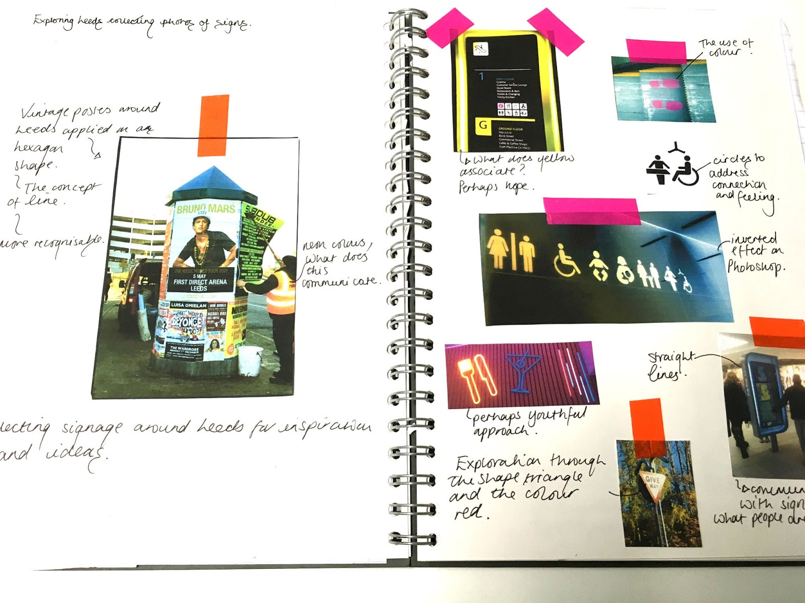
We then explored Leeds by
recording signage. We then decided to visit a shopping center; the space being
vertical and horizontal. We then purchased some balloons and started blowing
them up. Even through this preparing stage, people were reacting to this by
looking and creating different connections by reacting to the balloons. Our
initial intentions were to place these balloons as a run way towards the escalators
to see how people would react to this.
However, when preparing the Trinity center did not allow us to
complete our project. Therefore, we explored Leeds and found a walk in center,
where the layout was a straight line of shops. We then had the idea of running the
balloons down this area where people were walking and seeing how this change
would adapt to the public. Doing this many people were annoyed and frustrated;
they were kicking the balloons, the facial expressions looked annoyed. Therefore,
this comes back to the theory of the circle playing with senses as in modern day
we are used to creating more of a connection with straight lines rather than
curved.
Even though our initial idea didn’t go to plan, I feel our final
outcome was more successful: creating a diversion, through people kicking the
balloons out of the way, eye connection of people becoming annoyed of the
balloons being in their passage and finally creating a new connection of people
picking up the balloons. All of these elements show the idea of people reacting
to change and how they have adapting to 3d elements being placed on a grounded
space.
To improve our idea we could've applied a more contextual approach towards signage. We could've applied signage relevant towards the environment of the shopping industry seeing if that had any interaction or response. Creating the idea of applying a no entry signs applied onto the balloons to see if people would go into a certain area.
To improve our idea we could've applied a more contextual approach towards signage. We could've applied signage relevant towards the environment of the shopping industry seeing if that had any interaction or response. Creating the idea of applying a no entry signs applied onto the balloons to see if people would go into a certain area.
Contextual Research into, Signs and Symbols their design meaning by Adrian Frutiger
The Circle Theory:
In the modern day we are used to a factual approach, straight to the point through the concept of lines. Squares apply the idea of stages, the way we perceive things in a set function. However the circle connotes more of a feeling, the idea of the circle conveying more of a sense rather than a relation to our mind. The circle is usually associated with relationships through a internal shape of a wedding ring. The concept of the circle being more secure and secluded.
It also creates the idea of being included in the circle or perhaps conveying an isolated aspect of being outside the circle. This then relates to the idea of fear, perhaps through the idea of speed and time. This is through the vision aspect of the circle appearing more like wheels and gears.
The concept of time is also perceived through the elements of the sun, moon and stars. This is shown through the stages of the day as a sun is positioned in the layout of the clock appearing clockwise.
The concept of the circle associates with life through the feature of the egg which addresses hope which is an emotional bond.
Task 02: Objective symbols of subjective things.
Creating 60 Pictograms which gives a subjective idea however appears objective.
My first set of pictograms was based on the word Anxiety.
The definition of Anxiety is a feeling of worry, nervousness, a strong desire or concern to do something.

This Pictogram was influenced by the shape of arrows to suggest movement and direction.


Applying direction and movement however with the idea of a scratched effect to convey the aspect of Anxiety.

I created this image through ink marks which I developed further by altering the colour levels, using a red shade to associate with danger and worry.

The use of the ink marks applying the rule of 'this shouldn't of happened'. Anxiety is an extra unneeded element. Using the inverted effect on Photoshop to create an isolated, lonely aspect.

This ideology of layers being applied through the ink marks. This idea of layers conveys the stages of feelings and how feelings build up. The colour of Blue addresses the idea of fear and isolation.

The movement within the ink marks create the concept of tears which relates to emotion. I had adapted a circular line element to relate to the circle theory of emotion and senses.

The same concept applied however creating variations with tone. Applying a red feature to address fear and danger of Anxiety.

Four examples from the Red collection of Anxiety Pictograms. The concept of overlaying to address a development of feelings and insecurity.

Creating an image which sis crowded to convey the feeling of Anxiety feeling trapped.

Applying a negative effect applied with a colour effect on Photoshop. The use of the inverted negative space applies a sense of a formed shape.
The second word was Ecstasy to influence my pictograms on.

A joyful expressive movement to convey 'Ecstasy'.
Ink marks to suggest an expressive style.
I developed this image further by applying digital skills by altering the levels on Photoshop.
To develop this image further, I repeated this image to emphasise the overwhelming aspect.

I then wanted to brainstorm ideas through a different approach. I then created letterforms with this repeating aspect.


Creating letterforms influenced by this image:


Exploration in sketchbook of using cutting up letterforms which I produced. Then I developed this further y using Photo Booth to manipulate the pictograms.
Contextual research: Julien Priez
Sample of the 'E' influenced by Julien Priez using a negative format as well as contrasting lines. I developed my drawing using a brush and then applying it onto photoshop in an inverted effect.


Vincent De Boer


These letterforms have a sense of joyful and happiness characteristics towards them. I wanted to include this as the thickness and texture has added depth and character towards the letterform.
At this point in the project, I then explored with colour, to see if this impacted the pictogram to convey 'Ecstasy'.

Experimenting with Inks and applying layers.

To develop this further I drew out singular lines and then applying the layer technique later on with Photoshop.

Exploring different colour effects, changing the colour to see if this has an impact to the pictogram.

I then developed this further by applying a contrast colour towards the mint tone.

I then combined these two elements to create an overwhelming aspect. I applied the opacity on Photoshop to combined colours to create other colours within the layer.


Applying the Overlapping technique as well as using Opacity on Photoshop. Applying a vibrant background using a joyful colour way.


Julien Priez

I have included this piece as the designer has involved movement as well as look at forms in lines. The samples above I have mimicked this characteristics in my samples.


Exploring backgrounds and different colour ways using Opacity and layering on Photoshop. I feel this works more successfully at incorporating a fulfilled aspect to represent 'Ecstasy'.

Shapes created through creating collages from letterforms I created previously. I have incorporated symmetry to create shapes.
I developed my drawings further by applying Photoshop effects to improve the visual outcome.
Theory behind the 'Line'
The Line has an important role of a connecting link. The space between two dots are simply imagined to be a connection. It appears to be an independent force. If the dots were connected the dots are no longer recognised, but are known as a line. Lines are more fluid and trustworthy showing links which reassure the audience. The line is an invisible trace of a moving dot.
Movement and direction appear in the line. The line is an element that has already gone through a process of growth. The Line performs a perfect duty of construction. If we were to remove lines from a grid, new ones will appear. This introduces the relationship between negative and positive. The line can change its appearance by thickening the line or changing position, slanting the line. If the line is thickened a surface appears with a length and width, this results to a square.
A thin line is not suitable for colour, however if the thickness is increased this can now contain and communicate colour and tone more clearly.
Finally the movement of line relates to the humanistic qualities, for instance walking in direction of a a straight line. This addresses the concept of feeling secure with line, because thats all we know and use to.
I then explored with angle, line, foreground and background, thickness, colour, and grids.
I created samples for Rebellion of braking the rules. What we are not use to seeing, braking up the idea of our expectations.

Rebellion: The action of resisting authority.
Incorporating the element of resist through an unequal structure.

Exploration with irregular tape to create pictograms for the word rebellion.
Perhaps to complex, Does the added pattern work with the theme of rebellion? Pattern created through the exploration with line and circles. Is the pattern added for aesthetics?

Adapting layering through foreground and background, to create more meaning towards my work. I have applied the pattern where it overlaps the main feature, perhaps this is rebellion.

Sketchbook work, exploration
Creating a structure and connection with lines. Uneven cut up lines to suggest rebellion.
Incorporating triangles positions in a left direction as these are proven to be more recognisable.
Exploration influenced by Eltono

The symbols are structured and easily recognised through the use of line. It also measures the audience as in todays society we are use to lines.


The third example shows more of a clarity. I feel the third example is a lot more recognisable and easy to read towards the audience. The lines being slanted suggest rebellion.
The use of using silver and burgundy introduce tone, as the darker tone is used more effetely in the foreground. It also introduced the theme of negative and positive. In the second example shows the positioning of a silver square being out of place. This represents rebellion. It could also represent security within space.
The first example is least successful as I feel the lines are too overpowering and there is a lot of content within the pictogram. It perhaps won't be easily read towards the audience.

Developing the pictograms further on Photoshop by only using the darker tape. This shows the shapes created within negative and positive space, to perhaps create a more minimalistic approach.

I then applied a negative effect to see if this had an impact. This is an RGB setting, so if i were to print this CMYK the quality will not be the same. To develop this further I could use neon tape to address a youthful aspect to suggest freedom and rebellion.

I have specifically used pink to create an edgy approach towards the tape work, as I feel rebellion brings out the characteristics as something youthful and free. It also has an urbanist approach. I have applied Opacity on Photoshop to create a distressed look.

Exploration with ink, then developed this further with level on Photoshop to add more of a contrast. I have adapted incomplete lines to address rebellion. Exploration with direction and movement. Exploration with lines and movement to relate to the square theory.

I specifically used the medium ink as ink has a sense of mistakes which I feel fitted well with the them of rebellion. The unwanted ink marks perhaps suggest a story of people making mistakes through rebellion. It also incorporates the theme of youth and freedom. Perhaps being in the square is too formal, perhaps rebellion is about braking the square.
The square theory
The square is modernised and contemporary. It includes a boundaries property; a formal structure to suggest a factual approach. It also creates the characteristics as something protected, trustworthy and comfortable. It also relates to everyday environments of floor, ceiling, and walls. Therefore this relates to what people are use to and what they are comfortable with.
The triangle theory
Triangles with horizontal side form ideal backgrounds for signs such as road signs due to the symmetry aspect. Horizontal triangles include a contextual meaning associating with Egyptian pyramids and mountains relating to nature which creates an organic approach. With the base it also suggests stability and safety.
The Arrow Theory
When two oblique lines come together it forms an angle. Arrows which point Left and Right are more recognised adit relates to human movement.
Task 03: Subjective symbols of Objective things.
Black lettering originally created in Germany, known as the Jewish typeface, known as 'Juddenlettering'.
David Rudnick

Rudnick has used the characteristics of black lettering to create a more contemporary approach. The characteristics included are sharp and straight lines. The elements have also doubled to 90 degrees including a high degree of braking. The shapes are tall and narrow.

This image includes and unreadable aspect including a subjective nature.

Exploring with variation of depth and line density. There is a high contrast in strokes and widths.

The lines are broken up and includes biting. Biting is the use of overlapping too letterforms. The outcome is non cliche and has created a contemporary urbanised approach towards black lettering. The angles are sharp and forceful.
Luca Barcelona


Luca Barcelona had used thick brushstrokes and included variation in line densities. This artist has used more overcomplicated approach compared to Rudnick.
Luca Barcelona uses exaggerated terminals which incorporates a rhythmic flow. This therefore creates an abstract approach. The kerning is compressed including strong brush strokes.
Christian Belanger


Christian Belanger has included exaggerated, extended terminals and alterations with letterforms. The background medium fits with the theme of black lettering as it is distressed and vintage However in my pinion these examples are too cliche and not contemporary.
Jon Arneberg

This sample is a lot more contemporary and minimalistic. It includes line densities influenced by black lettering.

Includes exaggerated terminals and descenders.
i feel this is relevant towards my project as it shows a minimilstic approach which appears a lot more modern contrasted to the other two examples.
Pokras Lampas
Pokras Lampas is a Russian Calligrapher, who was originally a graffiti artist. Lampas has created the largest calligraphy artwork worldwide. The medium Lampas uses are: used old nibs, pilot parallel pens 6.0mm. Pokras Lampas has worked with Nike.
Calligraphy for girls combined the Eastern culture for inspiration. Lamas applies his work in unusual compositions.


This fits into my project as it explores subjectivity through shapes within Black lettering. These samples include a pictogram quality. The abstract layer creates a dynamic approach. The samples are extensive where the elements are rotated in addition to repeating forms.

A sense of direction and flow which relates to way finding. It includes a subjective nature where the designer has adapted shapes to create a sense of direction.


The designer has incorporated line within the piece, this quality reminds me of abstract way finding. It includes 45 degree angle where elements are placed.

Using the medium of ink and a thick paint brush, I have created lines and marks influenced by black lettering.

This piece in particular is inspired by Pokras Lampas through the repeating shapes and elements.

Further experimentation, however I developed my technique as these lines appear too soft and fluid for black lettering. I developed the technique at angling my brush and using a harsher movement.

There is a high contrast in line density as well as including a 45 degree angle.

Further experiments. I feel these elements were to complicated therefore through out my experimental process I defined the samples to be simplified.
I then developed these marks further by creating hand collages.


When creating these samples, I felt some elements needed to be removed and simplified therefore i developed these further on Illustrator, where I removed elements and extended lines to create a clearer pictogram out of subjective nature.
Final Outcomes


No comments:
Post a Comment