Definition: A tea bag is a small sealed bag
containing dried plant material.


The History of
Teabags
Popular
Culture within the History of the Teabag
The arrival of tea in Britain began in the seventeenth
century. In the late eighteenth century, the popularity in black tea override the concept of green tea this then leads to the process of the addition of milk.
In the nineteenth century, tea became more cultural by introducing Britain
to traditional Indian and Chinese tea.
The purpose of the tea bag became a belief of the
tea tasting its best. Originally tea came from tea leaves; the process entailed
the removal of the leave within hot water at a certain time the tea was
brewing. Therefore, the purpose of the tea bag was to create a removable device
which was made as easily in a mug rather than a pot, consequently keeping tea
pots clean more easily. The first inventions before the tea bag was tea eggs
and tea balls: these were metal containers which were removed with an attached
chain.
In 1908 Thomas Sullivan, a New York tea Merchant, started
to send samples of tea created in small silken bags. The feedback given was the
silk was too fine and would often rip. Taking this feedback onboard, Thomas
Sullivan created tea bags made from gauze. These bags were first popular in
America. The invention introduced size of a small tea bag created for mugs and
a larger tea bag created for teapots. The features included a string and a tag
at the end of the tea bag to create an easy access to remove the teabag.
Introducing
Tea bags to Britain
The British society were wary to introduce the element of
tea bags due to the horror stories of tea bags of Britons who have visited
America. However, in the World War Two they invested in a mass amount of tea
bags. It wasn’t until 1950 where removing tea leaves was known for being a
tedious household chore, therefore tea bags became more popular as they made it easier for pots to be cleaned.
In 1953 Tetley invested in tea bags which was then
introduced in Britain. In early 1960, tea bags made up to 3 percent of British
market. By 2007 tea bags made 96 percent of the British market.
Tea Bags
in Science
Launching an empty tea bag
reveals the power of density differences and convection currents.
The process entails emptying
the tea bag, removing the content within the tea bag. Then if you unfold the
teabag and straighten the tea bag. Open the tea bag up to look like a cylinder.
Position the cylinder upright. Light the top of the cylinder, the cylinder will
burn. As the fire reaches to the bottom of the cylinder, the tea bag will lift
off.
How does it work?
There’s three principles which
makes the activity happen. The density difference between the air inside the
cylinder contrasted to the air outside. Heat is trapped in the airbag which
causes the molecules to move quickly. These molecules are further apart
contrasted to these outside the cylinder. That means the air inside the
cylinder is less dense than the air outside the cylinder.
The second principle is due to
convection current. The larger volume of space generated by the hot rising air
within the cylinder needs to be filled. Therefore, cooler denser air outside the
cylinder moves in the bottom of the cylinder, filing the space up.
The third principle is when the
bag burns it changes to ash and smoke. The hot smoke rises and disappears into
the air. The ash created is lightweight, hot air is strong enough to quickly
lift it upwards. As it rises, it cools down then falls back down.
This experiment is used for
rocket inventions as well as used for hot air balloons. The method for hot air balloons
is similar, as the hot air balloon burner is used to rapidly heat and expand the
air inside balloon. This creates the same air density as the experiment with
the burning tea bag. However, the difference is with the balloon there is no
mass. Instead the air inside the balloon is heated much hotter than the outside
air, as a result the balloon lift off.
Appearance
within Popular Culture
Tea
culture
Tea culture is the way tea is made and consumed, the
process of how people interact with tea. It includes aspects of tea production,
tea brewing, tea arts, ceremonies, societies, history, health, education,
and communication and media issues.
Tea plays important roles within different cultures. It
is commonly used for social events. In Britain social events such as Afternoon
tea. Other tea ceremonies are held in China through its Chinese heritage. Other
Asian cultures such as Japan and Korean hold different tea ceremonies. The
concept of these events, the tea differs as some events include butter and
salt, creating tea to be more savory rather than sweet.
Tea culture has spread through States such as Hong Kong,
India and Pakistan, which has then lead to countries in Africa. Different
regions include different flavors of tea using different flavors such as herbs,
milk, or sugar. The temperature of the tea varies widely.
Bubble tea:
Also known as pearl milk tea is a mixture of milk which
may include balls of tapioca. Bubble tea is popular in Asia, Europe and Canada.
Tea in health:
Herbal teas are used to relief stress and used for
relaxation. Green tea in particular is used to make your complexity appear better.
Tea
bags in Politics
The Tea Party movement is an American political movement
which was a conservative position in the Republican Party. Members asked for a
reduction of the US national debt by reducing government spending for lower
taxes. The movement entails government-sponsored universal healthcare. Since
2009 there has been multiple protests. Various polls have found 10% of Americans
identify as members of movement were slightly over.
When Barack Obama’s first presidential inauguration,
where Obama announced plans to give financial aid to bankrupt owners. Following
this, conservatives wanted to fight against Obamas agenda. The movement name
refers to Boston Tea Party (16 December 2009).
What is
Visual Poetry?
Concrete Poetry
conveys the poetic genre. In 1950s, Concrete poetry simulated in Germany,
Sweden and in Brazil. Swiss poet Eugen Gomringer and Brazilian Noigandres poets
are considered the founders of concrete poetry, who have researched and defined
concrete poetry through essays. Concrete poetry was highly popular in 1960s,
however the craze ended by 1970s where it became less used.
Concrete
Poetry is the sub-genre of visual poetry. The definition of concrete poetry
comes back to the element of structure equals content. The use of space is used
creatively within concrete poetry, by arranging words in non- linear patterns
across the page. This then results to concrete poetry being aware of graphic
space of structuralism within composition layout. Concrete poetry is a mix between text and
image where the audience views it though reading and visually viewing the
content.
The purpose
of concrete poetry is emphasizing the concept through structure, functional
construction and the rejection of subjective expression.
Adapting visual poetry towards the chosen object:


Ottar Ormstad is a Norwegian poet where he has published sereval books based on concrete poetry. The poet has also produced animated video- poems, dark room photography and graphic art. He is renowned for his yellow letters work. Ormstad work is based on literature created in programmable media.


Adapting visual poetry towards the chosen object:

Lemon Grass is used to make tea. I wanted to adapt this phrase into my visual poetry to address culture and popular culture.

The structure is based on the plant lemon grass, to address this identification through the readers interpretation.
I felt the previous sample was not visually clear of the moment of Lemon Grass. Therefore with this sample I have layered the word in different directions to suggest the grass imagery.

I then had the idea of creating visual poetry influenced by the grains inside the tea bag. This image reflects the content inside showing how in certain sections the teabag appears darker.

For this example, I included the idea of the development of the teabag. The use of the tea bag being larger in history contrasted to the modern day, where the tea bag has been modernised to be a lot smaller. The rectangular shape imitates the structure of the tea bag.
At this point of the project, I researched into visual poets.
OTTAR
ORMSTAD
Ottar Ormstad is a Norwegian poet where he has published sereval books based on concrete poetry. The poet has also produced animated video- poems, dark room photography and graphic art. He is renowned for his yellow letters work. Ormstad work is based on literature created in programmable media.

A piece of Ottar Ormstad's Yellow letter work.

Ottar Ormstad's piece of concrete poetry. I used this for influence as the poet has used one letterform and repeated this as a pattern. I could adapt this process towards the poetry work.

I have created a more abstract approach towards the visual poetry samples. I have repeated the letter 'T' to create a visual pattern. I have used the letter 'T' as it sounds like the spelling 'tea'. I feel this was my least successful piece as the other samples previously had a sense of meaning.

I then changed the typeface to Futura as I wanted to modify my designs. I then applied a bold typeface as it creates more of a structure within the piece. I repeated the word to create a sense of a pattern. The layout was in an uneven structure to show layering to reflect the grains within the teabag. It also addresses the theme of something being restricted and sealed up.

I then repeated the words 'tea bag' as I noticed shapes within capital letters. Which in this sample has created a sense of a pattern influenced by Ottar Ormstad.

I then placed the words on top of each other to create a sense of a new typeface. This technique has created negative shapes. The meaning behind this piece reflects popular culture and how tea has created a culture worldwide, in countries such as China, India, America and Britain.

This statement is also known as bubble tea. This is my least successful as the contextual understanding is not performed within this piece. I wanted to use Italics to see what the outcome would appear as. If I were to develop this further I would've adapted a pearl like quality as well as using the context of milk within the design work.

Tapioca is an ingredient within bubble tea. I have used lowercase Futura to reflect the ball quality. I played with structure and composition layouts of applying letterforms repeatedly. The quantity is to suggest the imagery of the liquid within a certain contain. Letters appearing trapped relating to concealment.
Danielle Aubert
Danielle Aubert is an assistant
professor at Wayne State University. Aubert has created a series of drawings on
Excel. The series was taken place over fifty days where Aubert would produce 6
drawings a day. Each drawing was set up in a grid, the drawings explore
colour, type and layout. The use of Excel was through changing cell preferences
for background colour, fill pattern, border styles and incorporating type
through comment boxes.
58 Days Worth of Drawing Exercises in Microsoft Excel


These pieces have an abstract approach of using the initials of words. I could adapt this element towards my design practise by applying the letters 'T' and 'B' from the word teabag. The designer has developed this piece further by applying colour through blocks. I could adapt this abstract approach towards my samples.


These pieces stood out to me, as they are visually exciting. The use of the grid appearing through, creates the piece to appear more structure and graphical. I could apply this technique into my design work when using Excel. The use of colour has been used effectively in addition to applying tone. I could adapt a monochrome towards my pieces as a tea bag has tones between white and black.

This piece reminded me of the plant material within the teabag.

This piece reminded me of my visual poetry of layering letters to apply a darker tone. Again it relates to the feature of dried plant material. This piece also has a sense of movement and speed through the letters turning into lines.
Drawings created on Excel: own experiments

Drawing influenced through bubble tea. The use of squares being trapped and concealed. The colours chosen through different flavours of Bubble tea.

Applying tone and variation of quantity to suggest movement through the liquid aspect of tea.

Experimentation of shapes and applying type.

I then created this image influenced by a teabag. I repeated the object as the content inside reminds me of a sand timer. I introduced tone to convey the movement of the content inside the teabag.

I developed this image further by applying grids around, to signify each grain.

I felt this was my least successful sample as it appears dull. However I included this to show a more abstract way of working with the object teabag. I have applied squares to signify the teabags itself. I then applied this to structure and composition layout.

Using Line influenced from the letter 'T'. Colour from previous experimentations on Excel.

I felt this design was too complex. To develop this further, I could apply a more minimilistic approach by being concise of what i want to communicate.

Recreating the texture of the teabag. Introducing shape onto Excel.

Structure influenced by the letter 'T'. Applying the quality of crossed lines and then introducing tone from the teabag. I then applied different grids to represent different movements of the grains within the teabag. This shows that a teabag has a different appearance from the way it is positioned.
Music based on Tea
Tea is associated with calmness, tranquillity, peace,
composure. Tea has the ability to comfort someone in times of trouble. These
songs which I have researched, connect these two factors together; worry and
peace.
“Pennyroyal Tea”
Nirvana
This song is one of the saddest songs associated with tea. The
song captures a depressed person uses pennyroyal, an herb thought to be a
natural way to have an abortion, as a symbol to cleanse the body of the
unwanted. The song is dark and delicious.

I firstly drew a fetus in relation to the concept of pregnancy.

I then adjusted the levels and adapted an inverted effect to fit in with the theme as something dark and gloomy.

The image was then adapted within a teabag to convey the idea of suffocation and concealment, qualities from a teabag itself. I created this image on Illustrator, altering the image through image trace and then expanding the image. I then defined the image with the paint tool and added elements through this tool.

Some other observations of a fetus from different perspectives. I changed the position of the fetus convey isolation and emotion, as having an abortion is a highly sensitive issue.

This image is a positive effect. However this image did not work as successfully as the previous image, as the negative effect conveys more of a gloomy sense.

I explored with different shapes within a teabag. However this is not as successful as the previous two images as the fetus drawing is not as clear and could perhaps be refined further.
“Her Tea Leaves” Iron and Wine
The song is about the narrators undying devotion
towards a mystery woman. This piece is influenced by a lyric from this song, “her
tea leaves dry by the sea.” I created compositions layouts with two elements of
tea leaves and low opacity blue to reflect water. I then adapted these elements
within a teabag to convey the process of a teabag ‘drowning’ in liquid in
addition to the metaphor of the narrator’s feelings of heartache, emotions
towards the mystery woman. It creates the idea of a story before the mystery
woman’s ‘tea leaves’ dry by the ocean. I also included the leaves floating into
water to signify the sensitivity towards the song.


Exploring composition layouts within Illustrator.
Exploring my object Typographically: I collected Tea bag packaging and sketch out the typefaces onto filter paper.


Using a teabag with a constraint


 Then I researched into teabags which contained the herbs in. Triangles are used to create more flavour.


The paper used is Layout paper to relate to filter paper used for tea bags. The paper contains the same quality of transparency, fragile and delicate. The quality also includes the idea of seeing through other pages this was intended to relate to teabags working in layers and seeing through the object. It also includes the idea of flavour; the image showing shows a more intense flavour contrasted to weaker flavours shown through lighter images.


The covers are upside down to create the idea of a teabag not having a set position. In everyday use tea bags are placed in different layouts. This composition shows this aspect. It also introduces how teabags are left for granted and the idea of the tea bag being used once and never again.


The images came out a lot clearer. However If I were to develop this further, I will apply InDesign to create the layout of the pamphlet stitch booklet. I will also consider the order of including a chronological order of the history of tea bags.


 Creating a minimalistic approach by just using one image for emphasis. However the content of the title is too long and overpowering. The type size at the bottom of the image does not fit in as it is too big.


Exploring my object Typographically: I collected Tea bag packaging and sketch out the typefaces onto filter paper.

Researching into Branding

For the packaging of the words, 'classic' and 'English Breakfast Tea' the typeface used is Gill Sans. Twinings change the colour according to the flavour. The logo uses uppercase Serif typeface to symbolise traditional Britain. Twinings include a strong brand identity. The packaging designs through out the company uses decorative and text heavy typefaces. The typeface used for Twinings is similar to Times New Roman Bold which is a traditional serif font designed by Stanley Morison and visor Lardent.

Tetley designed by Martin Wait best known for his work for Letraset. The serif typeface includes a lowercase font. The letter 'y' symbolises the idea of a leave as well as a 'floaty' feeling to relate to tea. This logo creates more of a friendly aspect which perhaps suggest it is inexpensive compared to twinings. The typeface establishes a sense of calmness and relaxation. The serif typeface is lost to perhaps suggest a sense of modern Britain rather the establishing a sense of heritage compared to Twining.

Lipton typeface is Optima Nova Heavy san serif designed by Akira Kobayashi and Hermann Zapf. In my opinion this logo is less successful. The colours used create confusion of communicating a tea brand. However the typeface used includes serifs to signify this elegance and sophistication.

PG tips uses the typeface Bodoni condensed. Bodoni is a typeface used for sophistication and elite food branding. The idea of colour being introduced the green representing the leaves and the red which is a complimentary colour to represent Britain's heritage. The idea of the word 'tips' acts as a teabag being concealed within the letter 'G' which relates to a tea bag quality.

Yorkshire Tea was launched in 1977, Yorkshire is used for Betty's cafe. Betty's is a traditional cafe based in the Yorkshire are of England. The san serif typeface includes a curved quality at the edges to signify the idea of change through teabags changing its shape. It also establishes the theme of absorption. Yorkshire Tea logo uses a bad typefaces compared to Twinings. This could relate to the different areas the companies were based. Yorkshire is an area where there is a lot of farming and includes more landscapes. This could contrast to London being more elite.
Using a teabag with a constraint


Exploring constraints through line, using Photoshop for collage.


Contact sheet of Photography of a teabag
Collection of Teabags
I researched into supermarkets which sold teabags to expand my knowledge on branding within the tea bag industry.


I then explored into researching into the heritage of tea bags from different cultures.
As tea originated from China, I researched into the different types of herbs which produce tea.
Teas from China are separated into seven categories. The
first category is flowery teas. The first example is Dragon Pearl Jasmine tea,
which includes a rich fragrance and flowery taste, a type of green tea. Another
example is ‘Buddha of Mercy’ which includes a sweet fragrance creating a tea
called Tie Guan Yin. Phoenix Flower, Taiwan Oolong, and White Peony are also
examples of flowery teas.
The second category is green, grassy tea which includes a
wide range of overtones of green in addition to a smooth, rich, fresh taste.
These examples are: Loong Jien, Pi Lo Chun, Da Hong Pao, and Young Green herbs.
The fruity teas include Golden Tips Red, Taiwan Oolong, and
Silver Needle. Nutty Teas include herbs such as Dragon well, and White Peony:
these teas are smooth, creamy, and buttery.
Another Category is Honey, which creates Phoenix Honey Tea
Smokey teas refer to herbs such as Lapsang Souchong, Da Hong
Pao, Monkey Pick tea, and Young Green tea. These teas include a smoky, roasted
taste.
Earthy teas include Pu Erh Green and Pu Erh Black. These
teas come in either leaves or compressed. The colours range from a plum shade
to a chocolate shade. This particular tea is kept over a long period of time
and sold like vintage wine as it is very rare and expensive.
Researching Teas in India
Popular Teas include: Orange Pekoe Black Tea, Masala Chai, Ginger Chai and Cardamon Chai.
Main kind of Indian teas: Nilgiri- Southern region of India, Assam- from North East section of the country, and Darjeeling- comes from the Himalayas.
Main kind of Indian teas: Nilgiri- Southern region of India, Assam- from North East section of the country, and Darjeeling- comes from the Himalayas.


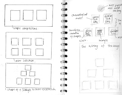
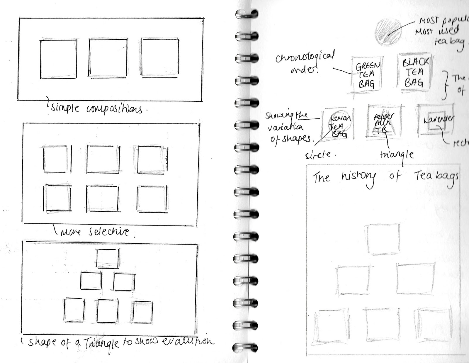
Selecting other objects which are counter-compositionals


A tea bag is made from tea leaves known as camellia sinensis, tisanes (herbs), filter paper, grade plastic or silk.
Investigating into Filter paper
Filter paper is a semi-permeable paper. It is used to separate fine substances from liquid. The properties from filter paper is the volume filtration. The particles are caught in the bulk of filter paper. Filter paper is used as it absorbs liquids. Tea bags are made from abaca fibres, which includes a thin and long fibre. Paper is made from synthetic fibres. The paper is very porous and thin in addition to having a high wet strength.
Camellia Sinensis is a species of shrub, where the leaves are used to produce tea. White tea, yellow tea, green tea, black tea, are processed differently to vary the levels of oxidation.
Designing Three Outcomes
My first idea is a booklet based on Visual poetry which incorporates photography from the constraints task.

Creating compositions with Photoshop where I applied opacity and layers within Photoshop. I have also adapted levels and colour balance.

Creating second composition, however playing with scale influenced by the history of teabags, the use of how teabags use to be such larger and are now reduced to create more flavour. I have applied opacity to convey the idea of flavour being week. This is contrasted to a smaller teabag being more intense, this is show through the use of colour.

Using the Grid system to place the typography. However the use of colour being intense perhaps is overpowering which is not successful contrasted to the other compositions. To develop this further I could print the type onto a plain background to create the image to look less crowded.

Creating a composition influenced by the grid method. The strip in the middle conveys the idea of tea stains, in addition to the type acting as the plant material within the teabag.


Exploring printing onto different colour paper. I have printed onto tracing paper to mimic the idea of transparent paper used for teabags. The pink paper is influenced by the flavours of fruit tea. I have also printed onto white gloss paper to incorporate the idea of a magazine element.
With this outcome, I used a pamphlet stitch to create a booklet.

Front cover to show a sense of history through the size of the tea bag within visual poetry.

Varied pages to create more interest through colour.

The use of tracing paper showing the other pages shows the stages of the teabag. It creates the illusion of the plant material within the teabag.
The right hand page acts as a sense of layers conveying the structure of a teabag.

In my opinion, this is the least successful as the left page could be recompositioned as the image is close to the edge. Also the right image is unclear and could be printed on different paper to suggest a clearer image. However saying this is could suggest the story of flavour as flavour is intense which is shown in the right page.

Centered images within the booklet is out of tracing paper to vary the texture within the booklet. In this image is shows the pamphlet stitch matching the typography within the booklet.

Again this is the contract associated with the theme of size. I also have applied a lower opacity image onto tracing paper which I felt was more successful, as it shows other images through the paper.

Experimenting with different coloured paper. When trimming the pages, I will have to ensure I trim them more accurately as I found this a lot more challenging.

This is the back cover to suggest a sense of a story within the visual poetry. How the teabag has become more smaller as time has gone by. To develop this further I could of included the typography research into branding and created visual poetry with that typeface.
Aiga Magazine
Erik van Der Weijde is a Dutch artist, photographer, and
prolific publisher who is situated in Brazil, has produced over 50 different
zine titles. The context behind zines: they are known for being rough, scruffy,
cut and paste aesthetic. Weijde had a vision to professionalize this
unprofessional genre. The work ethic is still DIY process, where Weijde used
cheap local printing and produced a a website and studio called 4478zine.
Weijde discusses how zines is an accepting showcasing and
selling work to a larger audience. For example, Weijde zine called, ‘Subway’
has become the well-known zine around. The content within the zine is based on
facts from eBay and Wikipedia, where Weijde randomly chops and pastes together
this content.
The editor-in-chief’s introduction, Adrian Gonzalez-Cohen
for ‘The Buffalo Zine’
The Buffalo Zine introduces a more creative aspect, where
they apply collaged images and handwritten notes and achieve subjects. The
creativity in this magazine relates more to the visual poetry booklet produced
as this booklet includes collages and layering aspect of type.

For the second idea, it is a booklet based on Excel drawings of different tea bags, developed by Twinings developed in Britain.
The first thing done was creating a wide range of excel drawings to create a sense of a timeline. A history of the development of teabags.

I began with this image influenced through my research process. The idea of including tone relates to the idea of grains and the movement within liquid. It also includes popular culture as black teabags are more used and more known.

Creating different shaped teabags to create a double page spread.


These teabags are influenced through green tea, as this was originally more used and known. Ive adapted the element of singular squares to signify each grain within the plant material.


I then developed the images in a grey black tone to show the development within popular culture of black tea becoming more known and popular.

I then explored with different tones I noticed within cherry and cinnamon tea bags which I purchased for visual research.


I then developed the idea of tone and creating different tones for different types of fruit tea. This tea is influenced by Lemon and ginger.


This tea bag is influenced by Lavender teabags.


I then created triangular teabags.
However, in my opinion these were not as successful as it was hard to communicate a triangle out of squares.

I then developed this image further by applying a shape of a triangle to help communicate the shape better. I feel the other image fits better as a collection, but on the other hand lacked a sense of clarity of a triangle.
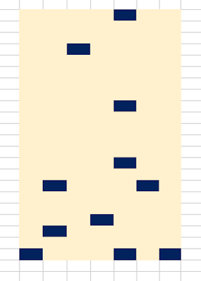
Through out these drawings, I wanted to adapt the meaning of shapes. Research has proven that the shape of the tea bag improves the flavour of the tea. The shape of a triangle is a modern development which has proven to create the tea to be more powerful compared to teabags which are circles and squares.
These series of drawings shows the order of how green tea was first popular however then black tea became more in demand and more known as a tea bag. I then drew through different flavours of fruit tea from the company Twinings which I researched when visiting supermarkets.
I then drew out pictures on Excel, this typeface was not successful as it did not fit in with the theme of sophistication and looked cliche.

The problem with the type was the use of the grid system being to small to fit the type on. Therefore if I were to develop this further I could cut out the lettering and then place this onto a grid system.

Drawing out herbs: Dragon Pearl Jasmine


Buddha of Mercy

Masala Chai: the green and red has come from the word Masala, usually used for curries which I have adapted the idea of spice and chilli.

Orange Pekoe and Black Tea. Using the colours to communicate this from the name chosen for the tea.

Ginger Chai.
I have adapted brown tones to create the idea of a cup of tea. The concept of milk being added to address the word chai. The yellow squares represent the plant material. The cream line represents the string from the tea bag. I feel with these drawings they appear to overwhelming and overcomplicated.

This series of tea bags were not as successful, as the idea of 'tea bags' were lost. When researching from the origin of tea bags, the elements associated with tea were mainly herbs. Then the tea bag invention came after to create tea to be more easy. The problem with these designs were they are too complicated and may perhaps be harder to communicate to the audience. The typeface was also unclear and in my opinion did not fit within the theme. In the final outcome, I wanted to include a sense of a story through image. Something that was abstract as well as clear to suggest tea bags.
Researching into modern tea: popular culture
Bubble tea is a Pearl milk tea which originates from China. Continuing the history story timeline. Bubble tea is a mixture of fruit and milk to make chewy tapioca balls, fruit and jelly are also added. Fruit flavoured teas and milk teas. First popular was bubble green tea which uses infused green tea. Larger pearls were adapted and later replaced with small pearls.
I researched into different flavours and created excel drawings from the movement of the pearls within the liquid.

Creating a structure to communicate the bubble tea culture. However this was to complicated and cliche.
Exploring different colours to signify different flavours within the fruit tea culture.

Kiwi Flavour, I have adapted the same colours from the flavours on Bubbleology. Bubbleology is a company which sell different flavour fruit teas.

Apple flavour
The squares signify the tapioca. The idea of involving movement. This leads to the modern idea within popular culture of feeling more free contrasted to a tea bag where it is more trapped and enclosed.

Adapting a border to create a more defined communication of the tapioca pearls within the tea.

Raspberry flavour to introduce variation of colour within the design work.
I then researched into different types of milk tea. As milk was later on added to tea, adapting the modern approach to tea culture.

Almond Flavour

Papaya flavour. The problem with this one in particular was when I came to print of the design the colour was set in an RGB quality being on excel.
These were my least successful as they became very repetitive and less innovative. The other problem with this design was colour was set on an RGB setting being on Excel. However when printing with CMYK ink the pictures appeared dull and more alike and similar. Therefore I decided not to develop these further as some drawings were more successful and interesting.
Printing most successful designs onto suitable paper.

I then printed onto thin paper influenced by delicate paper used for teabags. Whiles printing some of the colours were not as clear, if I were to develop this again I would create swatches which are appropriate for CMYK printing quality.

I then experimented onto graph paper to see if this created an impact as well as including a sense of a grid method influenced from the programme Excel.

I then produced a booklet from Pamphlet stitch and Stab stitch.

The paper used is Layout paper to relate to filter paper used for tea bags. The paper contains the same quality of transparency, fragile and delicate. The quality also includes the idea of seeing through other pages this was intended to relate to teabags working in layers and seeing through the object. It also includes the idea of flavour; the image showing shows a more intense flavour contrasted to weaker flavours shown through lighter images.

For this sample I have varied the order to create more diversity within the final outcome. This was intended to create different shapes within each page. As the object of a tea bag varied through the plant material movement as well as the teabags constraint of being applied onto water.

The covers are upside down to create the idea of a teabag not having a set position. In everyday use tea bags are placed in different layouts. This composition shows this aspect. It also introduces how teabags are left for granted and the idea of the tea bag being used once and never again.

For the third design idea, I decided to chose a different stitch and explore on different paper to see if this had an impact for my final outcome.
In this printed format the triangle shape is cancelled out, to develop this further, I could create a darker border with RGB then when printed the CMYK ink will appear.

The images came out a lot clearer. However If I were to develop this further, I will apply InDesign to create the layout of the pamphlet stitch booklet. I will also consider the order of including a chronological order of the history of tea bags.


To improve the stitching, I will have to ensure the stitching is more tighter to ensure an even finish.

The printing quality came out a lot more accurate and clearer. However, I will perhaps need to refine the triangle designs as there are some excess around the design from Excel drawing.

To improve the quality, I will have to ensure my platform is clean so each page is left clean and finished.

Three Final Outcome produced influenced by the Object of Tea

To develop the Stab stitch further, I could vary the dots in a pattern format to introduce a diversity within the stitch. This will create more of a triangle and point which relates to research of triangle teabags being more better.

When recreating my design I will have to ensure the sides are trimmed more accurately. I could also explore using InDesign to ensure my pages are more neatly finished. To improve my practise further I could introduce different stitch marks. To improve the communication of the image work I could perhaps create a chronological layout to introduce an element of a story.
Feedback
The feedback given was the Teabag brochure was a lot more successful. To develop this further, I could include type influenced from branding to create an identification for each image as some images may be hard to interpret. It could also include the year it was released to create a sense of a timeline. The images could also relate to an event for the tea industry. Other feedback given was to include a front cover perhaps with the title 'The History of a Teabag'. The photographs could be improved by creating the brochure acting as a teabag itself. I could use extra string and attach it to the end to create a sense of a teabag quality. The label could include the name of the event or exhibition which the brochure would be used for.
The paper is see-through to show the concept of tea. The concept of space through the colours not showing has worked as an advantage as it represents the teabag absorbing. As Twining's use flavours and different colours I could include this into the type included.
I then researched into events within Twinings. Recently, the company has released the launch of their new website launch. The brief is to create a poster representing the history of teabags within Twinings as Britain consumes the most tea. Another idea is the teabags could be used as an animation for the new website. Twinings is being introduced into the 21st century, the history of the teabags could represent the success of the company.
From the Teabag drawing which I produced, I defined these by removing the grid layout and applying darker colour ways, for instance:

Contextual Research, gathering information to communicate what each teabag is.
1956-Twinings makes tea bags for the first time
With this fact, I could create a poster for the Anniversary of this date. A poster to celebrate the 60th Anniversary for Twinning Teabags.
Earl Grey Teabags

Earl grey tea was produced by Richard Twining named after the Prime Minister, Mr Charles Grey. Earl Grey is a tea blend of Bergamot oil.
Lemon and Ginger Teabag.

Lemon and ginger teabags helps to boost your immune system, lowers your effect of diabetes and helps create perfect skin and great hair.
Peppermint is Caffeine free-helps disruptive sleep patterns. Pyramid tea bags were invented by Brooke Bond in 1997. Pyramid shaped bags allow tea leaves to infuse more effectively compared to round bags.
After gathering contextual research, I then explored composition layouts through which teabags were more successful then others. I also had to be concise on how many tea bags will be displayed.

These compositions were explored on Illustrator, where I explore quantity, type size, type style, scale and size, composition layouts, colour ways, centred composition.
These designs will be on A2 paper.

Using this composition layout included meaning of mimicking the pyramid shape influenced by triangle teabags. However the feedback received was it was too compact and complicated.


The typeface of the title does not fit in with the theme. The title makes the composition look like it is designed for a book cover rather than a poster.

Refining words, applying a different context towards the image. However, the feedback given was it was to minimalistic.
Refinement Process

Refining work I have already produce, removing the word 'Introducing' to condense the title down. The typeface was reduced to roughly have the size smaller. Also introducing words which fit on one line and applying a centred composition.
Final Outcome

Printed quality onto matt paper, A2 size. The colour ways were changed into a CMYK swatch through Illustrator.
The feedback given was to explore printing onto a gloss finish paper, as this poster perhaps will fit better in advertisement rather than a bespoke piece.


No comments:
Post a Comment