Brief: to create a wayfinding and imagery for the new building and the various courses and facilities.
Ideas
Colours:
Common Room Area: playful and colourful
Wayfinding Typography: Bold
Courses:
*Shape Coded
*Colour
Wayfinding
*Entrance
*map
*toilets
*floors
Theme
*Geo Shapes
*Typeface: San Serif
*Colour
Issues with Current University
*Bad lighting
*Depressing
*no sense of social interaction
*society build up collars, meeting
*Library- modified.
*more colourful
*better seats
*cramped
*more effort on decoration (plants)
*actual shop, art and food perhaps clothes.
*"Best Art Uni in the North"
*Balcony/open environment
Primary Images of the Existing University
The problem with the current studio is it is clinical, plain, no inspiration, there is a sense of a loss of community. This area should include liveliness, youthfulness and a place where students can work and socialise.
General maintenance, perhaps this idea could be developed by applying a series of exotic plants. This will create a sense of fresh air and and healthiness towards the university.
This wall could be more exciting by applying type and images which are more visually exciting and relate to the course title.
There is. lac of clubs and community where students can come together and meet new people. The university is divided into the courses and there is a lack of communication.
The canteen could be more visually exciting. Somewhere where it is exciting and enjoyable. A place where students and relax chill out meet new students.
Research
Geometric shapes
These are the most commonly used shapes. We are introduced to them as kids in school: square, circle, triangle.
Squares are reliable, give stability and suggest order. Circles represent completion, wholeness and harmony. Pentagons, hexagons, octagons, give the design a unique feel. They are used to portray an already known use of a shape. Triangles that point up represent direction and power. Triangles that point down suggest instability provide direction.
Different types of design circles: solid, segmented ring, decorated ring, round composition.
Geometric shapes are the basics. This style of shapes is made with connecting lines and has a recognizable geometry. Squares, rectangle, circle, triangle, and crosses are geometric shapes. This type of shapes often has symmetry has a structural look to it.
Squares and Rectangles
Squares and Rectangles create a sense of equality and conformity. The familiar shape is seen as stable and trusting. The square further relates to the earth, with each four corners relating to the four points on a campus.
On the other hand, this shape is seen as boring/ plain. Square and rectangles can appear without borders or frames. Sometimes rectangles can appear beyond their margins in a project because of their distinct vehicle and horizontal shapes.
Text is mostly set in a rectangular shape. The shape, made of four intersecting lines, is the most used and safest shape option. While this shape typically is made of four sides that close and contain element, squares and rectangles can also have an open shape.
Circles
Circles have a trendier usage and are used more commonly in websites and digital design than in print projects. Circles are most frequently used to represent things of the same shape which creates a sense of completeness.
Because a circle does not have a distinct beginning or end, they imply movement. The shape is a thought to have a feminine association and is associated with love, energy and power. Circles suggest infiniteness and harmony.
Usage of a circle in a project typically brings immediate attention to that element because the shape is not so commonly used.
Triangles can have one of two quite opposite meanings. These shapes can imply stability, power, and energy. But it results in feelings of conflict, tension and nervousness when the base is upside down and appears unstable.
Almost any use of a triangle implies motion. The shape is almost any form related to masculine ideas because of strength.
Crosses
A cross is related to a religious interpretation however it contains other symbolisms such as health, hope and balance. A cross shape can appear as a form of a ‘t’/ ‘x’ or a combination of intersecting lines and spaces.
Vertically- oriented crosses are thought of as a strong, while horizontal options are made more peaceful.
CMYK Idea
Exploring collaboration of colour to suggest the idea of a community.
Contextual Research
Swiss Graphic design
UNIFORMITY AND GEOMETRY
Even a quick study of classic Swiss style works reveals a strong attention of graphic designers to uniform design elements and strong geometric shapes. Graphic artists have experimented with abstract geometric patterns, uncomon color combinations, text manipulations and striking abstract visuals that were used to clearly convey their purpose in a very remarkable way.
Research from 'Swiss Graphic Design' by Richard Hollis
The concrete artist Mary Vieira made a limited but important contribution to Swiss Design. 'Brazil Builds', poster by Mary Vieira for an exhibition of architecture, prints ad Vieira's sculpture, 1954.
This design relates to my designs on sim cards as the shapes are positioned in the same layout and scale. The combination of shapes creates an interesting composition. The use of the shapes being applied on Illustrator creates a refined finish. The artist has applied colour in the background and then applied a black white approach within the shapes. Perhaps I could adapt colour to create more interest.
Abstract Art
Swiss Graphic Design is referred to International Typographic Style or the International Style. It originates from Switzerland in the 1940s and 50s. The design holds qualities of simplicity, legibility and objectivity.
The style is a contribution of san-serif typography, grids and asymmetrical layouts. It also includes the combination of typography and photography as a means of visual communication.
Friedrich Vordemberge- Gildewart
Friedrich Vordemberge-Gildewart (November 17, 1899, Osnabruck, Germany- December 19, 1962, Ulm) was a German Neo-plasticist painter. Vordemberge-Gildewart is one of the first painters to work for his entire career within abstract style.
The designs include spaced out shapes which form a composition. The first two designs include a simplicity which creates more of a successful composition which establishes sophistication, and elegance. The other designs are more complexed which could be incorporated into my design process by repeating elements to form a complex structure.
Jan Tschichold
The Swiss Style emphasises simplicity, communication and objectivity. The designs include an asymmetrical formation through the sans serif typeface, it includes a mathematical grid. The Swiss Style merged elements of The New Typography, Bauhaus and De Stijl. The Swiss Style was developed in the 1920s and 1930s, where the designs include white space, plain letterforms and photographs. Photography became very popular and more accessible during this time period, where designers embraced this. The Swiss Graphic Designers were influenced by Jan Tscichold’s 1928 book Die Neue Typographie. The book outlines how typography should be seen as the art of communication. Typography was perceived as a primary source. Tschichold explores the idea of asymmetrical design through san serif typefaces.
Josef Muller Brockmann
Josef Muller Brockmann (May 9th, 1914- August 30th, 1996) played a key role in Swiss Graphic Design. Muller-Brockmann’s designs aim to create posters which communicate masses. The communication is through different language barriers such as English, French, German and Italian speaking population within Switzerland. The designs include a harmony and simplicity of these pieces that influence a post-war world which had lost a sense of central nationalism and gained a lesson in the need for globalization. Muller-Brockmann established as a theorist of the Swiss Style, which established a graphic expression through a grid-based design, subjective feeling and illustrative approach.
Otl Aicher (wayfinding influence)
Designer Otl Aicher designed for 1972 Olympics Games in Munich. Otl Aicher created a pictogram system which visually communicates clarity. The system creates an easier orientation. The Pictograms create an international understanding, which is suited for our modern, global thinking world.
Contextual examples of combining shape with type.
The contrasting colour makes the designs more contemporary and fresh. This idea could be adapting as an idea. The use of combination of colours creates a sense of originality and identity, it also combines the essence of a community.
Gathering Imagery of exciting surroundings. Inspiration to base the designs on. The images explore massive type on walls, plants, live technology, building communication through technology.
Secondary Images
Primary Research
Visiting Tropical World to gather ideas of surroundings of the combination of industrial and plants.
This could lead to an idea of an open aquarium.
Primary Images of University of Leeds
This University is more academic, however there is a lot of studying facilities which encourages students to study. The facilities allow students to meet each other through different courses. There is a sense of a community.
Initial Ideas
Experimentations of mock-ups of Type for each Course. The layouts include the idea of Geometric shapes.
Exploring with colour, the monochrome layout will look too dull and will have less personality.
Incorporating Swiss Graphic Design to create an abstract approach. The idea of the creative students being able to interpret the Wayfinding.
Applying Grids as a medium choice. This approach has created an abstract aesthetic. This design is perhaps too complicated.
This design could be developed by applying a more bold typeface to make the lettering stand out more.
This design includes retro typeface to create an urban approach towards the design. This design would perhaps be more suitable for brochures. It creates a more contemporary, quirky approach which students will be able to relate to.
Experimentations influenced through contextual research. This design plays with scale and size. During the critique the designs with the shapes in the background were seen as more powerful and stronger. The letters complicate the message which is being communicated. Perhaps shapes would be a better design medium.
Taking the feedback on board, the designs were developed by exploring different patterned backgrounds for each subject. This design layout was seen the most successful.
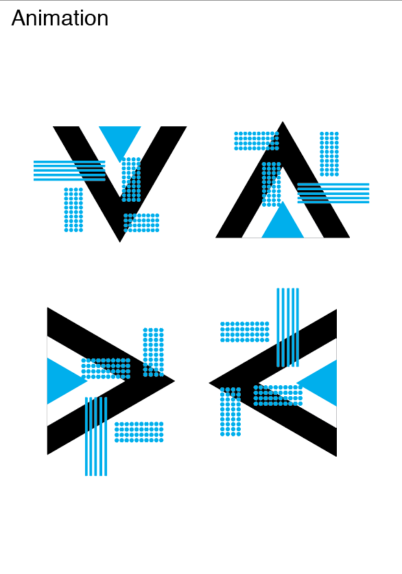
Experimentations which visualise as an animation. This could be developed further through technology by creating an animation for each section. This design explores the grid system however with dots which creates a new aesthetic.
Experimentation of Wayfinding arrows. The designs show shapes being incorporated as well as colour.
Here, the designs show a difference between colour. This colour will differentiate each course. The idea is to follow the Wayfinding system for the colour of the course you study.
Final Wayfinding Designs
Other Experimentations
Map to show the location of each subject, the subject communicated through Shapes.
The idea could be developed further by perhaps taking one square and that representing each subject instead of the design being too packed. This perhaps will be hard to communicate.
Design Development
To develop the designs further, as a group we combined all our ideas together and created the final mockups. The walls will be entrances for each subject. The subject will be conveyed through the shapes. The style is influenced through Swiss Graphic design. The collaboration of colour creates that essence of a community. Each design will be created into other aesthetics, perhaps on clothing to identify each student and what each student studies. The 3-D type will be 3-D to contrast the 2D and 3d element. It shows the idea of a community and creates the concept of touch. It will be an interesting design feature for the modern day.