Contemporary Graphic Designers


These pieces of screen prints are relevant for my development as a designer as it encourages me to develop my practise further by practising screen-prints exploring textures and gradient fills. The abstract layout creates a subjective nature which relates to my style. The use of colour is similar to the gradient fill I tend to use. This idea could be explored through this type of media print. The use of screen print creates a more distress, vintage approach.
Screen print Exhibiton


A collective of Oriental Screen prints. Culture is an aspect which I base my practise on due to my cultural heritage. The oriental culture really interests me, through the type of unique shapes. This emphasises the aspect of symbols and meanings. The use of the gradient fill by tone works effectively. To develop this idea further, perhaps experimentation with spray paints and stencil could create this impact.
DALILA
Digital air brush technique created on Photoshop. This example will develop my practise through learning new digital skills. The gradient effect is unique and the example shows a quick technique for creating textures.


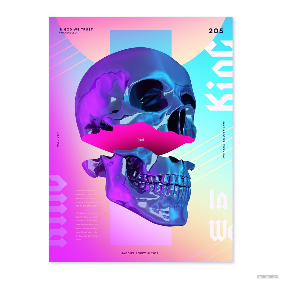
Logo Influences
IVY PARK
Ivy Park is an activewear clothing line co-founded by American recording artist Beyoncé and London based fashion retailer Topshop, introduced in 2016. The joint venture of Beyoncé and Topshop was officially announced in October 2014 and operates under the company Parkwood Topshop Athletic Ltd. Originally set for the fall of 2015, the launch was pushed back until Spring 2016 with an April 14, 2016 official launch date to in store and online retailers.


Fenty Puma
Rihanna is the creative director of Puma’s womenswear line


The typeface for 'Fenty' is exaggerated through height, the use of the slim letters creates the aesthetic of a female figure. The use of the lines varying create the idea of curvy woman as well as relating to Rihanna figure image. The collection is aspired by race course culture, as well as using hot vibrant cultures to celebrate the culture of the middle-east, where the images were set. The typeface for the logo is in black lettering to create a modern typeface however applies a more decorative approach towards the brand. In my opinion, the Ivy Park range is more successful as the typeface is more contemporary and will most likely stay in trend more.
Editorial
Boutique Magazine
I have collected boutique magazines to explore grid layouts, with type and image. Exploring a new sector to Graphic Design.

i-D is a British bimonthly magazine dedicated to fashion, music, art and youth culture. i-D was founded by designer and former Vogue art director Terry Jones in 1980.

Dazed is a bi-monthly British style magazine founded in 1991. It covers music, fashion, film, art, and literature. Dazed is published by Dazed Media, an independent media group known for producing stories across its print, digital and video brands.

SLIMIMAG is a quarterly collection of style inspiration showcasing the ‘chefs d’oeuvres’ of the fashion elite, alongside the most talented image makers the industry has to offer, a visual delight to fashion
Azeema Mag
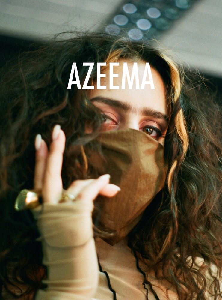
Azeema is a print magazine which explore resistance and femininity within Middle-Eastern and North African women and women of colour Azeema challenges and confronts issues surrounding representation and diversity by creating a space that is inclusive of women of colour and knowledgeable of Islamic faith, African and Arab culture.
Boys Don't Cry-magazine by Frank Ocean


the book’s content moves between high fashion extremities and raw, intimate moments.
The publication was released during the same time of the release of the blonde album. This publication has helped me develop as a designer as Frank Ocean explores concept and meaning towards his work. The wok has a sense of sensitivity. The design also shows how todays society has become more open minded, and encouraging more risks within the industry.
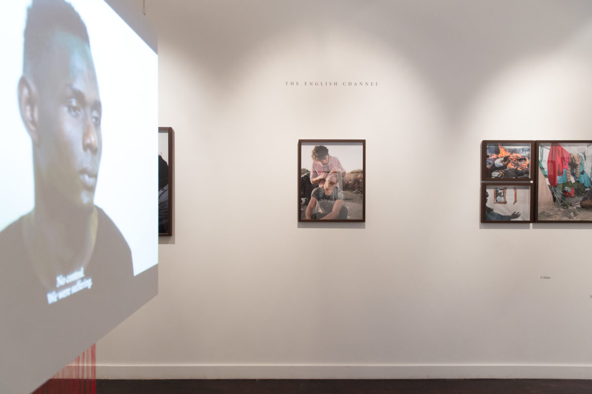
Foreigner- Migration into Europe 2015-2016


John Radcliffe Studios: documents the regular lives of refugees.
"Foreigner: Migration into Europe 2015-2016" is a photography series that hopes to portray a less sensationalist account of the Refugee crisis.
London based John Radcliffe Studios have designed a phonebook about the pressing issues affecting refugees. Countries in Europe have seen a massive influx of refugees as many of them have fled civil war in their home countries.
The studio hoped to portray as account of the events that were infolding with a humanist approach.
"We felt at the time, that the imagery used in the media to tell the story, was sensationalist, alarmist and wasn't giving people the time and consideration they deserve." the studio wrote in its kickstarter campaign.
"We wanted to approach the subject from a calmer perspective, using medium format portrait photography as a means of meeting the people at the centre the crisis facet face and leaving something about their lives."
John Radcliffe Studios
Foreigner: Confrontation and the light
Confrontation and the light is a collection of street photography that looks at the ideas of renewal and rebirth. The photographs were taken in London, Japan, Spain, Lisbon, and Amsterdam.
The photographs were presented in hardback books collected from charity shops. The meaning of this was to create a new meaning of life, their own history and details would give every copy a unique character. Many of the books are over one hundred years old and have developed a natural beauty in terms of quality, texture and smell that could not be matched by modern production methods.
In total 30 books were made, each one having its original contents partially stamped out by hand and cover painted in black.

Daniel Castro Garcia's first solo exhibition "foreigner"
"It's time to leave! If you must die in the open sea! You must not return. If any of you come back and report me, you're dead. If you have to die, you will die together now go!" - Aly Gadiaga, one of the migrants portrayed in Daniel Castro Gracia's Foreigner project, describes his journey from the Libyan coast to Italy.
The work on show is delicate and sensitive, a far cry from the sensationalised accounts often offered up in the press. "We are all foreigners." says Castro Garcia, adding he hopes to aspire respect rather than pity.
'It's not just about respecting those in the photographs- the audience also deserves respect.
The artist wanted to create a dignified response to this humanitarian crisis, that was not about sensationalism.
The photographer and audience should make the effort to try to put themselves in the shoes of the person in the image.
If you were going through a traumatic situation, we would not want a photographer and the audience coming up to us and taking pictures without our permission.
The creators wanted to create a balance to the story that was not there, in the press. The work aims to create more balance. This is to make the audience realise that this is not a black and white story, but in fact a very complicated one that needs to be thought and patience.
Explore people ignorance towards the perception of migration.
They are perhaps perceived as uneducated and not intelligent, the idea they are strain on society. This generalisation fails to make most of people's unknown talents and skills people have. Aly for example, Aly speaks 5 languages fluently, extremely intelligent and aware of society. These people deserve more recognition an opportunities, that they can bring towards society.
The underline notion is to convey a celebration of life. To offer a chance for people to spare a thought for all of the people that passed away trying to make it here. These people deserved to be celebrated. A politician has no idea what the life/ journey of a refugee / migrant is like is listened to.
Metaphor:
"The room is locked, but if you forgot to close the window and after two days the cat realises it's open, what does the cat do? He escapes, he does through the window is the only chance to escape. What would you do?"

'Brown Book' Magazine
A bimonthly magazine exploring the Middle East, an observation of the religion's evolving urban, identity and character. Published six times a year, Brownbook is a bimonthly magazine dedicated to art, design, culture and travel from the Middle East and North Africa. The publication's focused coverage reports and uncovers the most inspiring stories from the region.
Through a decade of observing, reporting and understanding. Brown book has successfully remained independent and is one of the most widely read magazine Dubai and the Middle East.

Migrant Journal
Migrant Journal is a six-issue publication exploring the circulation of people, goods, information around the world and the transformation impact they have on space. Infinite spaces explored are seamless oceans and boundless skies. There are considerations such as the law of nature, international laws and social and political dynamics. The publication explores mobile spaces of death, pleasure, traffic, and infrastructure, including most tragic issues which occur.
In 2016 many people flew in planes than ever recorded in history. Technology has also enabled new developments to take place through air from drones to satellite communication. The sky hosts migrants: water particles, seeds and birds. Meanwhile seas and oceans have become a mobid stage to which no-one takes attention of as thousands die in the sea for a better future. The sea is also home to the nomadic populations of humans and animals.
Migrant Journal is a six- issue magazine project that considers migration in all forms.
Examines the movement of people, ideas and goods around the world. Journal takes an informative look at the phenomenon of migration and its impact on contemporary life.
Designers: Justinien Tribillon and Catarina De Almeida Brito
Work with visual and textual element to aim being as flexible and open-minded.
Receive purposals from everywhere in the world to propose writing pieces, photographs, poems, comic strips, academic essays, translations, art, installations.
Try to reach outside our own professional/ intellectual/ social communications.
Target Market
First readers were probably designers, architects, urbanists, geographers, individuals interested in space, migration and design. However, the target market is pushing boundaries, it is more diverse.
Migrant Journal
Format focus on metallic inks add extra layer-too intense affect, higher quality.
Migrant Journal no.2
The contradiction between restrictions imposed on the movement of people and the acceleration in the circulation of goods, services, money. Issues include 'Iceberg houses' in London designed for the uber -wealthy to the infrastructure of high- frequency trading, from Romanian agricultural workers travelling to Spain and Portugal every Summer to pick strawberries while Portugese workers harvest grapes in France, to globally spread offshore accounts.
Migrant Journal No. 1: Across Country
The refugee crisis that Europe is currently facing is shedding a dramatic light on the countryside. Syrians refugees flee the war from Turkey, then Greece and their isolated beaches, to move on to travel Europe across country, fields and scenic landscapes from Macedonia, Serbia, Bosnia, Croatia. The forgotten rural land is the stage of our present migration tragedy.


The designers, migrantas, used urban places as a platform to show visual pictograms to provide visibility to express thoughts and feelings people who have immigrated.
The purpose is to create disability towards the issue of migration in society. To create awareness. The issues explored are migration, identity and intercultural dialogue.
Migrantas explore tools from visual arts, graphic design and social sciences. The organisation has worked with migrants in workshops.


Exploring Layouts in the Music Industry
Ebenezer is a U.K.-based rapper known for his guest performances on the 2017 tracks "Flexin'" by Irish hip-hop artist Rejjie Snow and "No Good for Me" by U.K. producer ADP.
The layout relates tot he idea of Psychedelia. The concept is not too overcomplicated, the layout creates the idea of illusion and a scattered lay out. However the piece uses space effectively to ensure the layout is readable as well as visually pleasing.
The image explores grey tone, and doting effect on Photoshop - this concept could be explored for idealisation and development. The layout explores visual symbols, this idea could be developed into illustrator by repeating words and creating unique shapes.


Kanye West- Life of Pablo

Which Pablo? Pablo Picasso, Pablo Escobar of course, Apostle Paul. [Paul] inspired and was the strongest influencer of Christianity. Pablo Escobar was the biggest mover of product, and Pablo Picasso was the biggest mover of art. And that mix between message, art, and product is The Life Of Pablo.


No comments:
Post a Comment