All photos and text in the final publication belong to Eloise Ferg. My role was to design the publication from the content.
Research
In the briefing Eloise stated many concepts she wished the zine to include.
Contextual research
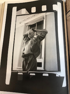
The first idea was film frames and creating layouts for the film photography section. These spreads are examples of this concept.
These layout concepts were taken from the "More or Less" publication.
I then researched into existing sustainable fashion look-books on Fontsinuse.com.
I noticed in these spreads the layouts were more clean to give of the idea of sustainability, something looking healthy. The use of the front cover was very successful in the three column layout. The use f the typeface being serif creates a decorative feel towards the publication. This gave me the idea to combine serif and a san-serif typeface for the publication which are sustainable.
These are pages from another sustainable fashion look-book. I noticed the look-books contained the similar san-serif wide typeface. I then researched into sustainable fonts
I ended up picking three typefaces: Courier, Century Gothic and Garamond.
Courier
Century Gothic
Garamond
After testing these typefaces on Illustrator, I decide to use the Garamond typeface and the Century Gothic typeface. As these created a more professional finish towards the zine.
Initial Ideas
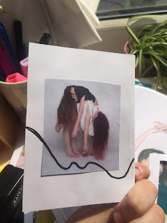
Eloise sent me over some thumbnail collages to show the idea of lines running through the publication. This idea is the lines will mimic loose threads from fabrics.
The photography were categories into four projects: Signature look, Cotton on to the facts, A cut above, and fashion shouldn't cost the earth. Eloise discussed her vision on concepts for each category. The first was the film idea layouts, the second was the line concept and the third idea was minimal layouts however applied repeated type in the background. Eloise liked the scanned technique which I have used for the "Tone it Down" publication and decided to use this idea. From this briefing I decided to sketch out thumbnails to help structure the images and create an order for each layout.
These layouts show the idea of film strips being applied in front of the images.
These layouts explore the clean concept for signature look. This section will be mainly focused on photography.
Different layouts created influenced from the sustainable look-book. This will help structure photos into the best composition.
These layouts includes film strips made from images, in the style of repeating photos to create a film strip aesthetic.
I then had the idea of combining more than one image on a page. However, this might take away the quality of the photos.
For the second prototype, I decided to create some more thumbnails which show the film strip being used for the background instead of infront of images.
The style will be experimented with different amounts of strips. The more strips the messier the layout will look. The first. prototype created I initially applied the photos into digital frames. However, this made the images look too digitalised and clean looking. Therefore, I experimented with creating new initial ideas by scanning in frames and applying the image over the top. I then played with the opacity to create a more vintage, realistic aesthetic towards the strips. I then experimented with tape to create a more collage finish. I created another initial idea by applying more film strips to see if that impacts the design. the design looked more complete with more film strips being added.
This initial idea was applying the photo in a digital frame. This idea was developed further by scanning in a film strip. I then cropped the film strip and applied the image on top. I played with the opacity levels to create a more better quality finish.
After this experimentation I then created thumbnail sketches to create a layout and structure for the photographs with this concept. I wanted the pages to switch from a big huge frame and film strip layouts.
This idea shows the idea of film strips repeating itself to create an interesting background. The umbers stage the number of the tiff images. The use of a sketchbook helps me organise photography content.
Signature look layouts.
The thumbnail below shows the idea of repeated text behind the image. This concept was discussed by Eloise Ferg.
This is a thumbnail sketch of the front cover. The image will be film based and the word may be more bolder and perhaps a different typeface compared to the content text.


No comments:
Post a Comment