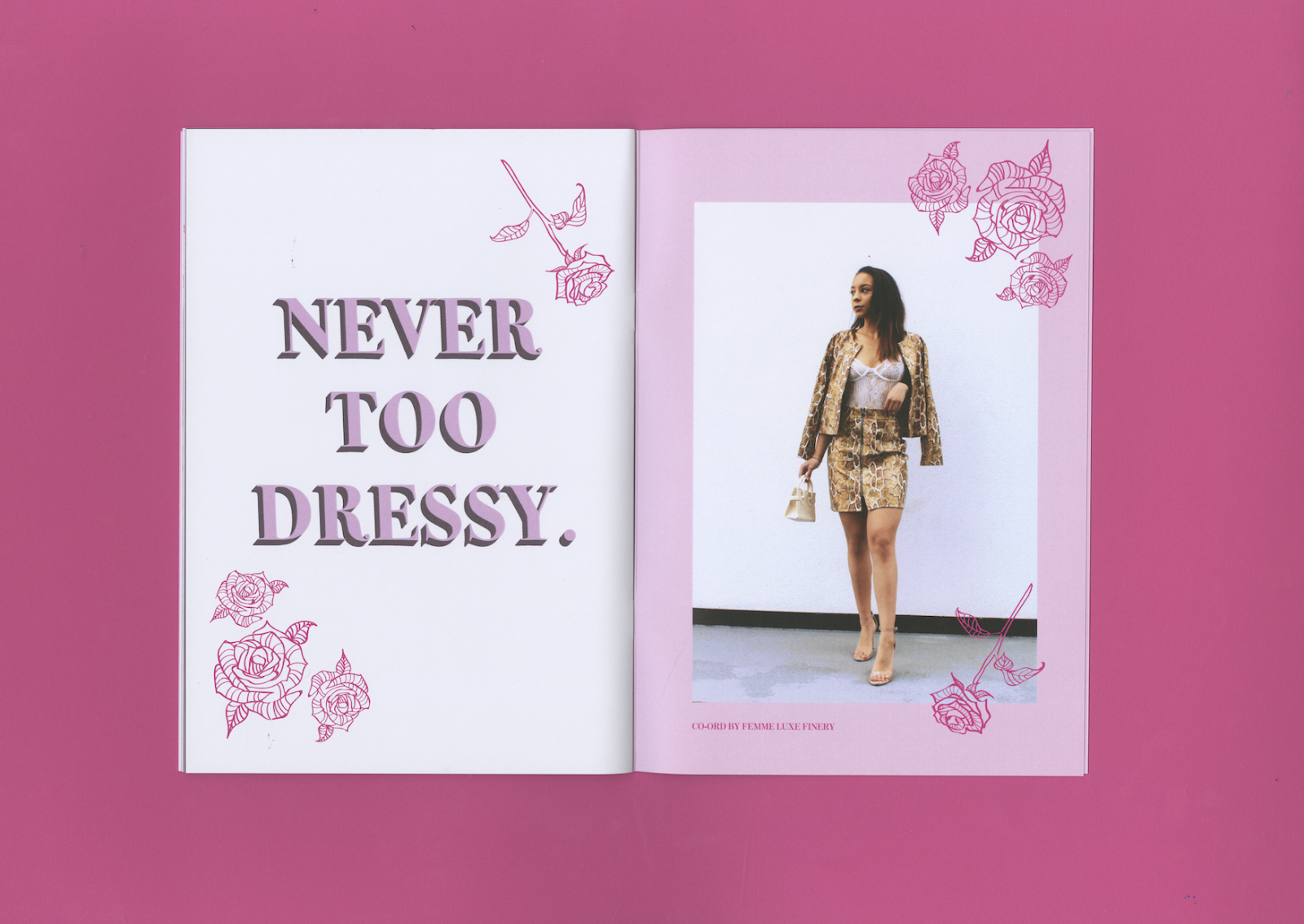
I developed the photography and thumbnails by creating layout spreads on Illustrator. I developed the layouts further by applying illustration. I incorporated the idea of roses, as pink roses are a symbol of grace and elegance. This will also help showcase my illustrative style.

This page is a brief description of what the zine is about. This idea was taken from the critique to help communicate what the zine is about for the target market.


I experimented with colour for the type. The cream helps bring the idea of softness and cosiness.

I experimented with borders to help lift the blue more. The pink colour way was selected from the clothing in the images. I felt the pink stood out the most in the photographs.


The typeface being 3-D was influenced from the PRETTYLITTLETHING look-book as it brings a sense of character towards the zine.


This spread was influenced by the Nike Look-book. The use of the text acting as a border creates a sense of character.
The layouts were then applied into an InDesign document. Some of the layouts did not work as the illustrations were too near the edge. Therefore I redesigned these layouts


I then developed the front and back cover by applying the illustrative designs to make the zine more consistent.


I applied these designs onto InDesign to create a PDF format for printing.
Final Outcome
For the final outcome, I had to consider format, I decided to go with a matte finish to highlights the photography more. I decided to create a saddle stitch bind as the pages were 24 pages. The final outcomes were successful in with using a typeface. To develop this further, I could have explored different 3-D typefaces from Dafont.com. This would have created the zine to have more character. I could have also explored different layouts, however as I had a strict time plan, I find that this process would have been time consuming.


No comments:
Post a Comment