Colour
What have you learnt?
The module explores research from Josef Albers, Yves Klein,
RGB v CMYK, and Pantone. Josef Albers explores graphic construction of line and
space in his Homage series. The series explores relationships between colours
to address meaning. Albers introduced information gathering through collecting
objects and receiving colours from them. The colours produced are dramatic and
mysterious.
Colour in printing qualities were introduced through CMYK
and RGB. RGB deals with colours for the web juxtaposed against CMYK which deals
with printed qualities. This allows a better finish and precise colour match.
This has created understanding when using Photoshop and Illustrator.
Klein Blue is a handmade colour designed by Yves Klein. The
colour was created into a trend where it was in high demand but this trend
faced out. This introduces how colour is used with trends and how this effect
graphic design. Good graphic design follows trends to fit into popular culture.
Pantone identifies colour through swatches. Pantone allows a
wide range of choices of colour which helps expand design ideas. Information
can be gathered through photographs relating back to Josef Albers’
experimentations. This leads to colour harmonies within the colour wheel. This
reveals how colours are combined to create a harmony and contrast. Theories
explored are complementary colour, analogous colour, Triad colour, and Split
complementary colour.
How Have you used
this?
For the self-branding brief, a colour palate was created
through pantone. This was done to establish meaning towards the final design.
The Excel tea bag imagery was created for the Object brief
405, this introduces varied tones influenced by Josef Albers Homage series.
The Substrate project was a branding produced. The concept
includes CMYK to relate to a printed format. The colours were then used to
categories each section. RGB colours were used to identify the element of
digital. This was used for a poster for the digital art festival.
Serpentwithfeet
branding was produced for the theme of popular culture. The aspect of popular
culture impacts colour at sticking for a set trend. The colours used are a
relaxing blue and a burnt orange. This acts as a contrast and harmony of
colour.
Lay out
The module explores composition layout. Layout is formed in
a grid system created through columns. The first grid explored was the Marber
grid system. This grid system was created my Romek Marber by creating a visual
similar identity to all penguin crime books. The grid helps section and
separate type and image to create a continues theme and flow.
Grid helps control the rationale for each design. Grids are
used to solve problems; different grids are used for working with size layouts.
There are various grids within graphic design: column grid, modular grid, and hierarchical
grid. These grid systems are used in Magazine and Newspaper layouts. Other
column grids explored are: single column grids, symmetrical double spread, Asymmetrical
double spread, Hieratical grid, Multicolumn grid. These grids can be divided
using a hang line which divides text and image.
In Graphic design, layout can be explored through braking
the grid. An example of this is through designer David Carson, where his work
explores braking the grid system. This could perhaps be overcomplicated but on
the contrary, be individual and unique. As a designer, this skill has been
developed through sketchbooks. The use of a grid system and a structure is
applied. Further Research into Unit Edition has expanded knowledge on Graphic
design and how layout and space has been used.
For the branding brief, our task was to design the layout of
a catalogue. The layout considered braking the rules through overlapping
imagery. The layout was separated into two columns, a symmetrical column grid
method was used for a double spread. This shows clarity and unity within the
brochure. For the title pages, the type was separated into 3 columns composing
into a centred position.
The image on the right is a design for the digital art
festival. The layout was structured into a map of where the event was
allocated.
Type
The investigation of type is through exploring key terms in
the atomy of type. The typeface is the design and the aesthetic. Different
designs of the same character are known as a Glyph. When considering logo
design lettering is used for a set word not an alphabet, this is usually
display lettering.
Layout within type includes a structure of a grid including
three lines: cap height, x height, and baseline. Ascenders is any part of a
lowercase letter above the x-height. In addition to descenders is any part of a
lowercase letter below the baseline. A terminal is the end of a stroke.
Fonts are the same even when it is italic, bold, thin,
regular. Italic is found in serif type and is handcrafted. Italic is designed
to create a compressed approach towards a basic shape letter. Oblique is
slanted typeface created mechanically rather than drawn and crafted.
A serif is a small line attached to the end of a stroke in a
letter. On the contrast, a san serif is a letterform without a serif. Different
types of serifs such as Transitional, Didone, Slab serif, Latin wedged serif.
The investigation of different fonts such as Bodoni,
Garamond, Futura, Times New Roman, Helvetica, Century, Caslon, Univers,
Clarendon, Berthold.
Bodoni is a typeface which is slightly condensed underlying
structure with flat serifs which juxtapose thick and think strokes and an
overall geometric structure. Bodoni was designed by Giambattista Bodoni. Bodoni
was inspired by Baskerville font. Designed in the late 18th century.
The typeface is known as a transitional typeface. The classical typeface is
known to be elegant and is used in the elite industry such as restaurants and
fashion.
Futura is a geometric sans serif typeface designed by 1927
by Paul Renner. The designs were based on geometric shapes. The typeface
includes a simple geometric form, as well as the lowercase has a tall ascender.
The uppercase acts similar to classical Roman capitals.
Helvetica is a widely-used sans serif typeface created in
1957 by Swiss typeface designer Maz Miedinger with collaboration from Eduard
Hoffman. Helvetica is the most popular typefaces in the 20th
century.
Univers is a sans serif typeface designed by Drian Frutiger
in 1954. The typeface is a classic typeface. It was released in 1957 the same
year as Helvetica. The typeface form is consistent and contains a range of
styles and weights.
Times New Roman is a serif typeface commissioned by ‘The
Times’ in 1931, created by Victor Lardent. Times New Roman creation took place
through influence of Stanley Morison of Monotype. Morison was an informal
adviser to ‘The Times’, who recommended that they change the typeface. The
new design made debut on the 3 October 1932. After the release of the font, the
design stayed with ‘The Times’ for 40 years. Due to new production techniques,
by 2004 the newspaper has switched typefaces five times since 1972. However,
the new releases of fonts have been variants of the New Roman typeface. In
commercial sale, Times New Roman became extremely successful, becoming
Monotype’s bests selling typeface of all in metal type.
The first module explored the
contextual understanding of type. The brief was to produce a logo influenced by
a set typeface. The typeface chosen was Futura, as the company was a men’s
clothes store. The logo was in capitals to identify intimidation and power. A
closer Kerning was used to reflect a bulky aesthetic. Images of stars reflect
the contextual understanding of the word ‘Embattle’. The final outcome was
produced digitally. Throughout other projects, the type explored has been
digitally as typefaces are more refined and accurate.
Final Designs
The research stemmed from investigating Book binding
stitches through workshops. Stitches explored were: saddle stitch, section
sewing, pamphlet binding, Coptic binding, Japanese binding, screw-post binding.
The production of the booklets used pamphlet stitch and saddle stitch.
The outcome of the colour booklet included the investigation
of colour exploring: Josef Albers, Yves Klein, RGB v CMYK, pantone, and colour
into graphic design, colour harmonies.
The Format could be developed further by printing onto
better quality paper. This could be the same constancy of paper to create a
theme and continuation; printed on 3gs paper, which is a grey tone. The use of
grey identifies the theme of what is colour. The front cover could be printed
onto card to create a hard-back feel. This could be further developed by
creating a hard-back book.
The binding could be developed by it being sewn using the
aesthetic of threads to represent the purpose of hand made to identify
handcrafted colours.
Colour could be explored further; perhaps use colours from
Josef Albers homage series painting. Therefore, the colour will have more
purpose and meaning. These colours are harmonies so will contrast better. The
colour harmony explored within the booklet are complementary.
The typeface is Helvetica. The typefaces could be varied,
using Bodoni to establish an elite, elegant approach towards colours. Univers could
be adapted to create a clarity. The typeface within the booklet needs to be
developed further as the type looks placed on the page, without an intention or
meaning.
This stems to the layout needing further development. Perhaps
layout could be explored through a three-column grid. This will create a
magazine aesthetic which will be more visually exciting. The grid needs to be
varied rather than just a centred composition for each page. Perhaps braking
the grid by applying layering such as opacity of colour blocks to reflect the
different possibilities of colour.
Designing 3 slip covers using the Marber Grid by Romek
Marber.
The Layout needs more work, this could be expanded by
applying a background to structure the design. The designs look minimalistic.
The designs only use one element of the grid, perhaps expand this by using
other lines within the marber grid.
The case of the caretaker’s cat design: the style of drawing
perhaps does not fit the theme of crime however reflects my style as a
designer. Colour could be applied perhaps sticking to the theme of green, white
and black to reflect mystery. Dark tones would be more appropriate. Perhaps the
designs could be inverted to create a horror feel.
The typeface used is Helvetica, it is clear and creates a
fluent rhythm towards the title.
For the Night of Wenceslas: the concept could be developed
of postcards of Prague. This could be scanned and illustrated to create a
fluent theme and purpose.
The Maltese Falcon design could include more elements to
develop the design further. The use of medium works effectively at initiating
the sensitivity towards the crime story.
Designing a poster for an exhibition
The use of colour includes meaning and purpose of seasons.
As the exhibition is set in the summer the colours chosen are warm and
harmonies.
The black is used as a refinement, it ensures the type
stands out and is simple not overpowering. The title is placed half off the
image and background to include the idea of braking the grid. This establishes character
and individuality towards the design. It also reflects creativity as it is an
art exhibition.
The type could be developed further by applying more
information of where the venue is and what days it is set. The poster could be
developed further by applying more layout compositions and creating it in a
sense of a catalogue to advertise the various artist.
Format could be developed further by printing onto a gloss
finish as this will be durable. It could perhaps be printed onto grey paper to
create a sense of a background. It could be printed onto poster paper to see
what the design looks like in context.
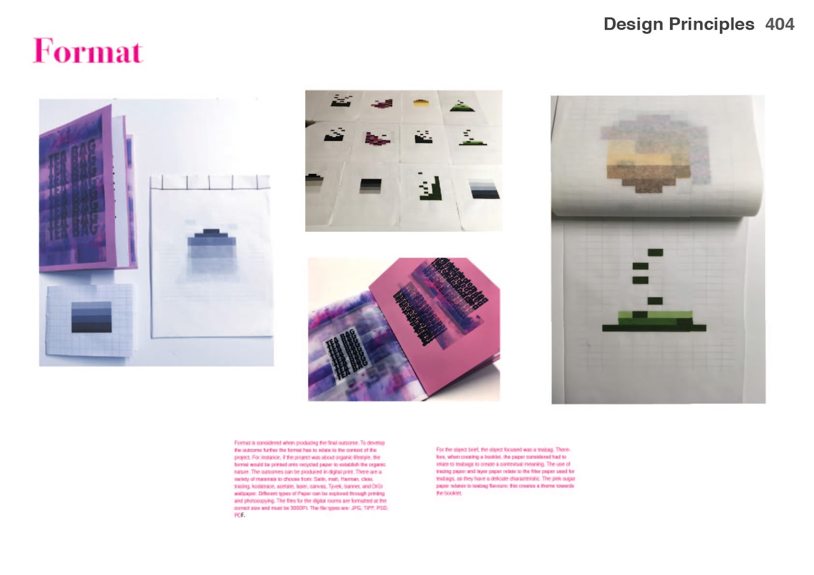
Format
Format is considered when producing the final outcome. To
develop the outcome further the format has to relate to the context of the
project. For instance, if the project was about organic lifestyle, the format
would be printed onto recycled paper to establish the organic nature. The
outcomes can be produced in digital print. There are a variety of materials to choose
from: Satin, matt, Harman, clear, tracing, kodatrace, acetate, laser, canvas, Tyvek,
banner, and DIGI wallpaper. Different types of Paper can be explored through
printing and photocopying. The files for the digital rooms are formatted at the
correct size and must be 300DPI. The file types are: JPG, TIFF, PSD, PDF.
For the object brief,
the object focused was a teabag. Therefore, when creating a booklet, the paper
considered had to relate to teabags to create a contextual meaning. The use of
tracing paper and layer paper relate to the filter paper used for teabags, as
they have a delicate characteristic. The pink sugar paper relates to teabag flavours;
this creates a theme towards the booklet.
Design boards


https://issuu.com/naailahussein/docs/404_design_boards_1
Final Evaluation
The module has helped gain skills. These
skills have been developed through colour, typography, format, layout, and
visual literacy. This was developed through communication outcomes. This was
shown through book cover designs, poster, and booklets.
I have gained knowledge on colour through
pantone and CMYK v RGB. This has helped design decisions for other modules, and
created more sense when working digitally. Layout has played a huge impact in
making things clearer as my designs would be too over welling due to a lack of confidence.
Layout was experimented through sketchbooks, where grids were used. This has
helped gain confidence when developing booklet outcomes.
Knowledge of typography has developed through
researching into different fonts. This makes sense of working with contemporary
fonts and traditional fonts. Also, the use of fonts has to relate to context
which has developed my work further trough out the course. The use of format
relates to the contextual meaning, which ensures each design decision has a
meaning.
Visual Literacy is the ability to construct meaning from visual
images and type. It also interprets images of the present, past and a range of
culture. Visual Literacy produces images that are effectively communicate a
message to an audience. The definition of visual literacy is the ability to
interpret, negotiate, and make meaning from information presented in the form
of an image. This was shown through visual outcomes where I have
explored image and type.


No comments:
Post a Comment