In Cold Blood is by Truman Capote
In Cold Blood is based on a true event. The non-fiction novel was published 7 years after the murder was taken placed. Capote investigated in the quadruple murder before the killers were captured. Richard Hickock and Perry Smith were arrested six weeks after the murders and were later executed by the state of Kansas.
Overview of the crime
The Clutter family were the family murdered. Herbert Clutter
was a respected man who established a success in the farming industry. Clutter’s
wife, Bonnie, was a member of the local garden club, she suffered from
depression since the births of her children. The family included 4 children
altogether, where two had moved out due to adulthood. The two younger children,
Nancy 16 and Kenyon 15, were both at high school living at home.
The two ex-convicts recently bailed out of Kansas State
Penitentiary, that morning of November 15, 1959 committed the robbery and
murders. A former cell mate of Hickock, Floyd Wells, had worked for Clutter’s
farm, where he notified that Clutter owned a safe containing large amounts of
cash. Hickock had the idea of robbing this cash and starting his new life in
Mexico. Hickock contacted Smith, another former cell mate, to commit the crime.
The information from Wells had proven to be wrong as Clutter dealt with cheques
and did not keep cash.
Hickock and Smith drove four hundred miles across the state
of Kansas where they reached Holcomb where the Clutter home was located. They
entered through an unlocked door whiles the family slept. They then discovered there
was no safe, they bound and gagged the family up to continue the search of the
money. Smith killed Mr Clutter as they both didn’t want to leave any witnesses.
Bonnie and the two children were also murdered.
Hickock and Smith were both identified as suspects and
arrested in Las Vegas on December 30 1956. The trial took place from March 22
to March 29, 1960. The jury deliberated for only 45 minutes before finding
Hickock and Smith were guilty of the murders.
After five years on death row at the Kansas State
Penitentiary, they were both executed by hanging just after midnight on April
14, 1965. By 12:41 a.am they were both pronounced dead.
Capote Research
Capote investigated into the murder, before the murderers
were found. Capote compiled 8,000 pages of note of information. After the
criminals were found, Capote conducted personal interviews with them both. Smith
was portrayed as more sensitive and guilt ridden between the two murderers.
Capote’s research included letters from Smith’s Army buddy, Don Cullivan, who
was present during the trial.
50 Years later they interviewed Don Cullivan who was very good friend with Smith during the Army.
Researching the background of the character Smith.
Smith had a drunken mother who was a prostitute, and an overbearing father who was a tyrant, and two brothers that committed suicide.
Mr. Cullivan said. “He loved that. He loved adventures, he loved foreign treasures and treasure maps. He was not very in touch with reality, in many respects, that way.”
Cullivan would receive letters from Smith,
where they would include diagrams, poems, and ruminations on his fate. Mr. Smith intended to drop to two strangers from his cell window,
asking in big bold letters for them to get him a hacksaw blade. He never got
the chance to drop the note, never got the hacksaw blade, but he sent the note
to Mr. Cullivan.
Analysis from the Film: In Cold Blood
As part of this research, I watched the first film produced.
The first film is based on details of the book. The film suggests Smith to be a
dreamer, always reminiscing about his career, wanting to be a performer. The
character carries a box around, this box is filled with books, letters and
songs, where he describes this as ‘all of his stuff’. This perhaps suggests
that Smith was highly passionate, talented, determined, ambitious that he would
go to such lengths to achieve his goals. His childhood background was rough as
the film suggest he was highly fond of his mother but resents his father for
what he did through actions. The character has this vision of Mexico being this
gold country, the place to be. Smith remembers when his mother and father took
him out horse riding, where his mother captures and ties up a dog. Perhaps his
behaviour was influenced through his upbringing.
When the police were investigating the crime scene, they
came across footprints which matched Smith ‘s and Hickock’s shoes.
In the film, Smith’s nature was shown by helping out a young
boy and his grandad who was unable to walk. On the way, they collected bottles,
which they sold later on for cash. Perhaps Smith saw himself through this
character, of when he was a child.
A quote from the investigator, 'How can a perfectly sane man create a completely insane matter'.
Overall themes explored are innocence, dreams, American
dream, religion, health, conflict, age.
Holcomb is a place characterized by its innocence. Holcomb
is a place where farmers and ranchers work hard to achieve the American Dream.
The dream is shattered through the dramatic quick cut blast from the shotgun
event. Another theme explored is religion through Herb’s connecting with his
faith with his worldly success. Holcomb became this place where people feared after the traumatic events.
The theme of mental health is explored through Bonnie’s
health issues. Perhaps this issue complicates the success of Herbs achieving the
American dream. The family privately deal with their own problems.
Perry’s dreams of Mexico are shattered by reality.
This is through his leg being in chronic pain through the motorcycle cycle he experienced.
In Epic of America (1931), James Truslow Adams wrote that the American Dream is “…a dream
of social order in which each man and each woman shall be able to attain to the
fullest stature of which they are innately capable, and be recognized by others
for what they are, regardless of the fortuitous circumstances of birth or
position.” The notion of striving for dreams – the American Dream in particular
– is central to In Cold Blood.
Truman Capote was
born in New Orleans to a teenage mother. Capote was sent at a very young age to
live with his aunts and cousins in Monroeville, Alabama. There he became
friends with Harper Lee (author of To
Kill a Mockingbird). Capote took Lee on his travels to investigate the
murder. Truman Capote was openly homosexual, at this time period where no one else
was.
The main Thrust of the narrative was to show the impact of
dreams and what lengths they would go to achieve this status. It could also
reveal how people can be easily manipulated through the power of money. The
idea could stem to people experiencing traumatic events can impact their
behaviour.
Other themes explored
Visions of rural America
Religion through Holcomb being 100% Christian at the time.
Men and Masculinity
The views of what it is to be a man through traditions set
in the book. For instance, in the film the murderers separated the genders into
two separate rooms.
Women and Feminist views, woman are expected to be
homemakers and mothers.
Families are explored through different upbringings. This
was shown through class.
Explore madness, this is shown through both characters
passing out and daydreaming through ‘spells’.
The narrative has taken something obscure and made it well
known through a non-fiction book.
Adjectives that describe the book: Innocent, Dreamful, Reminiscing, Insanity, Foolishness, abnormal, sane, shattered, crushed, crippled, sensitive.


Collabrated with Greg Mollica


Exploring a centred composition. To modify this, the typeface could be reduced. The spine is more spacious which perhaps would be good if I were to introduce more of a complex design.

The front cover introduces the layout with diagonal lines. The slant introduces the theme of action and perhaps action. This structure addresses a sense of a sharpness. To develop this further I have the idea of cutting up typefaces and introducing lines to establish the theme of lost.
The back cover was not as effective as the quote was placed at the bottom. To improve this structure I could perhaps include a smaller typeface for the quote, as visually it looks to overpowering. As this book is a sensitive topic in my opinion a smaller typeface would be more appropriate. As the larger typefaces looks overpowering and intimidating which does not relate to the character's personalities.
Creating Thumbnails to explore different Ideas


The heart beat line is developed onto the cut up dollar notes. The concept of music was developed further by applying the letters to act as musical notes. This idea was influenced by Smith's collection of music. The layout of musical lines was applied by rope in another example which I have explored.


Feedback 1
The chosen typeface works effectively to fit into the imagery of the alarm clock. The element of clouds could reflect the idyllic setting at the beginning and the end of the novel. The typeface with extended x-height relates to the impression of typewriting and headlines from a newspaper.
Feedback 2
The type on the back contrast the background and is clear to read. To modify it further reduce the size of the text in the blurb and uses thinner stroke width.
The blurb could do with more work, explore other grid methods and layouts. The music note idea is unique but perhaps use lowercase as this will mimic the concept of musical notes. The typeface on the music line could e more defined and a stronger serif font.
Feedback 3
The concept on the Bodoni typeface contrasts well with the storm background as it relates to the theme of horror and thriller.
Perhaps incorporate a hint of colour to create a sense of drama.
Feedback 4
The blurb feels like is is trying to fit in with the composition layout. A lot more space would create a balance towards the background. The typeface size feels forced.
Taking this feedback on board, the final outcome has too many ideas on it, which as a designer I tend to do. I need to refine this process and perhaps focus on one concept for my final design. The concept of Bodoni works well however some typefaces are too large to fill the content. I will adapt the idea and concepts within one idea to fill in the space. The idea needs to be clear and link between the front and back cover. I will focus my design process of music.
Final Outcome

Analysis of three existing crime books:

A suitable lie is about a character named, Andy Boyd, who is widowed
after his wife dies in childbirth. He then meets another woman who appears to
be the perfect woman. However, the book explored Anna abusing Andy. The book
reveals the theme of domestic abuse. The author includes the idea of gender
reversal; people expecting males to be the abuser.
The designer has included a ring as context to fit
in with the theme of relationships ad marriage, as a wedding is a key event
within the book. The designer explored the idea of a broken ring. This idea
conveys Andy’s feelings of being emotion, unstable, feeling heartbroken after
the death of his first wife. It also created the idea of domestic violence
through the ring being physically broken; this is used as a metaphor to address
Andy suffering from domestic violence. The use of the word lie being within the
ring shows the idea of someone being trapped as well as addressing the idea of commitment,
someone committing to something untrue and impure. To improve the design
further the designer could have used a silver ring to address the idea of ‘second
best’ not always being fully satisfied.
The semiotics being the ring addresses a unity, a
commitment, things lasting forever. This concept is lost through the ring being
broken which also addresses the meaning of bad luck. This hints towards the
book being about relationships and perhaps emotion.

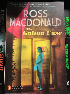
The repeating shadows represent the connection through different plots. This is through similar letters left by Culligan's ex-wife by which would hint a clue for each mystery. Culligan's ex wife knows information about Galton death. The repeated body is to represent the aspect of disguise. The concept of the character looking at you addresses the idea that she knows a lot more than she leads on to. The beach landscape represents where the book was set in Southern California on the coast in the late 50s and 60s. The triangle represents the links between each case.

An image of the coast in Southern California in late 50s and 60s.

Pilgrim is a code name, for someone who does not exist. The idea of the design is the fingerprint is used for identity, who is Pilgrim? Fingerprints is used to relate to the theme of crime. The writer addresses the idea of obsession and how people are self centred and focus on their own lives.
The lines within the fingerprint convey the idea of quantity. For example this could be through the amount of countries the character has travelled as well as relating the amount of deaths taken place in the book.
The symbolic meaning of the Fingerprint is through different types of fingerprints. The designer has used a Whorl fingerprint. The personality of a whorl fingerprint reveal a controlling and dominant persona. This perhaps suggests the main character's personality as well as the author introducing the theme of control.
In my opinion, this book design is cliche and the least successful compared to the other book covers. As the book cover different scenes within different countries, the designer perhaps could focus on a specific country where it was most important. Also as pilgrim is a code name, the idea of cryptic codes could be adapted as well as Arabic type as the character would run through Eastern countries.
Existing book covers from 'The Cold Ones'

Megan Wilson is a Vintage art director. Wilson has worked as
an art director at Vintage/ Random House. She has created blogs based on
vintage photographs, her blog Ancient Industries presents domestic living and
extinct artwork, photographs, and objects. Megan Wilson uses fine art compared
to other book cover designs.
Megan Wilson vintage style relates
to ‘In Cold Blood’ as the story is dated. The sky full of clouds portrays the
aspect of dreaming and wonder which relates to the Character Smith.
The message is to address the idea of wonder and foolishness
through the clouds. The concept of the cloud being the main focus
address this as the drama in the composition. This then creates the idea of
the clouds perhaps blocking the sky to relate to the traumatic event that
will happen. The concept of the book relates to the idea of weather, the
concept of something being sunny then leading to a storm. The storm
representing the event of the murder.
The key aspects towards the narrative relates to the story of
the Smith and Hickock travelling from Kansas to Mexico. The image comes from
their travel and journey, that is what is being communicated.
The clouds also act as a sign of something bad is going to
happen. It creates the illusion of the clouds filling the sky to perhaps
suggest a storm.

S.Niel Fujita (1921-2010) began
his career as a designer in Philadelphia at N.W. Ayer, then moved to New York and became the
head of the art department for Columbia Records. At Columbia, he designed album
covers with commissioned artwork by Ben Shahn, Andy Warhol and Roy DeCarava. Fujita
uses bold typography which has been modernist in tone. Frujita created a book about Graphics to introduce this industry to other
cultures which have not heard of the subject. Frujita expressed how he likes
working with authors as the author sells the book. This justifies the larger
typeface being used for the author.
Frujita then talks about Capote’s
requirements of not wanting red as it suggest the death was new, which this
theory does not fit in with the book. Therefore, the colour was changed to a burgundy
colour.
The intended message of the pin
was to suggest the idea of murder as well as suggesting something fragile and
sensitive to relate to the event. The typeface is san serif to suggest a
traditional approach towards the book, as this was the first edition.

Design by Eric White (with art direction by Greg Mollica) for Modern
Library’s 2013 edition of Truman Capote’s In Cold Blood, part of
their “100 Best Nonfiction Books” list. The typefaces used is Bodoni trade gothic.
Eric White
Eric White is an American visual
artist, based in New York. White generates psychological narratives
in his surreal figurative paintings. Hi work is inspired by cinema especially
in the golden age of Hollywood. The classical Hollywood Cinema in the sound era
was between 1920-1960s. This relates to the time period of ‘In Cold blood.’ White explores obscure pop culture seen though a
dream logic. Earliest acrylics, oils describe a paranoid social realism. His
work is described as distorted, dark and witty.

Exploration of photographic medium and hand drawn type. The composition layout of the penguin is visual exciting.

Exploring different mediums used for book covers which Eric White has designed.

The concept of letters relates to 'In Cold Blood' by Smith writing letters.

A painting by Eric White. Relates to smith's nature and characteristics of being delusional as well as dreamful.


To develop the project further, I could create collage composition for the final book cover design influenced by Greg Mollica.
The design relates to the designers as they have used a hand craft quality towards the book. Eric White created paintings which explored the context of the time period matching the time of 'In Cold Blood' was set. The use of the paintings being serious really captivated the moment which relates to the crime genre of shocking intent.
The message intended is to address the reality of the story. The fact how the story was true. The message is shown through the type being on a newspaper content. The composition layout is different and innovative however sill readable. The sign is through he colour of orange. The colour is eye catching however is an off tone to red. This suggests the idea of 'how can someone so sane create an act which is insane'. It also creates the idea of the blood drying up and perhaps is dated relating back to the context of which time it was set.
Book Cover typographic treatment
In task 03, the examples show the investigation of a hierarchy
of type which is included in book designs. In these examples, I have included
the blurb, title, author, quotes about the book.
This information is used exploring scale and size to address
importance for each role. The examples show a diversity of the size of the title
compared to the type of the author. S.Niel Fujita explains how the author sells
the book. In these designs, I have explored with size to see if this impacts
the title.
In the Spine, I have introduced different angles, and researched
into which spines are more visually exciting and stand out, when visiting book
shops. In my opinion turning the title at 90 degrees, creates more room and can
use a larger typeface. Therefore, the type is a lot clearer. Placing the title
first intrigues the reader. It has also created more space.
Centred compositions of the spine create the spine to look emptier.
This perhaps would work as an advantage if the background had a sense of a
pattern.
The typeface chosen is Georgia and Baskerville. I have specifically chosen Serif typefaces as they look more traditional and dated to relate to the context of when the book was set in the 1960s. The typeface is influenced by Eric White's design where the design has used a serif typeface.
The typeface chosen is Georgia and Baskerville. I have specifically chosen Serif typefaces as they look more traditional and dated to relate to the context of when the book was set in the 1960s. The typeface is influenced by Eric White's design where the design has used a serif typeface.

Here, I have explored positioning the title of the book cover to see if the type is still readable. I have placed the title below the author to explore a different composition layout. The use of the author being placed at theta creates an importance as well as the author perhaps being well known so this will intrigue the author to go to that book. The back cover juxtaposes the type of the author as it is positioned in a left style. The back cover could be modified by applying a larger space between each row to ensure the type is readable.

Exploring a centred composition. To modify this, the typeface could be reduced. The spine is more spacious which perhaps would be good if I were to introduce more of a complex design.

The front cover introduces the layout with diagonal lines. The slant introduces the theme of action and perhaps action. This structure addresses a sense of a sharpness. To develop this further I have the idea of cutting up typefaces and introducing lines to establish the theme of lost.

The first Thumbnail on the left is influenced by clouds. The idea of clouds is through the concept of dream, from Smith zoning out into dreams. This idea was influenced from Megan Wilson's design where the main feature was a cloud. To develop this design, I could perhaps record photography of sky and work with Photoshopping to alter the levels to create it looking less vivid. The second thumbnail is influenced from alarm clocks, as the 'o's represent the number zero as this was when the death took place. The third thumbnail addresses the concept of four as there were four victims. The crosses signify the religious aspect towards the book. The fourth thumbnail is influenced from a dollar note as the characters left the scene with less than 50 dollars.

For the first 3 thumbnails, I have adapted the concept of a dollar note and developed this concept further. The first thumbnail shows the two dollar note being positions in an alarm clock layout. This also introduces the theme of the numbers 2 and 4. The concept of two killers and four victims. The right thumbnail shows the idea of cut up dollars to address the idea of value being worthless. It also introduces the theme of something being shattered and broken. The third thumbnail introduces the theme of the American dream where the note will be cut up to fit into a graph which represents the stages of the American dream. The fourth thumbnail shows the idea of a letter from Smith to his friend as Smith wrote to his friend asking for an axe. To develop this idea further, I could create the letter then photograph it.

In these thumbnails, the idea is addressing the idea of a heartbeat with the concept of music. As Smith was very sensitive and would create music Ive adapted these two qualities within the thumbnails. The heartbeat also reflects the idea of life and death.


The concept of rope is being introduced. The concept of hanging rope to represent Smith and Hickock's death by them being hung. This concept is more gruesome and represents the idea of crime and horror. This was then applied into type. The problem with this idea is perhaps it is to cliche and generic.

I then incorporated objects which Smith and Hickock left the crime scene with; a radio and a pair of binoculars. In the fourth thumbnail this shows the journey from Kansas to Mexico, where the characters were traveling too. The heart beat in the middle represents the murders which happened whiles they were travelling.

To develop these ideas further I then created the ideas through media. This idea is to cliche and perhaps subjective which does not fit Penguin's requirement.


Apply heart beat line over a dollar note to create a more contemporary feel. I feel the problem with these idea were they were overcomplicated and perhaps subjective rather than objective. The ideas were to abstract which does not fit the clients requirements.
Initial Ideas for final Book cover

I then used Illustrator to develop the thumbnail into an initial idea. The problem with this sample was the typeface needed to be sharper Serif. The heart beat line was unneeded. The musical note was unneeded as the composition already communicated the idea of music.


The background is of clouds. The clouds are in black and white to reflect the contextual information of when the book was set (1960s). It also reflects the horror, and addresses the idea of something bad is going to happen; the idea of a storm. The background technique was influenced by Megan Wilson's design for 'In Cold Blood'.
The 'OO's are in negatives to reflect the idea of an alarm clock place at midnight. The harmonious lines are placed on the author's name 'Truman' to represent musical sheets. As the main character Smith would create music and carry this around on his journey.

Feedback from final crit

Feedback 1
The chosen typeface works effectively to fit into the imagery of the alarm clock. The element of clouds could reflect the idyllic setting at the beginning and the end of the novel. The typeface with extended x-height relates to the impression of typewriting and headlines from a newspaper.
Feedback 2
The type on the back contrast the background and is clear to read. To modify it further reduce the size of the text in the blurb and uses thinner stroke width.
The blurb could do with more work, explore other grid methods and layouts. The music note idea is unique but perhaps use lowercase as this will mimic the concept of musical notes. The typeface on the music line could e more defined and a stronger serif font.
Feedback 3
The concept on the Bodoni typeface contrasts well with the storm background as it relates to the theme of horror and thriller.
Perhaps incorporate a hint of colour to create a sense of drama.
Feedback 4
The blurb feels like is is trying to fit in with the composition layout. A lot more space would create a balance towards the background. The typeface size feels forced.
Taking this feedback on board, the final outcome has too many ideas on it, which as a designer I tend to do. I need to refine this process and perhaps focus on one concept for my final design. The concept of Bodoni works well however some typefaces are too large to fill the content. I will adapt the idea and concepts within one idea to fill in the space. The idea needs to be clear and link between the front and back cover. I will focus my design process of music.
Final Outcome


No comments:
Post a Comment