Layouts for Final Publication
The layouts explore the concept of including Easter type. As well as using the idea of a pattern and sequence to contrast type with Image. The concept of repeating words addresses the idea of complexity and then highlighting the stereotypical concept of "one". This is addressed though the filled typefaces contrasted against the outlined type.


A Contact sheet showing the use InDesign

The layouts were then cropped to the right size of A5 and made sure they were CMYK at a 300pi.
This was then designed in a layout in InDesign. Due to the consideration of the Japanese bind, and bind was needed. Therefore I applied a bind of 2 inches so none of the content gets covered.
Format
For the title pages for: Black, Asian, and Arab. I considered using Acetate to convey a transparent attitude from the West. However due to time management I did not have enough time. Therefore I ensured the format of the paper was at a high standard as this was photographic content.
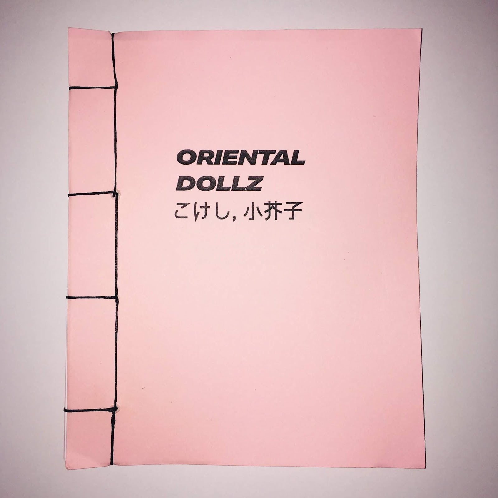
Initially, the design was a hard back cover book, however from the critique, this was stated to have lost the aesthetic of a magazine. For the format I ensured I bought baby pink paper and printed the logo for "Oriental Dollz" to finish the publication off. The reason for doing that, is from prototypes of printing on paper does not create the same effect. The paper either looks dull, or the ink started to come off.
Binding Technique
Japanese Bind


No comments:
Post a Comment