The Japanese bind wasn't as successful as I hoped. The bind is not as flexible, so the images were not fully visible as what I hoped. The binding process was a challenge as the paper was quite tough, so it was a struggle to stitch through this format. Perhaps a kettle stitch would have been more effective, or perhaps a stapled bind, if there were less pages. The front cover could have been developed further by applying a barcode, prize and blurb on the back.
For the Design layouts, the black section could have been designed further, as the Asian section and Arab section were a lot more stronger in the design aspect.
For the title pages, for Diversity and complexity, the font size could have been reduced as these printed out to be slightly bigger than intended. The Title pages for Black, Asian, and Arab would have looked more effective if they were printed onto Transparent format. For my next project I will ensure I have enough time to make sure I can print and bind for what I originally intended.
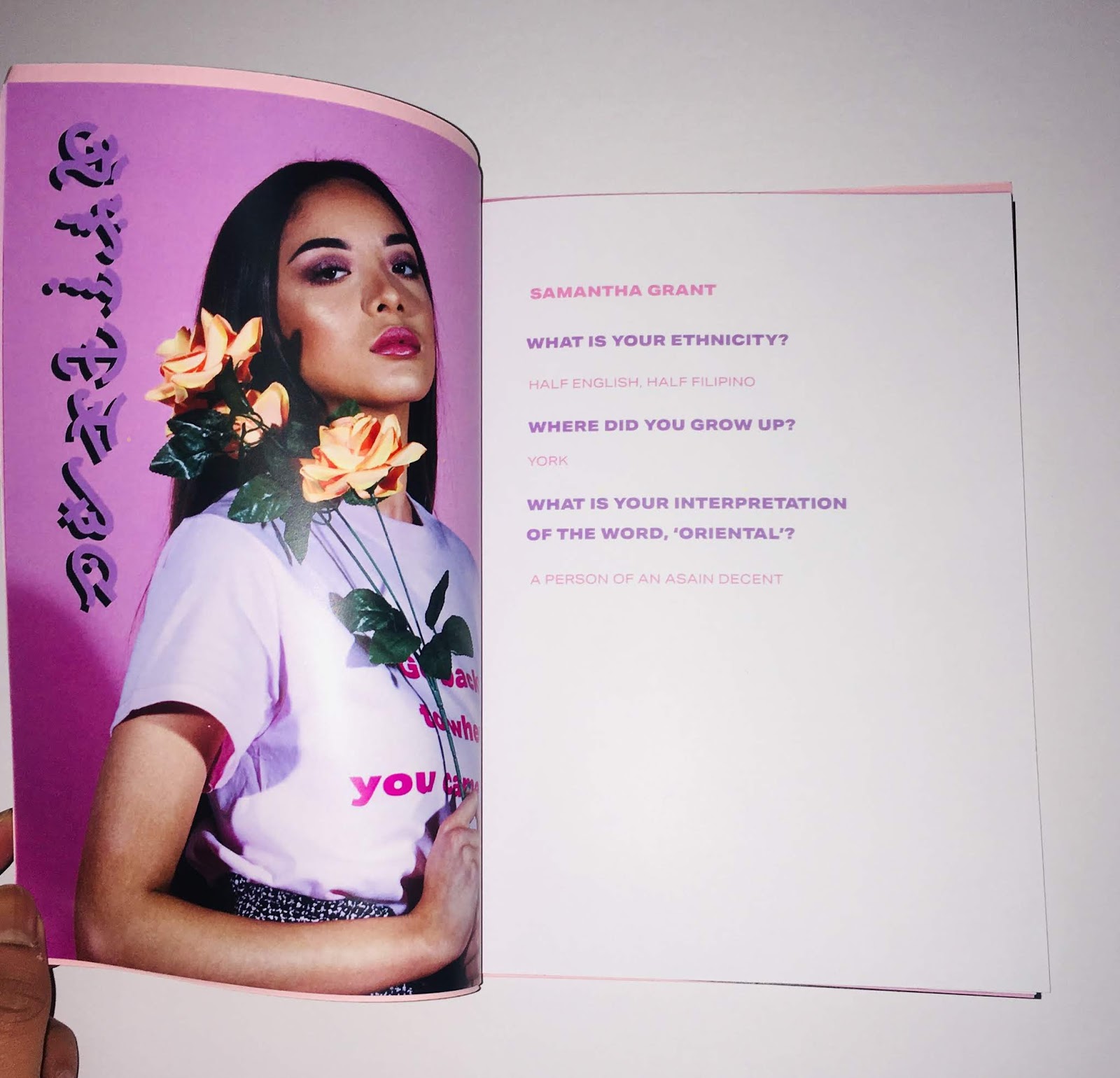
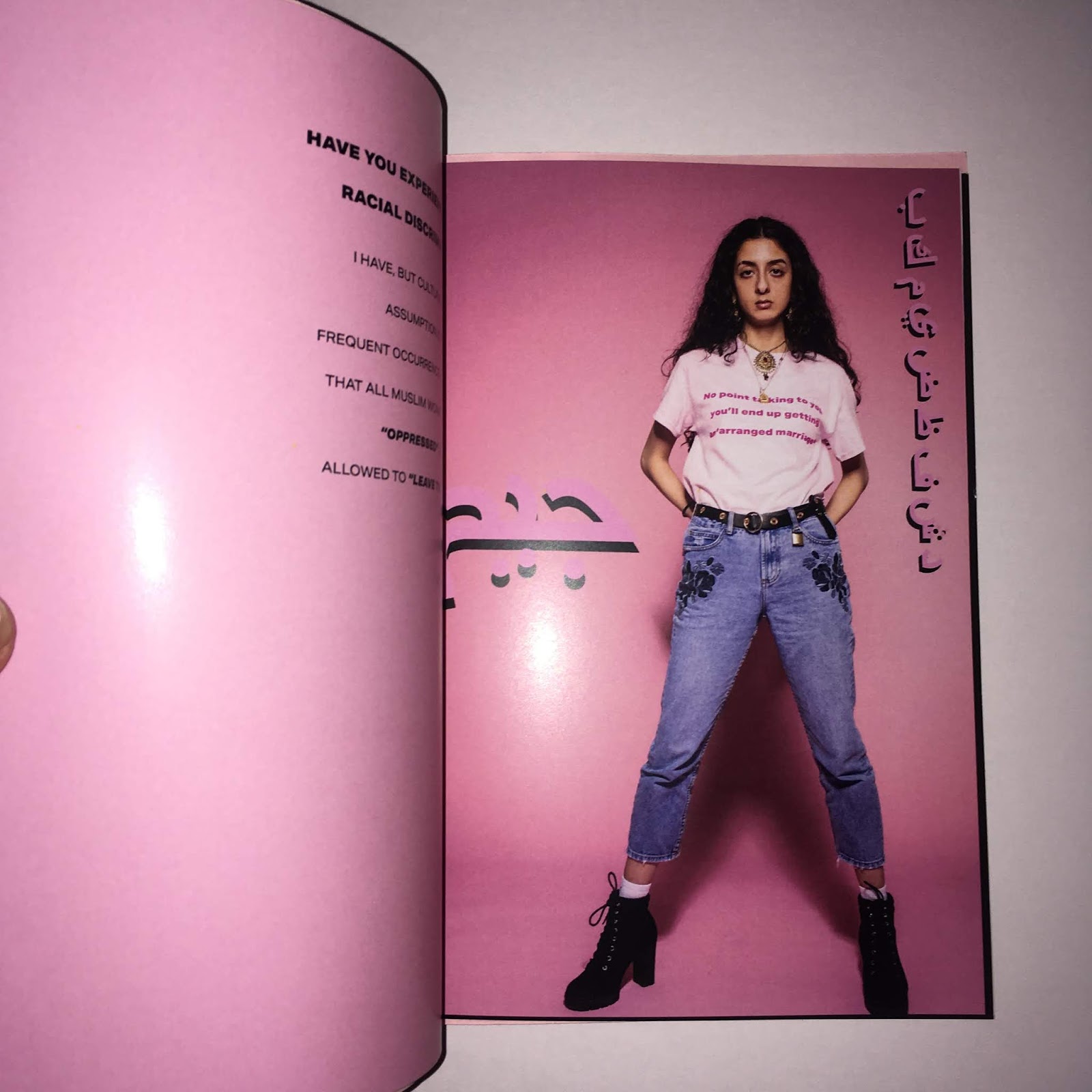
Feedback received that the use of Eastern typeface looks cliche and takes away the seriousness of the issue. However I feel it really establishes the concept of complexity and communicates there are so many cultures within the Middle East.


No comments:
Post a Comment