Using Photoshop to create the layouts for the publication.
Using Photoshop allowed me to work with double page spreads. The final outcome will be A5, therefore the speeds were A4 size, 210mm x 297mm. I developed as a designer, as I used guides to allow an accurate centre to create an A5 page. This made it easier to place images at the accurate size and scale. To develop the designs further perhaps I could of use illustrator by applying Arabic typeface for more of an artistic aesthetic.
The layout includes more of a sequence. During the critique, the layout was described as repetitive and perhaps could get less interesting as there is a lot of content. To develop the plain pages further perhaps explore type, perhaps type from the questionnaire to communicate the idea further. Type was analysed through the Azeema Magazine, by exploring layouts and grids. It was also noted that for the credit page perhaps apply the credit on the image for the secondary imagery; as most of the imagery is primary, there perhaps is no need for a credit page.
Development on Indesign for printing, this will allow a front to back print.
Using Indesign for the amount of pages, the pages will be 60 pages. During the critique it was mentioned perhaps creating a 100 page publication, however 60 pages allows the publication to highlight the primary images, as well as the publication not being too repetitive.
Applying Type on Indesign. Using Type on Indesign allowed the text to be played out in Grids which made it clear of how the text will be ready and allowed an easy layout. The guides allowed the type to be easily read.
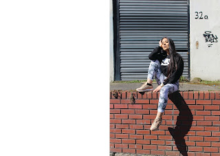
For this layout, I wanted the images to be diverse with the contrast of Eastern landscapes. This idea was taken from the Azeema Magazine. The images are Secondary, therefore during the critique, it was stated to apply the credit on the side of the page within the grid system.
Applying the text in a different space however in a two grid system taken from Daze magazine. This allows diversity within the publication as well as clarity.
For the models names and origin, I wanted it to be simple rather than a larger font. The reasoning of this creates more focus on the imagery as well as the layout being more professional and clean finished.
For the title page within the publication, during the critique, it was stated to add a definition and what the publication is about as this was not communicated before. As the publication will be sold in the UK, the meaning of the Arabic name was needed. A Bodoni typeface was used for the title to create a more decorative, fashion aspect towards the final piece, which related to context.
A logo of a palm tree was added for the last page to create a more personal aspect, however it also relates to the Exotic nature of the content matter. The illustration was created on Illustrator using the curve pen tool. The use of it being in black and white creates a clinical approach which allows sophistication and maturity towards the final outcome.
For the objectification piece, added poetry was added. The type is in a simple Helvetica, black and white to relate to the idea of simplicity but to also create a sophistication towards the publication. It makes the audience creates the connection between the type and image to relate to the sensitivity towards the piece.
Designing the Front Cover
The initial idea was to create a hard back cover out of traditional fabric as well as including a ribbon in the sense of a book mark. This would relate to the idea of fashion, as well as relating to the religious aspect of a religious book. However during the critique this idea was perhaps too complicated for the content. The notion of a publication will be lost aswell, therefore a paperback cover may be more appropriate.
When designing, the design of the cover would be simple and clinical. The design focuses on the Bodoni typeface. During the critique the final cover could been developed further by adding a bar code, and a price point. Perhaps including illustration of the traditional pattern would make the front cover more interesting and eye grabbing. The front cover could have been developed further, through colour, and pattern.


No comments:
Post a Comment