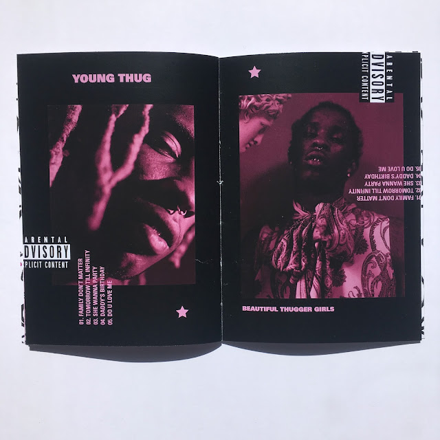
Final Outcome
During the feedback, the printing quality for the title age could be better, as well as perhaps buying a coloured paper and applying a screen print over the top to create a better quality finish.
In this image, the saddle stitch was tangled, for the future I will ensure the stitch it more accurate.
The feedback given was as the zine has less pages, the design could insist with more images rather than plane pages. The use of plain pages works well in a larger page zine as it helps break up the content.
For development, exploring different size formats would help develop my practise further. Perhaps exploring other saddle binds such as staple could be more effective. Other feedback given was to apply different coloured threads for the bind such as a neon pink to create a new exciting contemporary piece. Overall the piece was successful for the target market. Even though the piece was more fashion editorial, perhaps aimed at a feminine audience, the feedback from the male audience was high and they enjoyed the zine too. To develop myself as a designer I will create pieces which are more unisex. For this brief this was perhaps aimed more at boys so more contextual research could be used for other existing boutique zines such as I-D magazine, Vice magazine, and Fader. This would help me as a designer at exploring layouts and colour which the designers have used in an editorial layout.


No comments:
Post a Comment