Digital layouts were produced for a final publication which will be printed. The outcome will consist of 24 pages which is suitable for a saddle stitch bind. The layouts were influenced by Hort's campaign for Lebron James.


Experimentation of type to manipulate type to convey the idea of control and power. This design aesthetic was influenced by the Frank Ocean Branding.

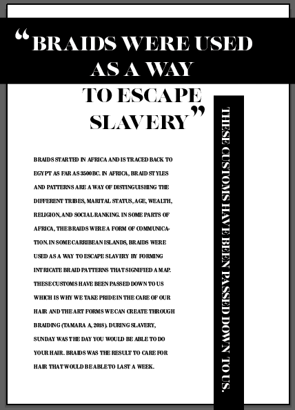
In the feedback it was stated to create a forward page for the first page, so the audience will be able to identify what the zine is about.


Feedback
- Include a statement to describe what the publication is.
- Target Market- create a focused target market to show who the publication aims at.
- Font- do more research into fonts which were created by diverse designers.
The fashion photography was successful, this is from skills gained from past collaborative projects and contextual research. However, during the critique it was stated the typeface does not fit well with the photography. The Univers typeface does not convey diversity and appears plain and too bold for the editorial publication finish. The aim was to create an urban aesthetic, however the clothing chosen is more sophisticated and would appear better with a more feminine, diverse, sophisticated typeface. Therefore, more research into editorial and typefaces will be investigated. The feedback will help me progress as a designer, as I will test different typefaces to develop my practice further.
AdobeFonts.com is a website which explores many typefaces. Lust Display Regular typeface was selected due to the type varying size which relates to the concept of diversity. Neil Summerour is a type designer, lettering artist, calligrapher and designer based in Georgia, USA, with one foot in Takamatsu, Japan. However, the issue with this typeface was the lines were too thin therefore in some of the designs the type was not visible and hard to read. For the theme of diversity, the idea of applying more than one typeface to emphasise the theme of diversity. For the body text ModernoFBCondensed was selected. This typeface was successful as it appeared more thinner and sophisticated which fitted the aesthetics for fashion. ModernoFBCondensed was founded in 1989 by David Berlow and Roger Black, Font Bureau has created custom typefaces for almost every major American publication, and grown a retail library of innovative designs like Benton Sans.


For the concept of scanning type, it was suggested to use a san serif typeface to see what aesthetics it would create, as this typeface looks to hash and less sensitive towards the topic.


To develop these designs further I created another prototype including fonts which appeared more successful and visible.

A forward page was created to develop the zine further to communicate what the zine about.

Benton Modern Display was selected to replace the Lust typeface. Benton Modern Display appeared more visible and more visible. It is also designed by the same designers for the body text, both typefaces have similar characteristics.


Overall, the feedback was successful and stated the font included more character and looked more sophisticated and delicate towards the topic of cultural appropriation. The typeface is varied throughout the publication which explores the theme of diversity.
Logo Development
The typeface explored was Beastly.


The 3-D effect on illustrator was applied onto the typeface. The purpose of this was to create a loud logo to contradict the phrase "Tone it Down".


During the Critique, it was stated that the logo looked out of place compared to the rest of the publication. It was stated in the critique to use the manipulated type, and use this as the brand identity instead.


Cleaning up the image on Photoshop. Using the magic wand tool and applying a white background to create a Monochrome effect.


For this example, I inverted the typeface on Photoshop and saved it as a PNG. This was applied on the layout for the Front cover on Illustrator. During the critique this example for the front cover was more effective compared to the previous design. The images are consistent and are from the same theme. The colour scheme is consistent aswell. The layouts use the most successful images within the publication.
Previous design

Initial Ideas influenced by the Frank Ocean Publication


Overall, these layouts were successful, but for the design for the front and back cover I wanted the images to be from the same theme. The idea of incorporating red on the front cover creates more of a statement and is more eye catching.


No comments:
Post a Comment