

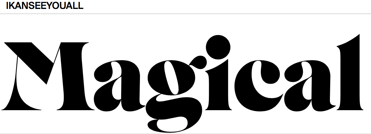
contributed by Flo doe on August 14th, 2015. Artwork published in circa July 2015.
source: https://www.behance.net@schoener
Typefaces
*Elegant Lux
*Transat
*Capsa
*Acta Poster
*Erotica
*Dream script
*Dream caps
*Lince
Elegant Lux

Elegant Lux is a reinterpretation of the light cut of Hans Mohring's Elegant Grotesk (Stempel, 1928), first issued as a demo version in 2014. Elegant Lux Pro is a revised version with a wide range of ligatures and alternates, released with TDF in 2015.
Acta Poster

Acta Poster is designed by Dino dos Santos, which was released in 2010. Related typefaces are Acta, Acta Display
Type Life- Issue 3- contributed by Swiss Typefaces on October 15th, 2018. Artwork published in circa 2018.

Photo: Swiss Typefaces
The third issue of Type Life, Swiss Typefaces celebrate contemporary type made by others. The Swiss design studio created a selection of there favourites typefaces, licensed the fonts and used them to design a magazine. The visuals are developed by lettering artist Julien Priez.
TypeLife3 showcases 19 fonts. The type design represents diversity and overview of design in the modern day. Most of the fonts were released in the past few years, and draw inspiration from past eras. The type explored are black lettering, script, slab serif, sans serif. The three major trends in modern typography are: stress of newness, historical references, vast stylistic purity (Florian Hardwig, 2018).
There are also functional fonts designed to solve specific problems. The type designers who created the fonts come from a diverse background. The represented distribution models range from traditional licensing to subscriptions, free and open- sourced fonts, as well as experiemental or even unfinished releases.

"Dream" set in Boogyroma and "chasers" set in Boogylink, two in-progress typefaces by Julien Priez Foundry names set in The W Clan GZA by Swiss Typefaces. The caption that mentions the typefaces is set in Suisse Int'l Condensed.

Typefaces used are Galapagos (Felix Salut, Dinamo) and Xprimntal 01 (CSTM fonts). The typefaces names are in KRSNA
Galapogos

Practice for Architecture, research and theory, contributed by Fatype in May 17th 2019. Artwork published 2018.
A typeface based on Felix Salut's Galapagos Game. Designed by Fabian Harb, Felix Salut and Johannes Breyer. Released in 2017. Felix Salut and Dinamo composed the same nine modules into seven alphabets: Rounded (A), Straight (B), Angular (C) and their crossings Rounded- straight (A-B), straight Angular (AC) and Rounded- straight- Angular (BC), Rounded -Angular (AC) and Rounded- straight- Angular (ABC, shown). The result is 70 individual typefaces: each style comes in 5 weights with Grid and non grid versions.
KRSNA
KRSNA was released in 2017 in Swiss Typefaces Lab section.

The image is a cover for a jazz funk bank from Solothum, Switzerland.

The body text is set in SangBleu Republic and the side notes are set in Suisse Int'l Mono. The green type is in KOPYME

KOPYME was released in Swiss Typefaces Lab section in late 2018. Comes in a single style names as Uzual.


On the right page includes the typeface Montchauve (Velvetyne). Designed by Frank Adebiaye, released in 2011.

Photo: Swiss Typefaces
Julien Priez' Mandions Gothic in combination with his lettering.

Pattern by Julien Priez, printed in fluorescent and metallic ink

The Arabic typeface is Azal, designed by CAAD AUS, Pascal Zoghbi, released in 2017.

The typeface on the right page is Respia Black (Sharp Type). Designed by Lucas Sharp, Wei Huang.

This page explores the atomy of type, showing diagrams of how letters can be manipulated.
Type Life 1: Special Lab
Contributed by Swiss Typeface on September 3rd, 2017. Artwork published on circa 2017.
source: https://www.swisstypefaces.com Swiss Typefaces
Type Life is a publication based on the topics about design, typography and lifestyle by Swiss typefaces. The content includes photography, illustration, lettering rathe than a heavy-long text, the overall concept is to create a visual experience. The print includes the use of metallic and neon colours.
The publication explores new ideas and fonts. The first contemporary font explored is BRRR. BRRR is a fun wide Grotesk font. The typeface is inspired from Simplon Monotype, the type was originally designed for a poster series for Swiss artist Simon Paccaud. BRRR is apart of the Lab typefaces. The lab typefaces consist of 5 styles; IKANSEEYOUALL, KRSNA, BRRR, Euclid Stencil, Riviera.
KRSNA started out as a custom version of New Paris Skyline, made for two vinyl record sleeves by Geneva- based musician Grace Core. New Paris collection, a complete palette for designers. New Paris Text and Headline each come in three weights with italics New Paris Kingsize additionally features a fourth ultralight weight, the majestic Kingsize Air. The typeface contains a fat amount of contrast through ball terminals and some serifs. The result is a display style that sits halfway between the Didot and the Sans. The four weights of NewParis Skyline, the collection totals in at 28 styles, providing plenty of options for covering a wide range of applications, from magazines and posters to catalogs and websites. Designers already have put NewPariss to great use in the fields of editorial design, fashion, packaging, and branding. It has been successfully adopted by art museums, cultural festivals and luxury restaurants, from Los Angeles to Salzburg.
KRSNA abandons the convention of a continuous baseline and introduces a three-storey space where the letters can sit at the top, centre or bottom, with the remaining space filled by bars and spikes. The resulting word images are captivating patterns with logo-like qualities.
TypeLife reveals how BRRR and KRSNA came into being depicting preliminary sketches, evolutionary steps, and photos of experiments made during trips reproductions of the very first applications show the fonts in context.
The main concept in Type Life 1 is the confrontation of opposites. Systematic typography is contrasted with footloose lettering, accurate vector shapes are shown side by side with drippy comic blackletter. High culture clashes with subculture when an icon of the Swiss International style gets remixed with graffiti. The digital is contrasted with the analog, the local with the cosmopolitan, the abstract with the personal. Glamorous spot colours were used such as Pantone Neon Pink and Yellow along with silver and black is a defining element of the publications identity.


Non-Central Moscow
contribute by Yury Ostromentsky on March 20th, 2019. Artwork published in December 2018. "Non-central Moscow" is a student project designed and composed by Viktoria Makeeva at HSE Art and Design School in Moscow. The typography uses the Regular, Old and Italic weight of CSTM Xprmntal 02, a set of three stylistically different typeface exploration by CSTM Fonts.


Which one am I now?
Contributed by Tristan Bath on March 23rd, 2019. Artwork published in Circa February 2019.
Which one am I now? was originally created for the rebranding of Wild, a digital studio based in Vienna and New York. The texts revolve around the recurring theme of mankind's ability to create and the struggle that comes with it. Wild Studio got David Avazzadeh, a photographer, to create visual support and a new lease of life, and decided to create a zine to carry the work. The typeface Arges was used for the bolder and shorter texts. Where as Beatrice was deployed for the longer texts for a cleaner aesthetic.


Foam Magazine issue 51, "Seer/believer", 2018.
Contributed by Jeremy Landes on March 16th, 2019. Artwork published in October 2018.
Foam is an international photography magazine published three times a year by Foam Fotografiemuseum Amsterdam. The typefaces used are Philipp Neumeyer's Rainer and Jeremy Landes Digestive, which are mixed to create striking headings. L15 and Haarlem are used for texts.


Sean O'Brien
WEIGHT magazine
January 23rd 2019
Weight is a fictional culture and lifestyle publication that uses hiphop music as a focal point to explore new things. Every issue will highlight a new album release from the artists in the industry, sharing their stories background and highlighting their lyrical content. Designed by Sean O'Brien while studying Graphic Design at Art Centre College of Design.


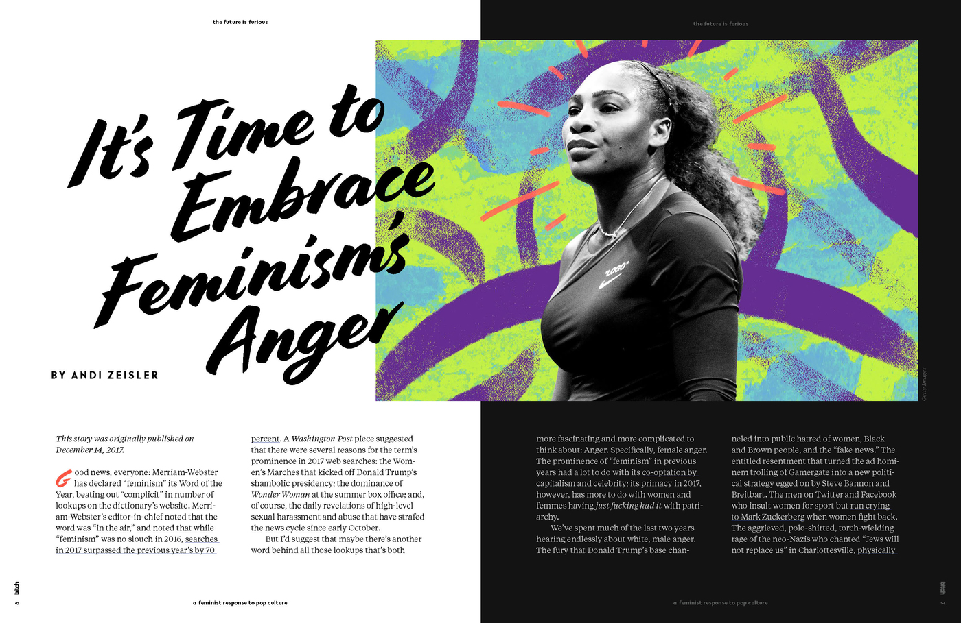
The Rage
contributed by XYZ Type on March 8th, 2019. Artwork published in September 2018. Designed by Veronica Corzo-Duchardt, in collaboration with Jessica De Jesus and Margot Harrington.
Bitch Media, published on independent magazine called Bitch with the phrase "a feminist response to pop culture." In 2018, the designers created a rebrand for their monthly, membership program as 'The Rage'. The name comes from the concept of anger, emphasising marginalised communities. The typeface used for the logo is Cortado, this design branding was used for totes, mugs, bookmarks, and membership cards.
The rebranding was heavily influenced by hand lettering of protest posters and 80's and 90's punk aesthetics Cortado typeface includes a sense of urgency and punk attitude. For the final logo Corzo-Duchardt manipulated print outs of Cortado on an old photocopier to push the emotion of anger and urgency even further.
Cortado type
Cortado script was designed by Jesse Ragan and Ben Kiel. The typeface was originally designed for Aldo shows 2013 campaign "Give Me Aldo" and is used for to all of Aldo's in-store design and e-commerce. Primary elements of the type were painted by Cecilia Carlstedt. In 2014, Ragan and Kiel updated the typeface and made it available for general licensing at cortadoscript.com. Since May 2017, the typeface is available from XYZ Type, with the name shortened to Cortado.


Source: https://fontsinuse.com/tags/1420/editorial-design


No comments:
Post a Comment