The images show examples of three prototypes.

Figure 1: Part one

Figure 1: Part two
Figure 1 shows the original prototype created on InDesign. This prototype was developed further by changing the typeface to make it fit into the publication better.

Figure 2: Part one
Figure 2 shows the developed prototype which was designed on InDesign. The typeface selected was Bneton Modern Display and Moderno FB, a serif font. This font worked well as it created more character towards the publication but also communicates a fashion publication by using the serif typeface. The serif font also creates a decorative feel towards the publication.
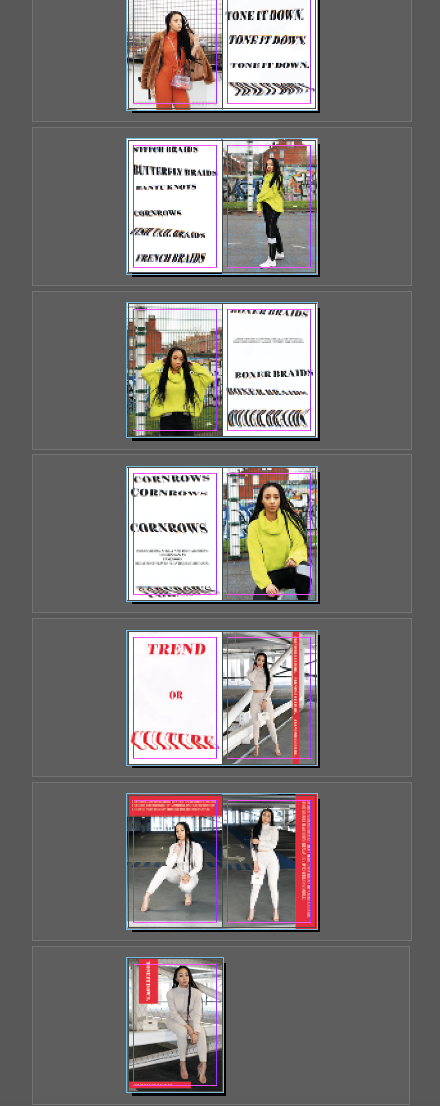
Figure 2: Part two

Figure 3
Figure 3 shows the final front cover design. The front cover was the most successful as both images linked and created a connection between the front and back cover. The inside will include a repetitive layout of the logo branding. The concept shows the type moving down the page which relates to the phrase, "Tone it down". This visual will be used for the final branding identity. This could be developed further by printing this on tops, or packaging such as tissue paper and tote bags.
Overall, I have learnt to create as many prototypes testing different typefaces to ensure the best typeface is selected. As my practice supports diversity, in future projects I will ensure the typeface selected will be more diverse and perhaps more visual and decorative.


No comments:
Post a Comment