How to fight fascism talk in Sweden 2017, by Mike Monteiro: co founder of San Francisco based interactive design studio Mule.
"Design is always Political."
All design is political, because all politics are designed. The world is a mess because a certain set of people designed it to be a mess. Now we need a different set of people to design our way out of it. This is not a choice. Regardless of whether this is what we wanted or not fascism is knocking on our front door. This is how we knock back. - Mike Monteiro
Shepard Fairey Hope and Nope Poster


The series presents political graphics from the events of Barack Obama's first election victory to the aftermath of Trump's presidency. The design conveys a biased approach to encourage ad persuade the audience to follow the 'right' path. It also connotes the audience's voice an reaction to the current events. The colours relate to context of the American flag, where the event was taken place. These posters have become highly recognised throughout industry.
Imagined Map US 2008-2017 is a design produced to convey what America will look like, which parts will be safe from terror attacks. The design used colour to convey which parts were more dangerous than others. The designs were complex and detailed. This will help develop my practise further by creating a function which highlights my strong drawing skills on Illustrator. This idea was explored in first year, perhaps this design ethic could be explored further for level 6.
Fragile UK Flag Anglo French, a graphic designer and former Phaidon Art Director Sarah Boris. The design uses the outline of the England flag drawn in fragile tape, this conveys meaning of the vulnerability of what the UK has become from coming out of the EU. This design is useful by exploring with media and materials in a handcraft format. This relates to my practice of exploring with materials and media.
Brixton Pound Currency London- 2009

The idea of creating a passport relates the the issue of migration, this product could be an interesting design idea for future projects. The use of the object being different and unique from your generic graphic design product, highlights the innovation of the design.
Graphic novel for potential Illegal immigrants
Australia
2013
Im 2013, following a period when 50,000 people travelled to Australia illegally by boat and 1,200 people died in the attempt, the Australian government introduced tough new policies to reduce people-smuggling, restore control over Australia's borders and prevent further deaths at sea. The government produced publications and TV, radio and press advertisement in a number of Asian languages, Arabic and English to publicise the new rules. This image-led narrative employs starkly graphic comic strips showing the risks of using people-smugglers and attempting dangerous sea voyages to Australia.
Design: Statt Consulting
Publisher: Australian Customs and Border Protection.

Syrian refugee crisis animation
Global
2015
Munich-based Kurzgesagt is a design studio that produces often animated information design to demystify complex topics. This six-minute film, available on the Kurzgesagt YouTube channel, explains why thousands of Syrian refugees were attempting to enter Europe. Visually colourful and simple, its accessible visuals support a verbal narrative about the causes of the crisis. It also debunks some of the myths about refugees and their impact that were prevalent at the time. By January 2018, the film had received 11.9 million views on Youtube.
https://www.youtube.com/watch?v=RvOnXh3NN9w
Islamic State flag
Global
For centuries, it has been a Muslim tradition to use monochrome flags known as 'Black Standards'. These feature the 'shahada'- Arabic script declaring: 'There is no god but Allah. Muhammad is the messenger of Allah'- and a circle to resemble the Prophet's seal. Since around 2000, Islamic militant groups including the self-styled Islamic State (IS) have co-opted variations on this design for the large flags that form much f their visual identity. Illegal in some countries, they are sometimes confused with conventional Muslim flags. The IS flag became widely recognised through media coverage following its 2014 offensive in Iraq.
Destination Pride data visualisation
Global
2017
Developed to help LGBTQ (lesbian, gay, bisexual, trans) people travel more safely, this project transforms the Pride flag, a rainbow-coloured flag that represents the gay rights movement, into a data visualisation tool that communicates how LGBTQ-friendly 195 countries and 2,000 cities are based on local laws and attitudes. The colours of the rainbow flag are used as sliders that relate to factors including marriage equality, sexual activity laws, and civil rights and liberties. Scores above 70 percent (long bars) are positive, those less than 50 percent (short bars) are negative.

Red: Marriage equality
Amber: Sexual activity laws
Yellow: Gender identity protections
Green: Anti-discrimination laws
Blue: Civil rights and liberties
Indigo: Social media sentiment
Anti-US stamps
North Korea
2015-17
North Korea has a long tradition of issuing stamps provoking the US. These are either for domestic use or to sell to collectors abroad, and they reflect national pride in very different ways. Despite being small, these stamps have strong narratives and are rich in information. They are as reminiscent of Hollywood posters as they are of the wartime propaganda produced by other dictional regimes.
Design: Unknown

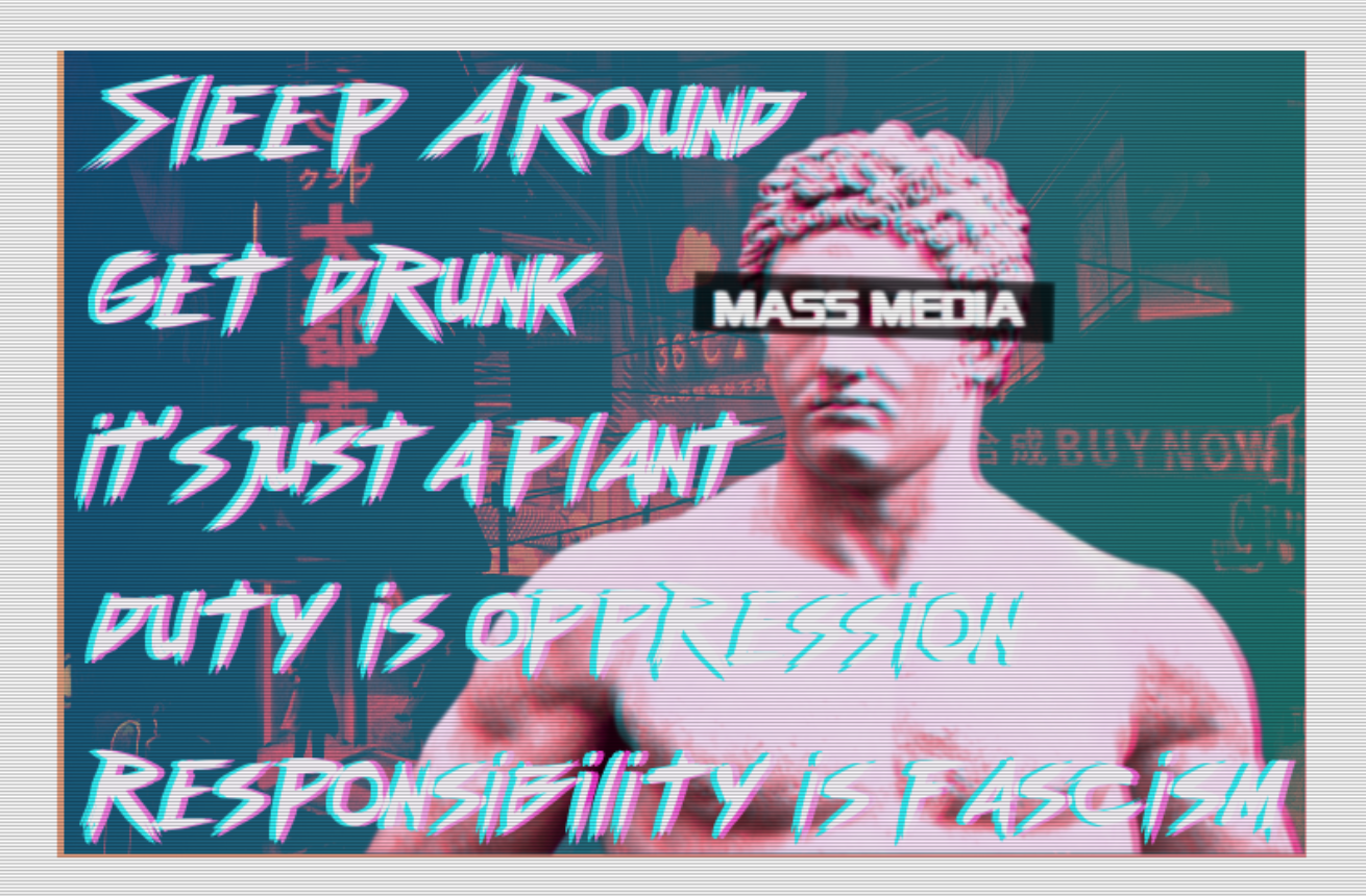
Fashwave memes
Global
2015
Fashwave ('fascist synthwave') has recently become the dominant musical and visual aesthetic for many young, white, far-right nationalists. Shared via channels including YouTube, Twitter and 4Chan, this subculture's artwork is as important as its largely instrumental synthesiser music. Fashwave imagery, appropriated from the apolitical 'vapourwave' music scene, evokes nostalgia for video games, internet memes and 1980s films through surrealist neon or pastel artwork. Reflecting its preoccupations, fashwave artwork often adds classical iconography and Nazi imagery to this cluttered mix.

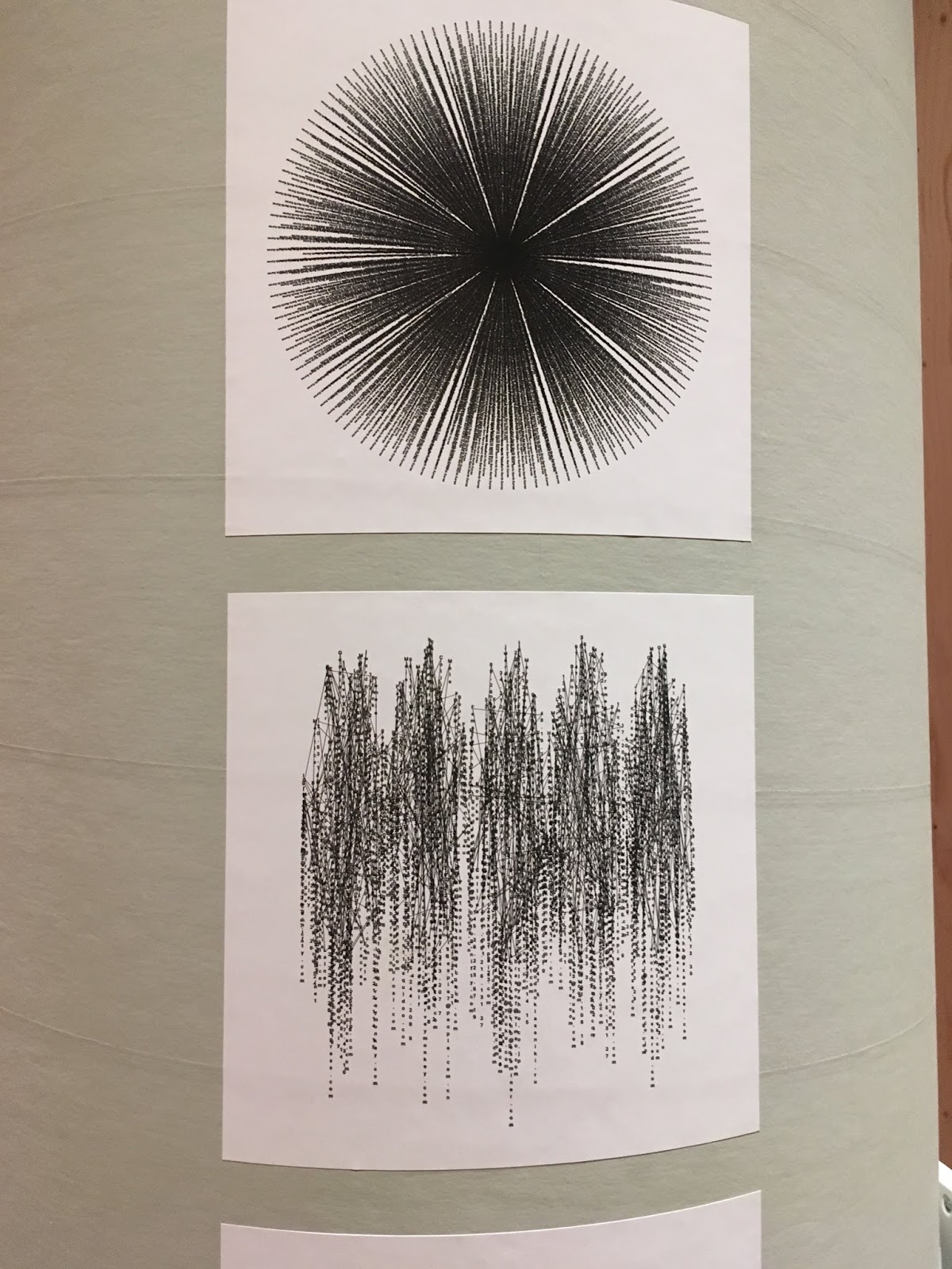
Data representations of US government surveilliance
UK
2017
Designed to provoke discussion around online government surveillance, British designer Romeo Galactic produced a series of typographic pieces as part of his final year student project. Edward Snowden's 2013 data leak drew attention to the US National Security Agency's searches of individuals' online activity for specific words. Galactic made 'Spook' from a selection of these trigger words- using an 'exploded circle' form to emphasise the far-reaching nature of this surveillance. 'Code Name' displays the names of known US spy programmes to highlight their scale and 'Meta' comprises numerous email addresses to emphasise how our data is routinely collected. 'Private was designed to echo the chaotic nature of blanket surveillance and question its effectiveness.
Names of the pieces:
Spook
Meta
Private
Code Names
Design: Romeo Galactic

Many Graphic Designers put their skills at the service of their own political beliefs. Using design to provoke debate or even to educate, they have often produced alternative narratives to mainstream media, such as the factsheets ad newspapers produced alternative narratives to mainstream media, such as the facts sheets and newspapers produced by the Occupy movement. This work shows how designers can help cute through the noise of political protest.

The 2Vth (Anonymous Pharaoh) artwork
Egypt
2011
Combining the mask used by the Anonymous with the pharaoh Tutankhamun, Egyptian designer and Illustrator Marwan Shahin created this piece of street art immediately after protestors forced President Hosni Mubarak from office during the Arab Spring uprisings. The image was used on the cover 2014 book Walls of Freedom: StreetArt of the Egyptian Revolution. Egyptian authorities banned the book for including content that is critical of the regime.
Artist: Marwan Shahin


Jeremy Corbyn merchandise UK 2017
Much of the Jeremy Corbyn-themed merchandise created in the run-up to the UK's 2017 general election was youth-oriented and irreverent- and social media-friendly. The Labour Party apparently approved the Jeremoji range of supportive emojis. The T-shirt, combining the Nike swoosh and the UK Labour nor Nike. It quickly sold out, was acquired for the collection of the V&A and brought its artist creators a court injunction.
Corbyn T-shirt
Design: Bristol Streetwear
Artist: Reuben Dangoor

Syrian political posters
Global
2011
The anonymous art collective Alshaab Alsori Arel Tarekh (The Syrian People Know Their Way) has produced posters relating to Syrian politics since 2011, a period spanning anti-government protests and civil war. After a rigorous approval process, poster designs are shared via Facebook and Flickr for others to appreciate or use. The designs vary in style and tone, though red, black, and solid black colours are common. Some are graphic in both senses of the word, showing violence and suffering. Others visually critique President Bashar al-Assad or express hopes for Syria's future.


Other examples from a separate exhibition include:
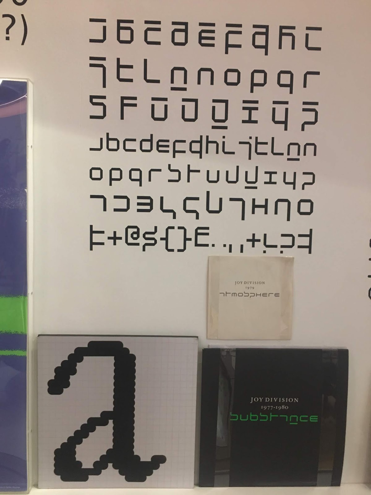
Substance 12-inch LP by Joy Division, 1988. Released by Factory Records Cover designed by Peter Saville Associates.
After the death of Joy Division singer Ian Curtis in 1980, long-time collaborator Peter Saville was asked to design the cover of the band's retrospective compilation album, Substance. Saville and his colleague Brett Wicken chose to use a version of Wim Crouwel's New Alphabet font that was partially redrawn to make it more legible. This decision helped to introduce Crouwel's experimental font to a new audience and an entirely new generation.
Kohinoor typeface, 2016
Designed by Indian Type Foundry
Over 700 languages are spoken in India and only 35 percent of Indians communicate in one of the two official languages, Hindi and English. Indian Type Foundry designs typefaces for many different Indian languages. Its Kohinoor type family is compatible with Latin, Devanagari and Tamil, three of the most commonly used writing scripts in India.
Kohinoor was designed to bring uniformity across an array of languages, allowing them to be used on computers and therefore reducing and likelihood of them becoming extinct.

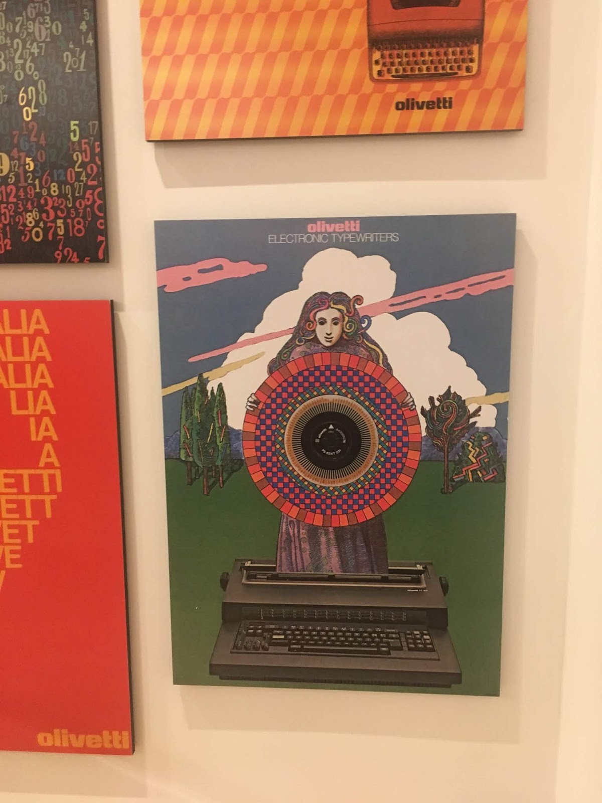
Olivetti posters
Recognising the need to integrate design into its business model, Olivetti created a permanent advertising and graphic design office in 1931, headed up by Giovanni Pintori. The department oversaw the commission ad production for all advertising and print media, and worked with a range of painters, graphic designers and architects to produce advertisements that have stood the test of time.
Rich in colour and pattern, and sometimes using new photographic manipulations, such as photocopying and photomontage, the designs ranged from the abstract to the surreal. They may be considered as pioneering, using bold and simple ways to communicate what was often complex information about technology and machinery.
Olivetti was founded in 1908 by Italian engineer Camillo Olivetti. His factory, in the town of Ivrea, first produced typewriters before expanding into adding machines, office equipment, furniture and computers. Camillo and his son Adriano took their responsibilities to their workers, and the local region, very seriously, investing in schools, housing and social facilities.
Throughout the 20th century Olivetti produced a number of influential designs. Products like Mario Bellini's Divisumma adding machines, Marcello Nizzoli's Lettera typewriter and Ettore Sottsass's Elea mainframe computer brought sophisticated design to engineering equipment and changed the look of their offices.
Olivetti's innovative design ethos extended beyond its products and developed into a comprehensive corporate strategy. The company employed some of the world's most significant architects, including Le Corbusier, Louis Kahn and James Stirling, the design factories and showrooms. They commissioned graphic designers Giovanni Pintori, Paul Rand and Milton Glaser, and called on the talents of the photographer Lord Snowdon and the novelist Alberto Moravia.
The company created by Camillo Olivetti belonged to an era when a large company was also a manufacturer, complete with its own plants, factories and local community. Its legacy shows how design can extend past pure functionalism to become something bright, sensual and playful.


Overall, the exhibition has helped me develop as a designer, as I struggled in 505 module of basing design on an issue. The exhibition has helped me gain knowledge of different products which are appropriate for an exhibition, these products are: maps, flags, clothing, comic books, illustration, photographs, branding, logos, and posters. Basing the design on politics includes a deeper meaning towards the product. Basing design on events helps the design have a purpose and function. For future designs, I will create more meaningful designs as well as incorporating innovation towards the design.
A purchase from the Exhibition
Made in North Korea by Nicholas Bonner: Graphics from Everyday Life in The DPRK
The first and most comprehensive collection of North Korean graphics in the world, Made in North Korea reveals compelling and surprisingly beautiful graphic culture of this most enigmatic nation. Over several decades, Nicholas Banner has been collecting stamps, candy packaging, postcards, tickets, luggage labels, wrapping paper, toys, food labels, label pins, bottle tops, phrase books. The book explores a rare glimpse into creative culture of North Korea, as well as documentations of the lives of Koreans.


No comments:
Post a Comment