Brief: To design a publication which highlights the issue with cultural appropriation of hair braids.
What are braids?
Braids are a traditional black hairstyle which has currently become mainstream. Braiding is a way to maintain hair which is more tightly coiled texture than the hair of other cultures. Tamara A (2018)- specialises in styles rooted in tradition. Braids are a way of expression to feeling beautiful.
History of Braids
Braids brings back nostalgic memories of intimacy, family and self-identity through artistic expression. Braids started in Africa and can be traced back to Egypt as far as 3500 BC.
"In Africa, braid styles and patterns are a way of distinguishing the different tribes, marital status, age, wealth, religion and social ranking. In some parts of Africa, the braids were a form of communication. In some Caribbean islands, braids were used as a way to escape slavery by forming intricate braid patterns that signified a map. These customs have been passed down to us which is why we take pride in the care of our hair and the art forms we can create through braiding." Tamara A (2018)
 |


On slaves ships the first thing was done was to have your hair shaved, to take away this concept of identity.


While the Migration from Africa to America, America lacked resources for braiding hair. During slavery, Sunday was the day you would be able to do your hair. Braids was the result to care for hair that would be able to last a week. Headrags and Cornrolls to main hairstyles during this period. For African-American women, covering their hair was something they had to do.

Image to show the how people of colour would cover their hair with head rags.
https://atlantablackstar.com/2014/11/05/7-ways-some-white-people-justified-american-slavery/slavery-pictures1/
By 1960s this developed a sense of a community, people would go and get their hair braided, this would create a place for a community to come together. This also allowed independence for women to be able to receive an economic income. It opened job opportunities for women as it was difficult for a coloured woman to find work in America. Braiding was seen as a skill, where salons were looking for hair braiders.
During the Great Migration, Black people leaving the South to Northern cities. Braided hair on adults were seen as old fashioned and backwards. Straight hair was seen as cosmopolitan and sophisticated.


In 1979, Bo Derek wore braids in the movie “10” produced by Prion, pictures distributed by Warner Bros. The purpose of this style was to create more recognition to the actress, as she wasn’t as well known. After this, magazines would start to call the braids, “Bo braids”. These “Bo braids” were seen as beautiful, exotic and acceptable. On white hair the braids would last 3 days contrasted to Black hair where the braids would last a lot longer. The message behind this shows that because a white person is wearing this hairstyle, it is seen as acceptable.


In the 1980s was the emergence of black women wearing braids in the media, for instance Alicia Keys introduced the backwards braids. Also, Basketball players introduced braids.


Images from Pinterest.com
In 1981, Rennee Rigers was sent to court by American Airlines to United Sates District Court S.D New York, for her braids. The judge said there was no evidence that braids was apart of her cultural heritage and the hairstyle was soon after the Bo Derick trend. The hairstyle was seen as a Trend rather than a cultural purpose.
Different Types of braids
Six straight back feed-in braids, stitch braids, butterfly braids, bantu knots, cornrolls, fish tail braid, French Braid
"French braiding or cornrows where the ends are pulled out lightly for a soft feel are popular. Basket weave braiding is more complex; I did this for Willow Smith recently, it works well with locs, wavy or straight hair because the pattern effect is more visible." Vernon Francois (2018)
Vernon Francois- celebrity hairstylist and founder of his own hair care line
“Boxer Braids” is a term named after white people taking recognition over corn rolls.
In a contemporary context, there are real consequences for women of colour who wear braids. They are seen as “unprofessional”, “Ghetto”, “Too Ethnic”, “Tone it down”.
Cultural Appropriation
Tamara (2018) states how being a women of colour, her hair has been the most controversial and socially unacceptable image in society. She goes onto to discuss how this concern may be seen as people being too sensitive, but backups her point by stating how history shows the damage it has caused through self-imagery and acceptance struggles. Tamara (2018) goes onto addressing that hair and culture should be honoured and respected in the modern day.
Francois (2018) discusses the definition of cultural appropriation. Cultural appropriation is when aesthetics from a culture is borrowed by another culture and is celebrated in a way which wasn't done originally by the originator. An example of this is the "Kim Kardashian's boxer braids". The issue with this is how a hairstyle can be perceived as 'trendy' because a celebrity from another culture is wearing it, but if the originator, a black woman was wearing it, it would be seen as 'unprofessional' or 'ghetto'. Tamara (2018) elaborates on this, stating how it becomes a deeper issue when other cultures are respected and acknowledged and the black community's voice becomes ignored.
Tamara (2018) states how people should credit the inspiration behind certain styles and trends to honour culture rather than appropriating culture. For instance, use right terminology such as Bantu knots which was originated from the Zulu tribe in Africa rather than 'twisted mini buns'. Tamara (2018) highlights how it is unfair how the history of customs are ignored and that is where the issue lies.
Tamara (2018) discusses how the mainstream media is a massive impact on the way people view and understand beauty. She goes onto say how publication such credit their real inspirations and histories behind looks when celebrating them. The media has the voice to speak out, and this is missing in the modern day, (Tamara, 2018).
This also relates to people have a stereotypical understanding of braids, that braids are singular and from one sector, when in fact there are many different ways of design for a certain braid. For instance, a Nigerian hair braider will have a different style compared to a Brazilian hair braider.
Bibliography:
Jackson, J. 2018, 3 Hairstylists on braids, cultural appropriation and media's erasure of black women, fashionista, 2 January. Available at: https://fashionista.com/2018/01/black-hair-braids-cultural-appropriation-media-erasure (1 March 2019)
Elle, 2017, 'Braided An American Hair Story', Youtube, 27 December. Available at: https://www.youtube.com/watch?v=yFGwmUCH9aI, (1 March 2019)
Brief: Create a fashion lookbook which educates people about braids, the meaning and purpose.
Publication name: Tone it down
Explore the concept of Trend or Culture?
Publication will explore black hip hop culture, and create an urban aesthetic towards the publication.
Questionnaire
Shanice
When did you start wearing braids?
The first time I wore braids was when I was little around five to six years old, originally, I didn’t like braids because of the pain. The process of the braids would take 5 hours and I would dread them and be put off going again to get them done.
It has only been recently where I have been wearing braids again, I saw braids on Instagram and I felt I could relate to these images. I wanted to try braids again however, with my own decision and control of what you wanted to do.
It is tradition by my dad’s family to do braids, it has a cultural purpose.
What do braids mean to you? (cultural)
Braids to me don’t have a cultural meaning but I do understand cultural meaning from other cultures. I like to embrace my dad’s side of the culture but it would be nice to be more educated and aware of hair braids.
How do you feel about “blackfishing”?
In my opinion, bloggers who are ‘blackfishing’ just have a lack of confidence within their own identity. People need to be more confident into their own skin and their own cultural routes. I also feel people need to be more educated about certain meaning and purposes to things which are important to culture.
Have you experienced any backlash from wearing braids?
Yes, people will look at me differently, and start feeling my hair. They will ask to feel my hair like it is something different.
What role do braids play in today’s society… Culture or Trend?
I feel braids play the role of both, but a lot of people are doing it for trend. When I was getting my braids done, the hairdresser called the braids “Kim Kardashian braids”. Braids have become mainstream.
Ivy Park is an activewear clothing line co-founded by American recording artist Beyoncé and London based fashion retailer Topshop, introduced in 2016.


The font used for the logotype of the clothing Brand is Aktiv Grotesk Black. Aktiv Grotesk is a contemporary grotesque sans-serif typeface released by Dalton Maag in 2010 (Dalton Maag, 2019). The san-serif typeface works effectively as it conveys a sense of strength, power, and assertion.
The scale variation addresses the idea of diversity and hierarchy. Furthermore, the Monochrome scheme works effectively, as it is simple for a complex design. This design approach has created an urban aesthetic towards the brand. Also, the layout is centred which works effectively and acts as a focal point, it draws the audience's attention in. To improve this design further perhaps the gap between the two words could be spaced out more or joined together as the gap is very thin and in my opinion becomes too compacted. Overall, the branding is strong, conveying power and strength. The characteristics of strength establishes a sense of confidence which relates to the context of sports and fitness, as the brand sells activewear. Consequently, the colour scheme is successful as it is simple for a complex design but also helps address the message of diversity and black culture.
This research will help develop my practice further by initiating a contemporary brand which explores the theme of diversity. The typeface being in capitals will help initiate a sense of confidence towards the brand, this will be considered when designing.The branding will address black culture through an urban aesthetic, this relates to the Ivy Park logo. I will further this research by exploring other graphic designers who have explored diversity.
Ivy Park Campaign Ad 2017
Fashion Photography
(Available from: URL )


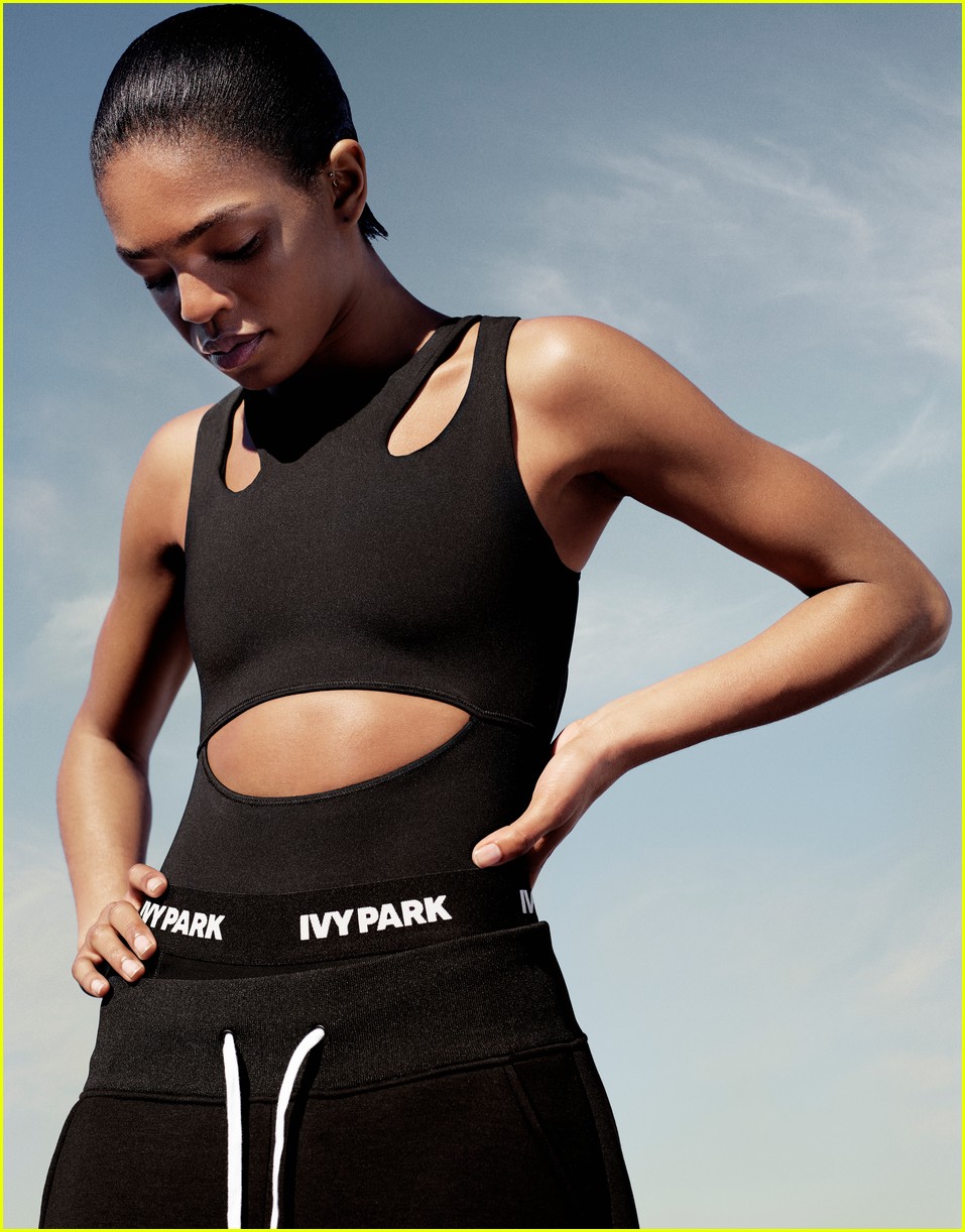


This research into fashion photography is relevant in developing my practice further. It will allow myself to strengthen my photography further by gaining new skills. The intention is to create primary photography for content which will create a more meaningful approach towards projects. New skills can develop my knowledge further by investigating different lenses which are relevant for portrait photography, for example a lens which will blur the background out.
The photography from the Ivy Park campaign are successful by the angle in which the photographs are taken. This will be recorded as this is something which I need to improve on. The primary colour scheme works effectively: black, white and Khaki. This helps identify the brand and helps create a sense of an identity. This leads onto the styling of the clothes, there is a clear colour palette which works well with the brand. This will help develop my practice further by directing a particular colour palette for the shoot. Also, the backgrounds in the photographs are minimal and clear which helps communicate the brand. The brand is visible in every image. This will help direct my shoots, to ensure the focus of braids is clear and addresses this is the focal point of the photograph.
I am not as confident in photography as in design, therefore I will have to ensure that the settings of the camera are accurate for the lighting for the location shoot. Lighting will be tested through the ISO levels and Aperture. The mode of the camera will have to be relevant for the shoot, as this is something which I have struggled with in the past. I will also need to consider where the shoot will be taking place, which will also relate to the theme of the publication. The location in the photography research will be unlikely due to the season. Therefore, more research needs to be done through locations in England which creates an Urban aesthetic. Perhaps find a location that relates to black culture, for instance a basketball court.
Research was recorded as the functions on the camera is something which I struggled with. This will allow myself to be able to figure out what settings are used for different light settings.
Lauren Sissons
Lauren Sissons is a Graphic Designer and Photographer based in London.
Ivy Park
Lauren Sissons focused on pre-promotional graphics, global marketing, outdoor advertising, windows, Instore and Event graphics for global launch of IVY PARK.


The composition layout of type and photography works effectively. This layout will be useful when considering text and image for a layout. The use of a grid used in a half drop repeat pattern creates the idea of the brand being playful, fresh and youthful. This idea could perhaps be considered when designing the final zine.
Images showing the brand into context


Bare Vintage
Bare vintage consisted of 24 pages, showcasing some of Lauren Sissons and Gus Walsh's 2016 photography for Bare Vintage. Launched first pop up shop in 2015.


The aesthetics and location shot works well. Combine the idea of using a council estate for a location shot to create a urban feel. My practice could combine the idea by using a council estate for a location shot to create an urban feel. The images are portrait photography, I could use this skill for the image aesthetics. The portrait photography is contrasted with a landscape image, this perhaps will help break the portrait photography up. The use of the layout works effectively with juxtaposing scale and size. The final image of a profile shot really highlights the element of the braids, perhaps this aesthetics maybe considered when shooting.
To develop this publication further perhaps more exploration of type could be combined to make the piece more visually engaging. The type design for Bare Vintage could be adapted with the piece to create a more loud, youthful, urban aesthetic towards the publication. Also, the type is a good tool to convey issues and messages, perhaps this publication could explore issues in rural areas or even more context about what the brand Bare Vintage is about.
This piece is similar to my work, as some pieces are just image based. To develop my graphical skills further a typeface should be chosen exploring the issues, experience and opinions of braids. This will allow my work to have more purpose and value. This will take me in a new direction using my photography to address issues which relates to context. To progress my work further, I need to branch out and research other typefaces used in fashion editorial. Therefore, the skills of graphic design will be developed by exploring other typefaces used in fashion editorial. The type design by Lauren Sissons can be explored as another technique to emphasise innovation towards the design piece. Therefore, technical skills will be explored further and developed.
Type Design for Bare Vintage
September 2016


Lauren Sissons Photography


Hort


The monochrome theme works effectively. This helps emphasises the design of the type. It also creates an urban, fresh feel towards the campaign. The technique of condensing and manipulating type creates the idea of firmness, strength as well as creating a sense of characteristics of muscles. The variation in scale and size addresses the concept of power, hierarchy and intimidation. The juxtapose layout of type and image creates the campaign to be more visually effective. The use of using grids creates more of a structure towards the editorial outcome. The use of a 3-way colour palette works effectively. The purple acts as the main focus which creates a sense of familiarity and identity. The photography is studio base, this works effectively for the campaign. However, for this project


The variation of type being multicultural introduces the idea of diversity and variation. The idea of including symbols from other cultures could be more useful for other briefs, rather than this specific briefs. This is due to the context being more focused on the issue of hair. The typeface is thinner compared to the Lebron James campaign typeface. Perhaps this will be less effect for this specific topic. Overall, the posters are not as successful compared to the Lebron James campaign for this specific brief. However, the use of the contrasted monochromes works effectively and makes the piece more visually engaging. The concept will be explored when designing to emphasise the theme of diversity.


This piece is the most successful compared to the other examples. The use of the type being experimented onto photography creates an interesting composition. The use of orange is the most successful as it creates more of an identity and originality. To develop my practice further this design aesthetic could be adapted when creating initial ideas.


These examples are successful in layout composition. This technique of grids can be tested in for the initial ideas stage.


The layout sequences of rotation of image and type works effectively. This simple style can be explored when tested. This approach is more simple compared to the previous examples. Overall, Host examples are more useful in creating templates for grids. This will help explore more graphic design further by exploring different grids and layouts.


No comments:
Post a Comment