Designing on Photoshop
Initial Ideas

During the critique, the feedback states how 'Trinity Kitchen' is hard to interpret. To develop this further perhaps incorporate the title to be smaller as well as an introduction page. Make the homepage more welcoming. The logo looks out of place, perhaps include a different effect to blend the logo in.

During the critique, these examples lacked a flow and continuous theme. The designs were too different. It lacked creativity and sophistication which was aimed for the clients needs. A clinical approach will relate to the Trinity website. The outer glow effect works effectively however is appearing harsh against the dark background, there is no link towards all the elements.
Development

Taken the criticism on board, the designs include a simplified design with a colour scheme which is continuous. The pink initiates from the logo. As lime green and magenta are the main colours in Trinity Kitchen.
Development in homepage

The homepage includes a clinical approach however simplifies the idea which makes the app for versatile and easy to use. The less complicated design emphasises the focus on the restaurants.
Designing a menu for Pho

During the crit, this was the most successful as the background explores contexts and a different innovative approach which will draw the user in. However other feedback stated this does not fit in with the other designs for the app. Perhaps this design is too diverse.

The purchase page could be developed further by applying a user profile to create an emotional bond for the user.
Development of receipts by applying imagery to create a more innovative approach. This also relates to the layout for the menus to create a link.

The promotion page could be developed further by applying a background to create it to be more interesting rather than the page being formative with type. The university typeface works effectively by addressing a contemporary food chain. However the use of pink perhaps creates a more feminine approach towards the brand which does not reach the target markets criteria.

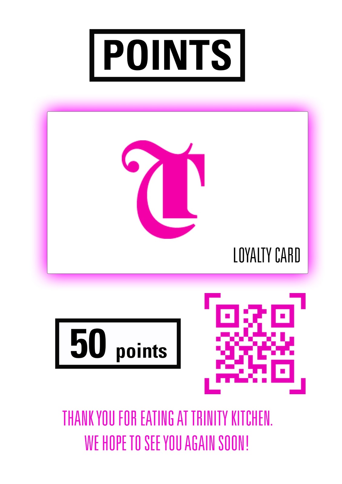
During the critique, the feedback given was to develop the loyalty card further perhaps created illustrative backgrounds to make the cards stand out more, as they look more generic. However saying this the simplified layout works effectively by addressing the idea more clearly.
Feedback
To develop the designs further, perhaps include toolbars to create a sense of functionality.


No comments:
Post a Comment